 SaaSFrame
Multi-Select
A field or list where several options are selected at once, shown as chips or checked items.



Index of all 7 Multi-Select examples
Multi-Select: design guide
Short answer
A multi-select lets people pick several options from one set, shown as checked rows, outlined cards or removable chips. Say up front that more than one answer is allowed, make the selected state obvious without relying on color, keep every choice reversible, show what is selected in one place and reflect the count in the action.
In the libraryas of November 2026
- Examples
- 7
- SaaS products
- 6
- Last added
- Nov 2026
Most common inAccount Setup 5User Onboarding 3Add & Edit 1Discovery Questions 1
Recently addedArcadePrivacyboardCal.comLinktreeReveal
A multi-select is a control for choosing several options from the same set: features you care about, countries you sell to, events that should fire a webhook. It replaces a stack of separate checkboxes or a series of single-choice questions with one field whose value is a list.
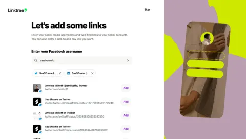
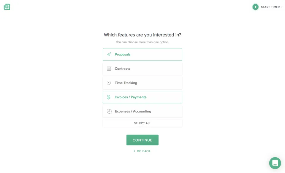
The captured examples fall into three shapes. Onboarding surveys from Bonsai, Reveal and Arcade use large selectable rows. Privacyboard uses compact pills that can be ticked in place. Cal.com and Linktree keep the chosen values as removable chips inside or under a field. The right shape depends on how many options there are and how often people come back to change them.
When should you use a multi-select instead of radio buttons?
Use a multi-select when several answers can be true at once and each one matters to what happens next. A freelancer can need both proposals and invoices; a webhook can listen to booking created and booking canceled. Forcing a single answer there throws away information or makes people pick an arbitrary favorite.
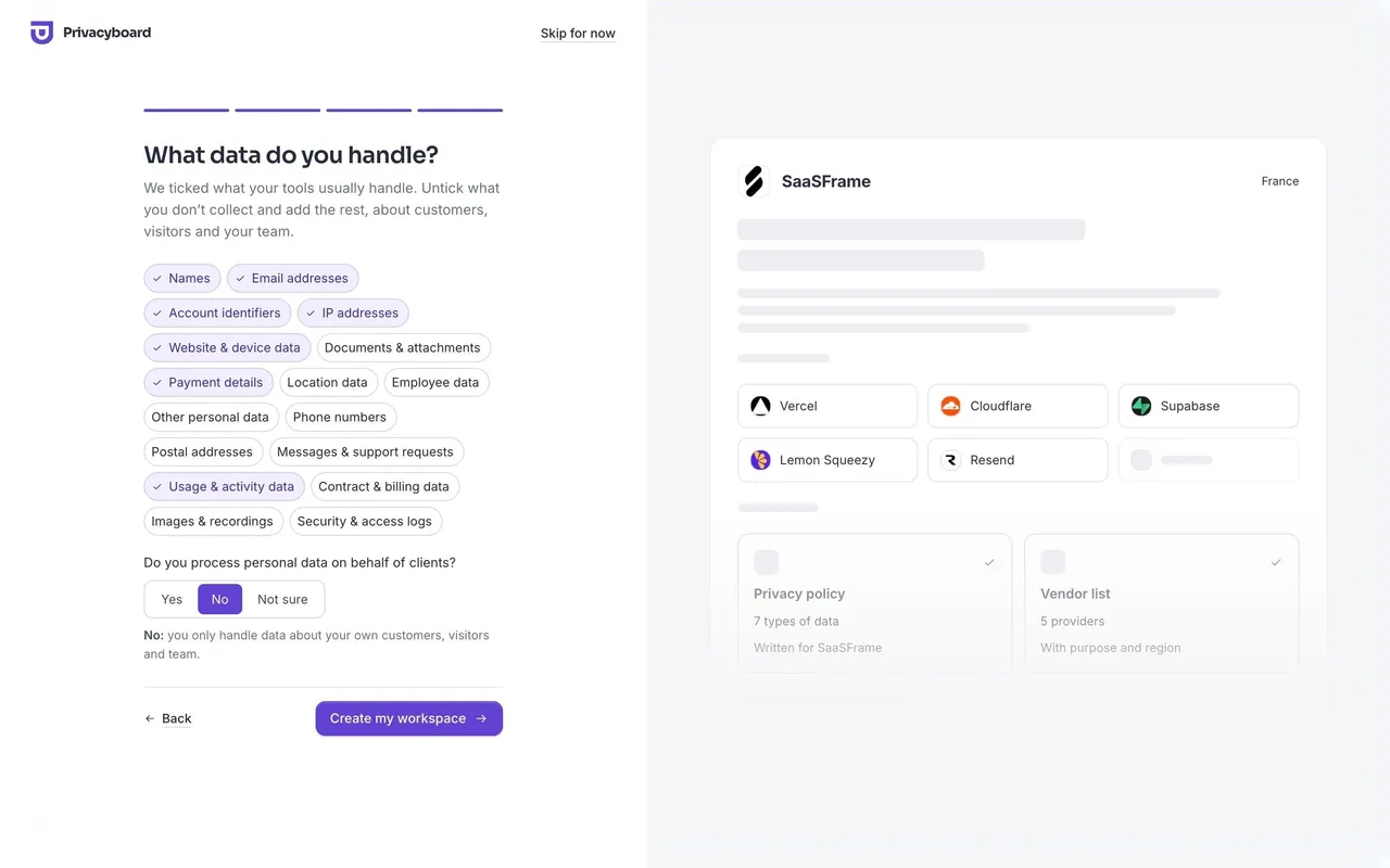
Keep radio buttons or a segmented control when the answers exclude each other. Privacyboard's data step shows both on one screen: data categories are a multi-select, while "Do you process personal data on behalf of clients?" is a Yes / No / Not sure segmented control. Mixing the two models on one question is what confuses people, not having both on a page.
Tell people that more than one answer is allowed
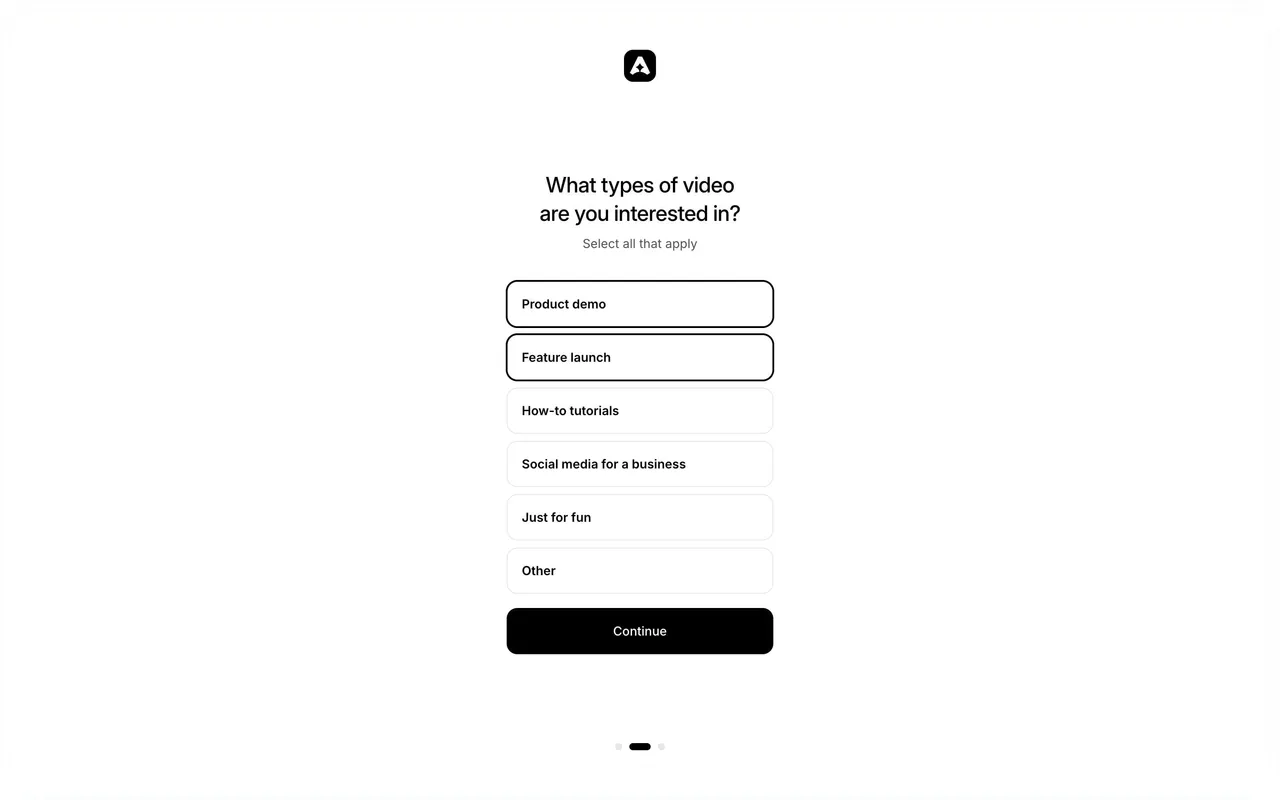
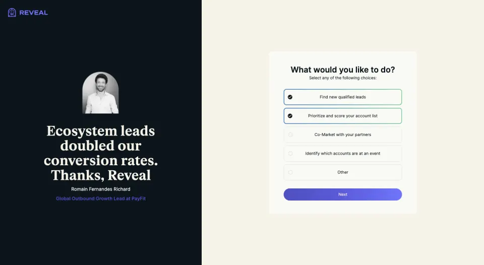
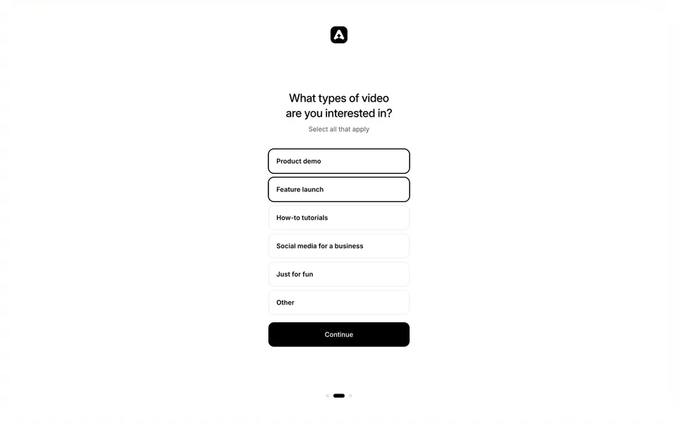
A list of options styled as cards reads as a single-choice question by default. State the rule next to the question. Bonsai writes "You can choose more than one option.", Reveal "Select any of the following choices:" and Arcade "Select all that apply". Each is one short line under the title, so nobody has to discover the behavior by clicking twice.
The visual design should reinforce the rule. Checkbox-like markers say "several" more clearly than radio-like circles. Reveal uses round markers that fill with a check once selected; it works because the hint is explicit, but a square checkbox would carry the same meaning without the sentence.
Make the selected state obvious, and not only through color
Selected and unselected options must be distinguishable at a glance, including for people who do not perceive the accent color. Combine at least two signals: a border or fill change plus a check icon, a weight change, or a change of label color with an icon.
Arcade relies on a single signal: selected rows get a thick black outline, unselected rows a thin grey one. On a monochrome interface that contrast is strong enough, but it is only a border. A check mark or a filled background would make the state easier to read on a low-quality screen or for someone scanning quickly.
Choose the shape from the number of options
- Up to about six options: full-width rows or cards, as in Bonsai, Reveal and Arcade. Every option is visible and has a large target. Icons, as in Bonsai, help scanning when the labels are product areas.
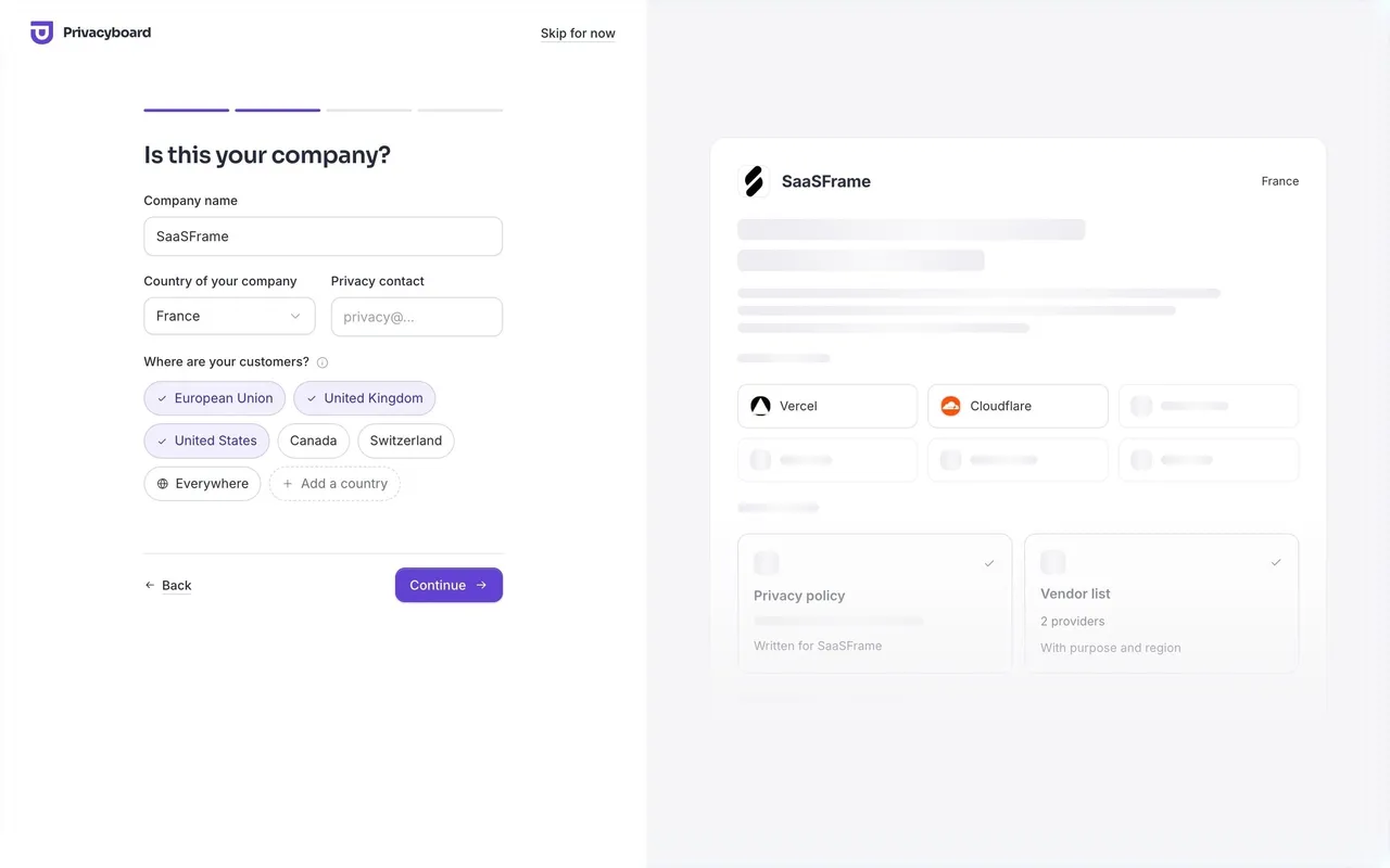
- Ten to twenty short options: wrapping pills. Privacyboard fits a long list of data categories in a few lines because each label is two or three words.
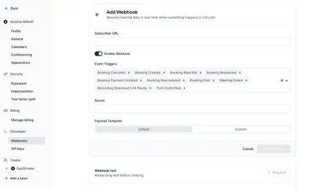
- Long or open-ended lists: a field with a dropdown or search, where chosen values become chips. Cal.com does this for event triggers; Linktree does it for links found by a search.
Pills stop working when labels get long or when the list keeps growing. At that point people spend more time scanning than choosing, and a searchable field is easier to use.
Pre-select only what you can justify
Pre-selection saves work when the product already has a good reason to expect an answer. Privacyboard's last setup step ticks the data categories that the tools chosen earlier usually handle, and says so: "We ticked what your tools usually handle. Untick what you don't collect and add the rest."
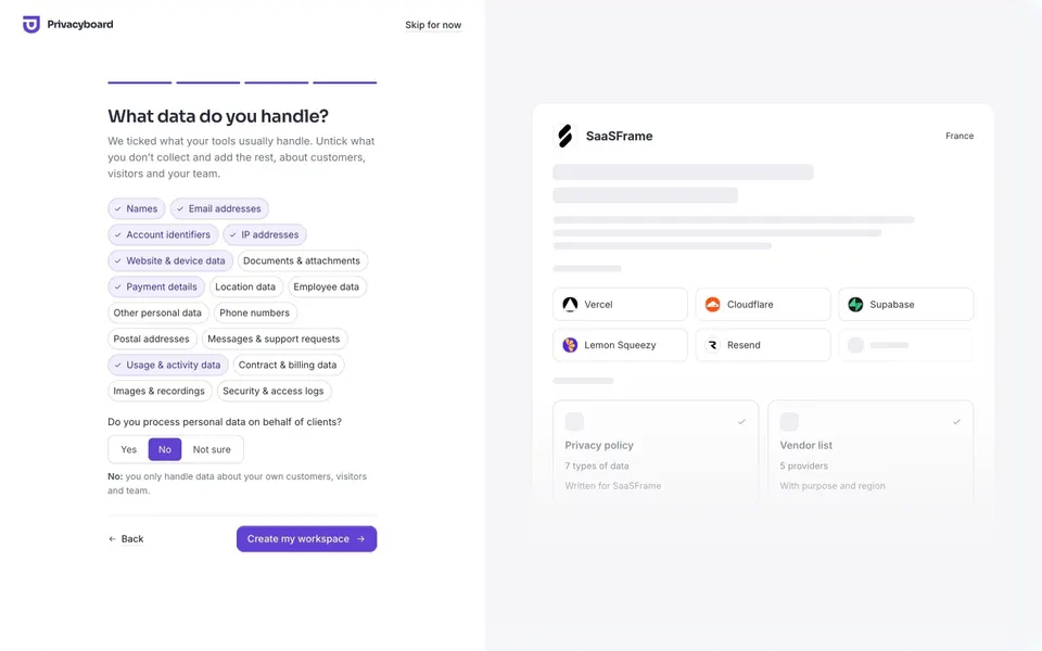
The explanation matters as much as the defaults. Without it, pre-selected answers look like a trick or get accepted without being read. If you cannot explain a default in one sentence, leave the option unselected.
The company step of the same flow adds two useful pills to a country list: "Everywhere" with a globe icon, and "+ Add a country" for values outside the shortlist. A shortlist plus an escape hatch keeps the common case fast without pretending the list is complete.
Keep the selection visible where you can edit it
Once values are chosen, people need to see them all and remove any one without reopening a menu. Cal.com shows every selected event trigger as a chip with its own remove icon inside the field, plus a clear-all icon and a chevron on the right. The field grows to three lines rather than hiding values behind "+7 more".
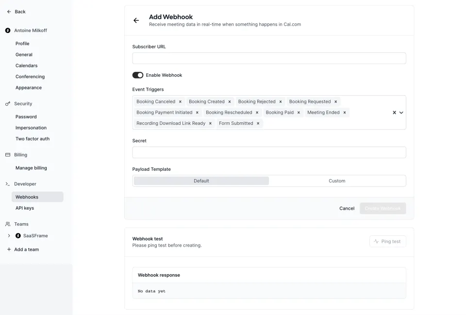
A clear-all control is convenient for long selections, but it is destructive. Place it apart from the individual remove icons, and consider an undo if the selection took effort to build.
Reflect the selection in the primary action
Linktree's link step lets people search, add results one by one, and see the picks as chips under the search field. The main button reads "Add 2 links", so the consequence of the click is visible before it happens. A line under the list adds "You can change your links later."
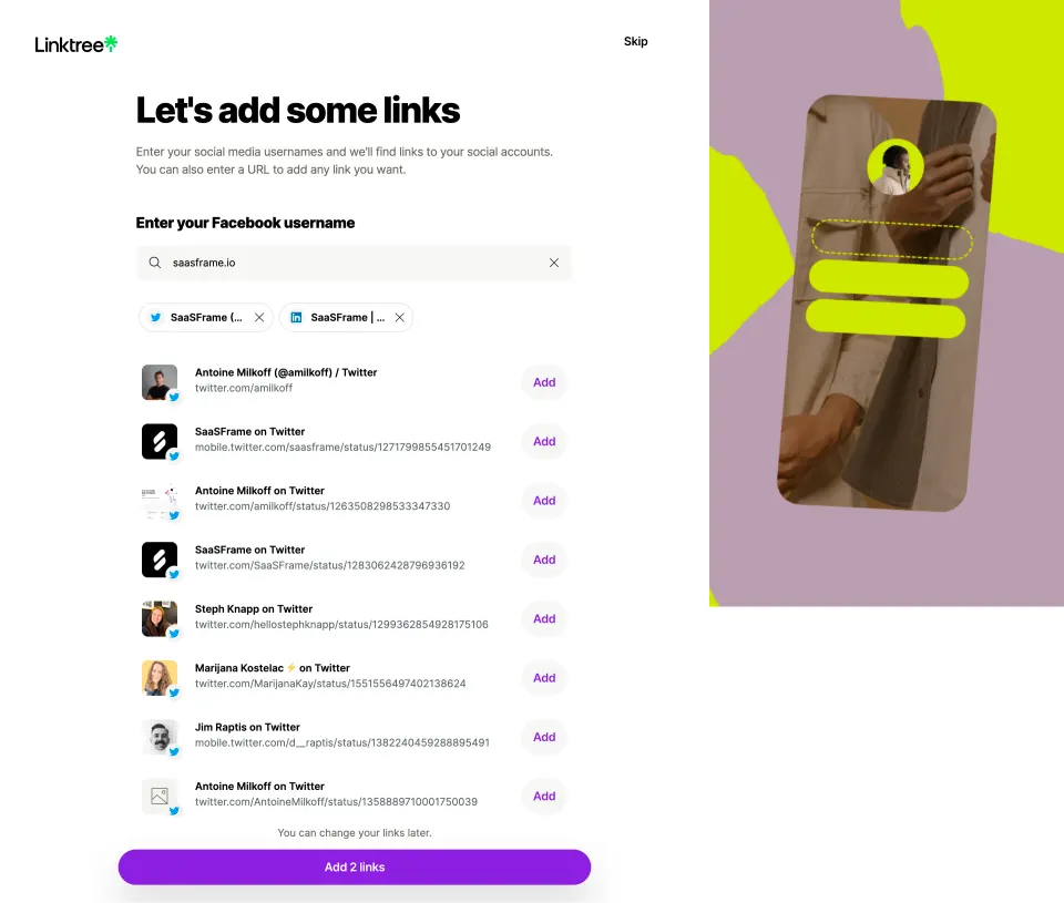
Chips built from long values get truncated, as Linktree's "SaaSFrame (..." shows. Keep the distinguishing part of the value visible, or reveal the full label on hover and focus, so two similar chips can still be told apart.
Handle zero, all and limits explicitly
Decide what an empty selection means. In an onboarding survey, zero answers may be a valid "skip"; in a webhook, zero triggers makes the configuration useless. Say which case applies, either with a disabled action and a reason, or with a clear skip route.
A "Select all" option, as in Bonsai, is useful when people often want everything. It should toggle to "Deselect all" once everything is selected, and it should not appear selected when only some options are. If there is a maximum, state it before people reach it ("Pick up to 3") and show the remaining number.
Make it work with a keyboard and a screen reader
Card and pill selections are often built from styled divs, which lose the semantics of checkboxes. Use real checkboxes, or buttons with aria-pressed, inside a group whose label is the question. Each option needs a visible focus outline and must toggle with Space.
For chip fields, removing a chip from the keyboard should be possible without a mouse, and focus should move to a predictable place afterwards, usually the next chip or the input. Announce changes in the count when the action label depends on it, as with "Add 2 links".
Multi-select review checklist
- Can several answers really be true at once?
- Does a short hint say that more than one option is allowed?
- Is the selected state shown by at least two cues, not color alone?
- Does the shape (rows, pills, chip field) suit the number and length of options?
- Are defaults justified and explained in the interface?
- Is there a route for values outside the shortlist?
- Can every selected value be seen and removed individually?
- Does the main action reflect what will happen with the selection?
- Are zero, all and maximum selections handled on purpose?
- Do options work as checkboxes for keyboard and screen reader users?
Multi-select FAQ
Should a multi-select use checkboxes or chips?
Use checkbox rows or cards when all options fit on screen and people choose once. Use chips in a field when the list is long or searchable and people come back to edit the selection.
Is it fine to pre-select options?
Yes, when the product has a real basis for the guess and says what it is, as Privacyboard does with the tools chosen earlier. Unexplained defaults tend to be accepted without being read.
How do I show many selected values without breaking the layout?
Let the field wrap onto several lines, as Cal.com does, and keep each chip removable. Collapsing values into "+N more" saves space but hides what is actually configured.
Should "Other" be an option?
Include it when your list cannot be exhaustive, and follow it with a text field when the answer matters. Reveal and Arcade both end their lists with Other.
Related patterns
See Checkbox for the underlying control, Tags for chip styling, Combobox and Autocomplete for searchable fields, Filter for multi-selects that narrow a list, and Radio Buttons for exclusive choices.