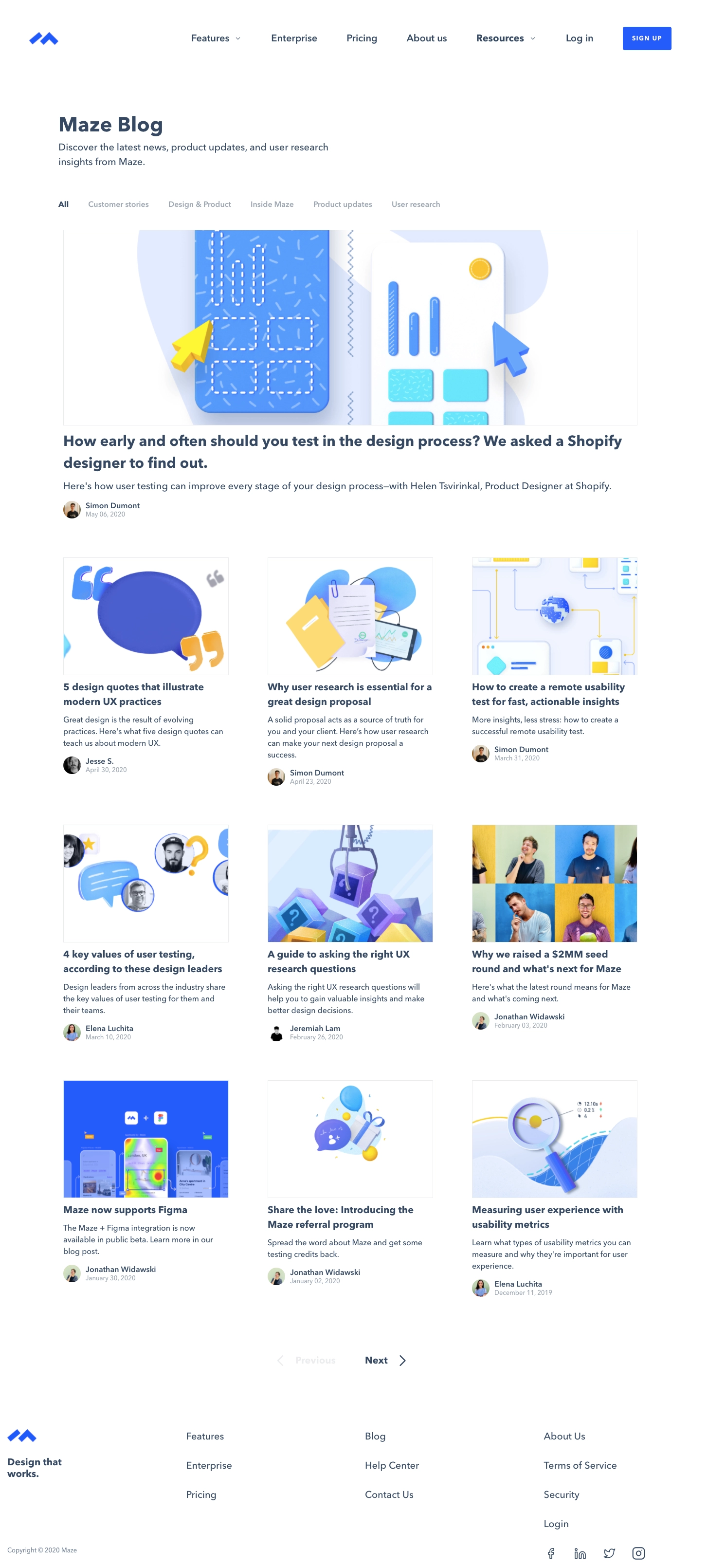
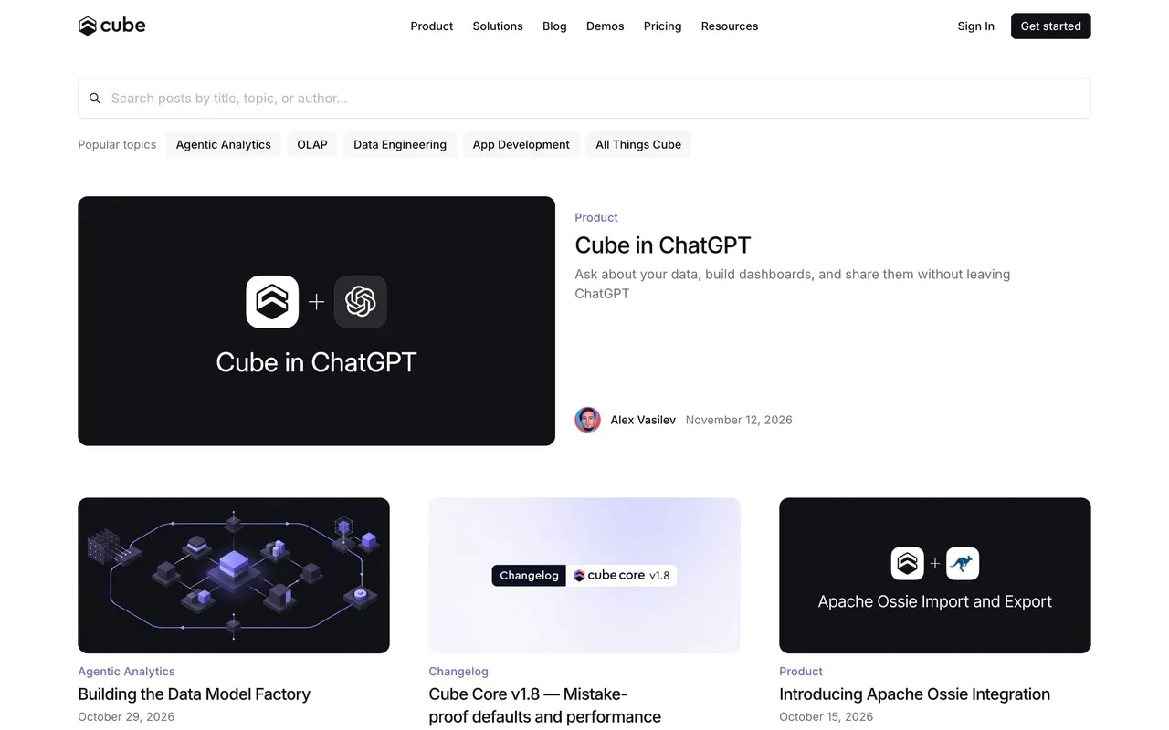
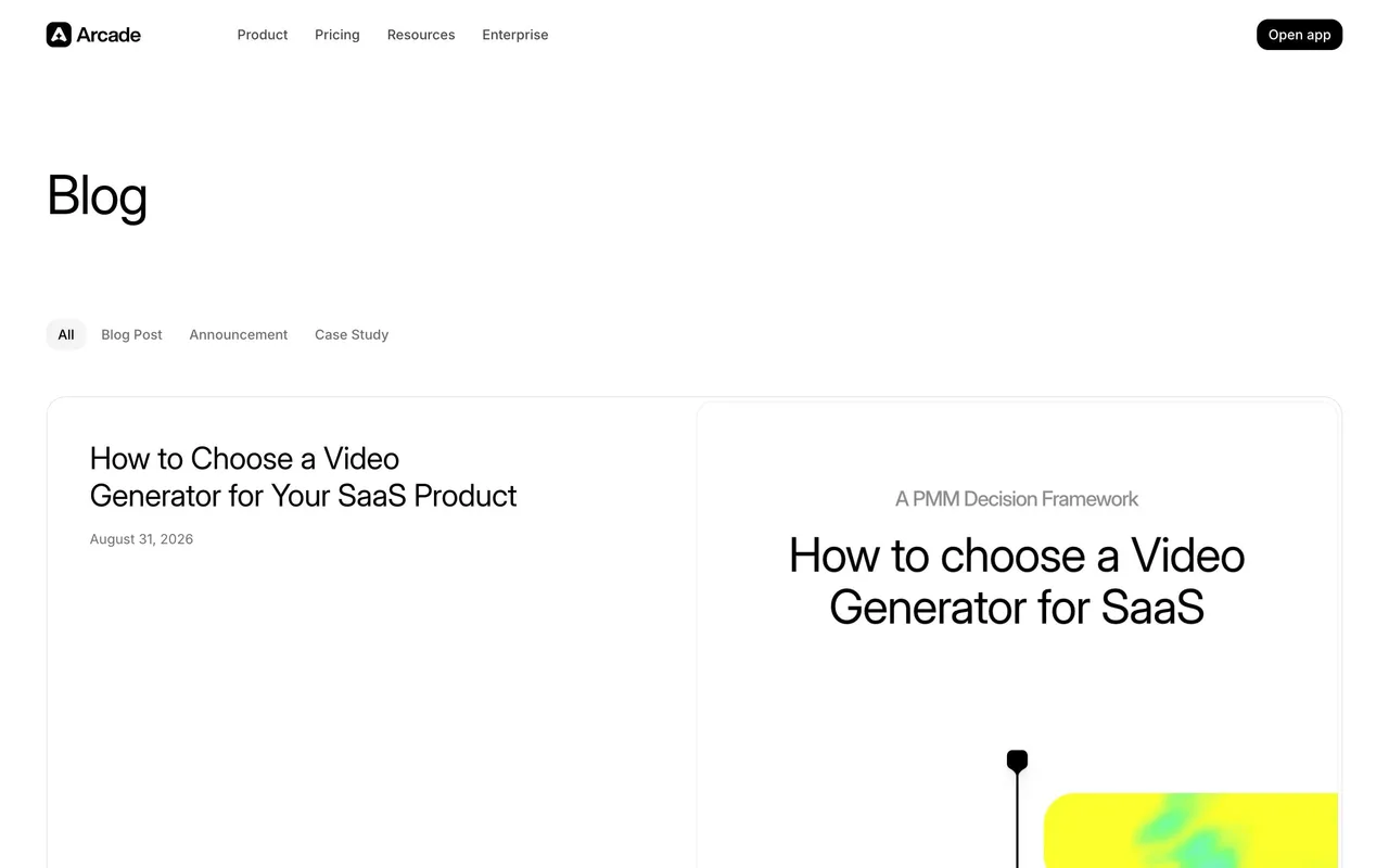
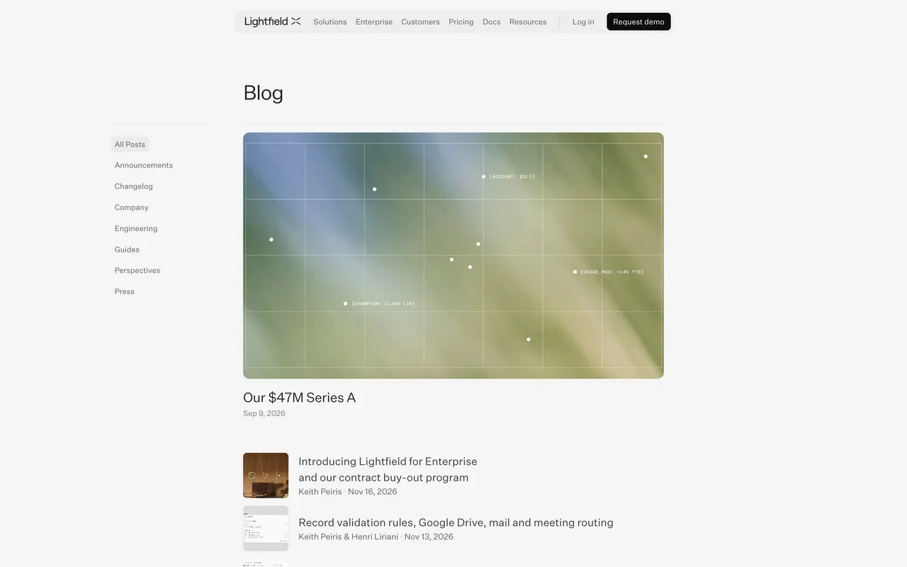
``` Maze’s blog exemplifies a modern, minimalist approach fused with vibrant, playful accents. The layout is meticulously clean, allowing content to breathe. Subtle pops of saturated accent colors and smooth micro-interactions create a fresh, energizing visual language that feels both professional and inviting. ```html
Layout and Structure
``` The page opens with a streamlined hero section highlighting featured articles, guiding readers to what’s trending. Content is organized into intuitively filtered sections, presented as a visually rich grid of blog cards. A sticky, understated navigation bar ensures seamless browsing, while the footer mirrors the minimalist ethos, housing essential links and CTAs in a clutter-free arrangement. ```html
Visual Elements
``` Distinctive icons, geometric illustrations, and custom thumbnail imagery infuse the interface with personality. Hover effects and animated transitions provide satisfying interactivity without overwhelming the user, ensuring a lively and dynamic browsing experience. ```html
Color Palette and Typography
``` A sophisticated mix of whites, off-whites, soft grays, and bold accent colors such as blue and yellow define the palette, spotlighting important elements. Typography is handled with a clear hierarchy—large, bold headlines juxtapose sleek, legible body copy. Modern sans-serif fonts exude accessibility and forward-thinking energy. ```html
User Experience Patterns
``` Navigation is frictionless with persistent search and categorization, while well-placed CTAs invite deeper exploration. Responsive layouts and generous whitespace support easy scanning, and scroll interactions animate elements tastefully as users dig deeper. ```html
Unique and Notable Design Choices
``` Maze sets itself apart with playful graphic motifs—subtle animated elements, geometric overlays, and branded flourishes reinforce a sense of creativity and innovation. The overall tone feels trustworthy and energetic, inviting visitors to both explore and experiment.
 SaaSFrame