Prompt 678 words Copy
# Design from Reference: Humblytics Connect Tracking

Create an original, high-fidelity visual design inspired by the reference. Prioritize composition, typography, colors, spacing, and component styling over technical implementation.

## Reference

- **Product:** Humblytics
- **Category:** Account Setup
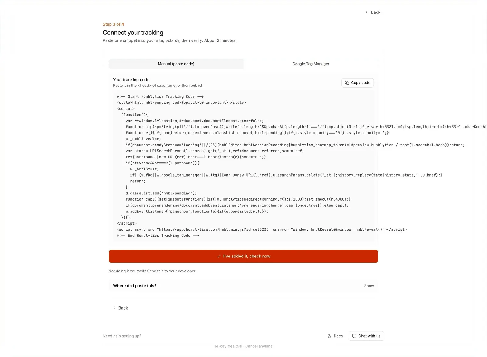
- **Screenshot:** attached to this message (also available at https://media.saasframe.io/v/8d5dfe04d6d96e694ba2-1600.webp)
- **Source:** https://app.humblytics.com/workspace/new

Analyze the attached screenshot first. If no image is attached, open the screenshot link; if neither is accessible, ask for it rather than guessing.

## Visual Design Context

### Brand
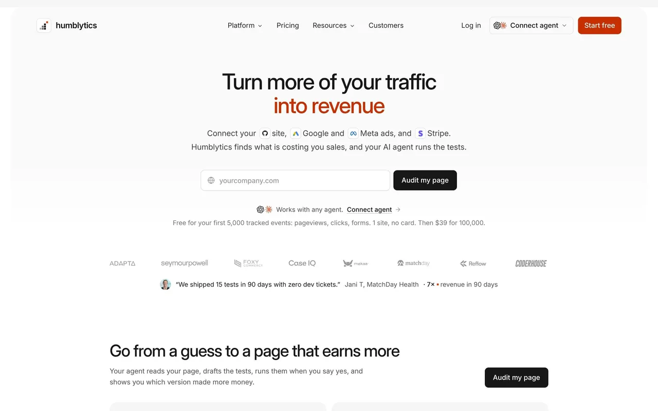
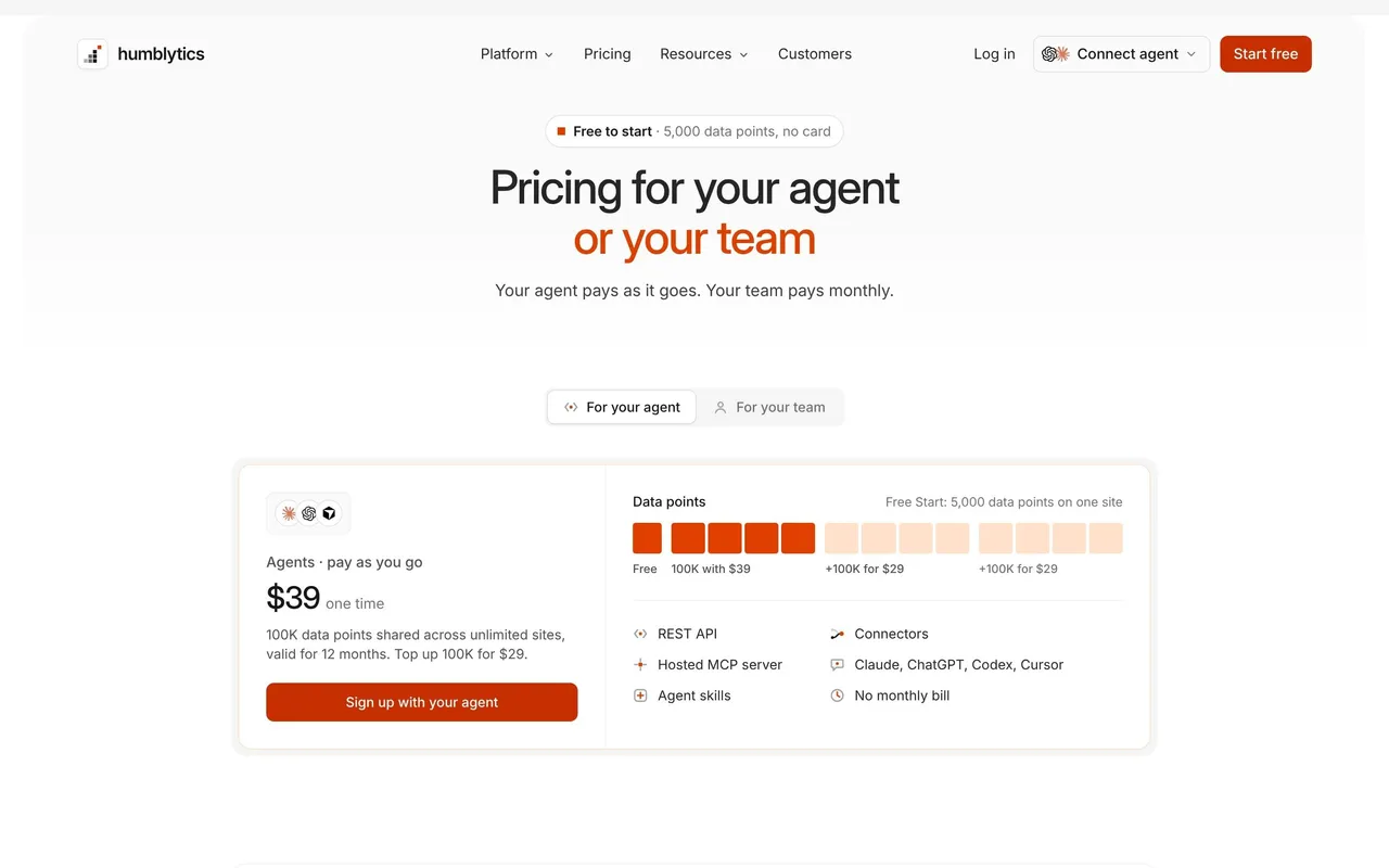
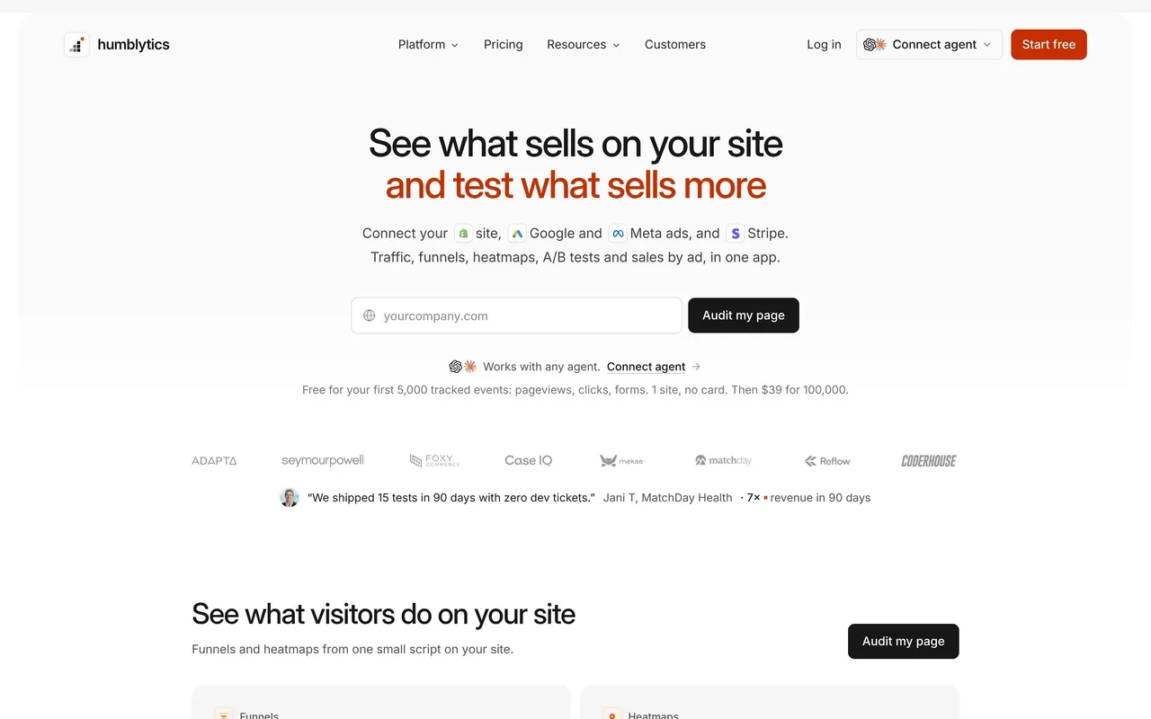
Humblytics (2026): website analytics, A/B testing and ad attribution, now positioned around your AI agent, which reads the data and runs the tests. Minimal, product-led, neutral grays with one orange accent.

### Palette
White and very light grays (#FAFAFA, #F5F5F5, #F4F5F7), near-black #171717 for text and primary buttons, gray body text (#404040, #525252, #737373). Orange is the single accent (logo square, second line of headlines, Start free buttons in the app #FF7A03), with pale peach surfaces (#FFF4ED) behind highlighted cards.

### Typography
Inter everywhere: 48–56px medium headlines with tight negative tracking, often split over two lines with the second in orange; 36px section titles; 17px body with a generous 30px line height; small 11–13px gray captions.

### Components
Black 8px-radius buttons (44px high on the site), outline secondary buttons, light gray cards with 12–16px radius filled with real product fragments (tables, heatmaps, test results), agent prompt boxes with a copy button, plan cards with an orange highlight, FAQ accordions, a dotted bar-chart motif in the footer. The app uses a gray sidebar and white rounded panels.

### Tone
Plain, outcome-led sentences in second person about sales, not metrics ("Turn more of your traffic into revenue", "Test a change, keep the winner"); the agent is addressed directly ("AI agents: read app.humblytics.com/agent.md").

### Overall aesthetic
Technical but friendly install step.

### Page composition
Step label, title, method tabs, code card, full-width verify button, helper links and accordion.

### Typography
Inter 18px medium title, JetBrains Mono for the code, 12px helper text.

### Colors & surfaces
White and #F5F5F5 code block, orange #FF7A03 verify button.

### Components
Tabs, code block with copy button, primary button with check icon, share-with-developer link, accordion.

### Responsive
Code block scrolls horizontally.

### Adaptation guidance
Always offer a way to send the snippet to a developer next to the install code.

## Content

**Instructions:**

Generate realistic example content that fits the selected design reference.

Create appropriate headlines, descriptions, labels, buttons, and supporting copy based on the type of interface being designed.

If a product or business description is provided, use it to guide the content.

Otherwise, invent a plausible fictional SaaS product appropriate for the reference.

Keep the content concise, coherent, and visually balanced.

Do not present fictional statistics, customer names, or testimonials as verified facts.

## Design Direction

**Instructions:**

Use the reference screenshot as the main source of visual inspiration rather than a strict layout template.

Preserve its most distinctive design characteristics, such as typography, visual rhythm, color relationships, component treatments, and overall aesthetic.

Feel free to modify section arrangements, proportions, spacing, and individual components to better suit my content.

Introduce original design decisions where they improve usability, composition, or brand consistency.

The result should clearly reflect the reference's visual language without looking like a direct reproduction.

Follow the visual identity of the reference design.

Use its typography, color palette, component styling, and overall aesthetic as the primary design direction.

Do not introduce an unrelated visual identity.

## Output

**Instructions:**

Generate a high-fidelity visual mockup of the requested interface.

Present the design as a polished, realistic website or product UI screenshot.

Prioritize visual composition, typography, spacing, colors, alignment, and component details.

Use the available image-generation or visual-design capabilities.

Do not replace the mockup with source code, a written design specification, or a textual description.

If direct visual generation is unavailable, clearly explain the limitation.

## Constraints

- Use the actual screenshot as the primary visual reference.
- Preserve essential messaging and factual accuracy.
- Prioritize visual quality and consistency.
- Do not invent unsupported product claims.
- Adapt structure and copy length for visual balance.
Reference image Attach it to your message: assistants can’t open image links. Open in ChatGPT ↗ Open in Claude ↗
Build it in Lovable ↗ v0 ↗ Figma Make ↗
Opening a tool copies the screenshot so you can paste it with your prompt.
 SaaSFrame