Generate a new design based on this screen, using your own content.
Preview the prompt
# Design from Reference: Shortcut Invite Team Members

Create an original, high-fidelity visual design inspired by the reference. Prioritize composition, typography, colors, spacing and component styling over technical implementation.

## Reference

- **Product:** Shortcut
- **Category:** Invite Team Members
- **Screenshot:** https://media.saasframe.io/o/8a2ec5e69a91d84908a1.webp

Analyze the screenshot first. If you can’t access it, ask me for it rather than guessing.

## Content

**Instructions:**

Generate realistic example content that fits the selected design reference.

Create appropriate headlines, descriptions, labels, buttons, and supporting copy based on the type of interface being designed.

If a product or business description is provided, use it to guide the content.

Otherwise, invent a plausible fictional SaaS product appropriate for the reference.

Keep the content concise, coherent, and visually balanced.

Do not present fictional statistics, customer names, or testimonials as verified facts.

Preserve essential messaging and factual accuracy. Adapt structure and copy length for visual balance; never invent product claims.

## Visual design

Use this context to reproduce the reference’s visual language: layout, typography, colors, spacing, borders, radii and distinctive elements. The screenshot takes priority if descriptions conflict.

### Overall aesthetic

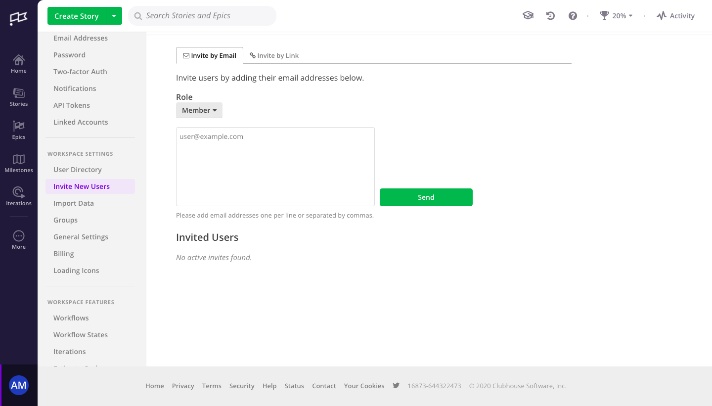
- **Style:** A utilitarian team-invitation settings page with dark global rail, pale settings navigation, and a sparse white form workspace.
- **Character:** Compact and functional, using green actions and conventional tabbed settings.

### Page composition

- **Capture and scale:** 1440 × 821 screenshot pixels. Following sizes are approximate screenshot pixels; CSS scale is unverified.
- **Shell:** A roughly 75 px dark icon rail sits beside a roughly 220 px settings sidebar. The top toolbar includes Create Story, search, and utility icons.
- **Main content:** Invite by Email and Invite by Link tabs precede instruction, role selector, multiline email field, and green Send action. An Invited Users heading/rule and empty message follow.
- **Footer:** A pale bottom bar contains legal/help links and copyright.

### Information hierarchy

- **Task:** The selected email tab and instruction introduce the invitation workflow.
- **Role/input:** A compact Member selector precedes the email entry; helper text explains one-per-line or comma separation.
- **Status:** The invited-users section explicitly shows no active invitations.

### Typography

- **Family:** Neutral sans serif; exact identity unverified.
- **Roles:** Main text and navigation about 14–16 px, section heading roughly 20 px medium, helper 13 px.
- **States:** Selected settings text is violet; empty-list copy is muted italic.

### Colors & surfaces

- **Foundation:** Sampled sRGB #FFFFFF defines main content, #F3F3F3/#EEEEEE side/footer surfaces.
- **Rail:** Sampled #1D1D39 and #111122 define dark navigation.
- **Actions:** Sampled green #59AF4A fills Send/Create Story; #EDE7F9 supports the selected settings row.

### Components

- **Tabs:** Small bordered tabs connect to a thin horizontal baseline.
- **Email field:** A roughly 400 × 160 px white textarea has a fine gray border and small radius. Send sits to its right near the bottom.
- **Role:** A small gray dropdown is directly beneath its bold label.
- **Navigation:** Icon-led global links and grouped settings rows use compact spacing, separators, and a pale-violet active row.

### Visual rhythm

- **Spacing:** Keep form controls grouped near the upper-left content edge, with generous unused space below.
- **Alignment:** Instruction, role, textarea, helper, and invited-users heading share one left edge.

### Responsive

- **Observed state:** Desktop only.
- **Recommended reflow:** Collapse navigation rails and place Send below a fluid textarea. Keep role and invitation method visible before entry.

### Adaptation guidance

- **Preserve:** Retain the clear email/link modes, role-first workflow, simple bulk entry, and explicit empty invitation list.
- **Adapt:** Use actual roles and supported invitation methods.
- **Avoid:** Do not infer sent invites or copy account identity and legacy footer details.

## Direction

**Instructions:**

Use the reference screenshot as the main source of visual inspiration rather than a strict layout template.

Preserve its most distinctive design characteristics, such as typography, visual rhythm, color relationships, component treatments, and overall aesthetic.

Feel free to modify section arrangements, proportions, spacing, and individual components to better suit my content.

Introduce original design decisions where they improve usability, composition, or brand consistency.

The result should clearly reflect the reference's visual language without looking like a direct reproduction.

## Output

**Instructions:**

Generate a high-fidelity visual mockup of the requested interface.

Present the design as a polished, realistic website or product UI screenshot.

Prioritize visual composition, typography, spacing, colors, alignment, and component details.

Use the available image-generation or visual-design capabilities.

Do not replace the mockup with source code, a written design specification, or a textual description.

If direct visual generation is unavailable, clearly explain the limitation.

Deliver a polished, cohesive design with precise alignment, hierarchy and spacing. Produce the requested visual artifact, not just a description. If unsupported, explain the limitation.
 SaaSFrame