 SaaSFrame
Prompt Suggestions
Suggested prompts or starter questions shown next to an AI chat input.



Index of all 5 Prompt Suggestions examples
Prompt Suggestions: design guide
Short answer
Prompt suggestions are ready-made questions shown next to an AI chat input, either as starters on an empty chat or as follow-ups after an answer. Write them from the person's real tools and data, keep them few and specific, only suggest what the product can actually do and make clear whether a click sends or fills the prompt.
In the libraryas of November 2026
- Examples
- 5
- SaaS products
- 5
- Last added
- Nov 2026
Most common inChat 4Account Setup 1Empty State 1User Onboarding 1
Prompt suggestions are short, ready-made requests placed near an AI chat input. On an empty chat they show what the assistant can do and how to phrase a request. After an answer they offer likely next steps. In both cases they turn a blank text field into a set of concrete starting points.
The captured examples include starter cards in Tines and Unabyss, compact starters in Caveman, follow-up chips after an answer in Lightdash and a full prefilled prompt at the end of Rox's onboarding. The common thread is that the best suggestions are specific to the person's context rather than generic demos of an AI model.
What are prompt suggestions for?
They solve two problems of an empty chat: people do not know what the assistant can access, and they do not know how detailed a request should be. A good suggestion answers both at once. It names a real data source or capability and shows a request at the right level of precision.
Suggestions are not a menu of features. If a suggestion reads like a product tagline, such as Boost your productivity with AI, it teaches nothing. Write them as requests a user would actually type.
Write suggestions from the person's real tools and data
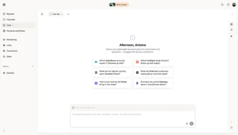
Tines greets the person by name and describes Chat as a lightweight personal space plugged into all their connectors. Below, six cards each pair an app logo with a question: Which Salesforce accounts haven't I followed up with?, How much revenue did Stripe bring in this week?, Are there any active Datadog alerts I should know about? The app names are in bold.
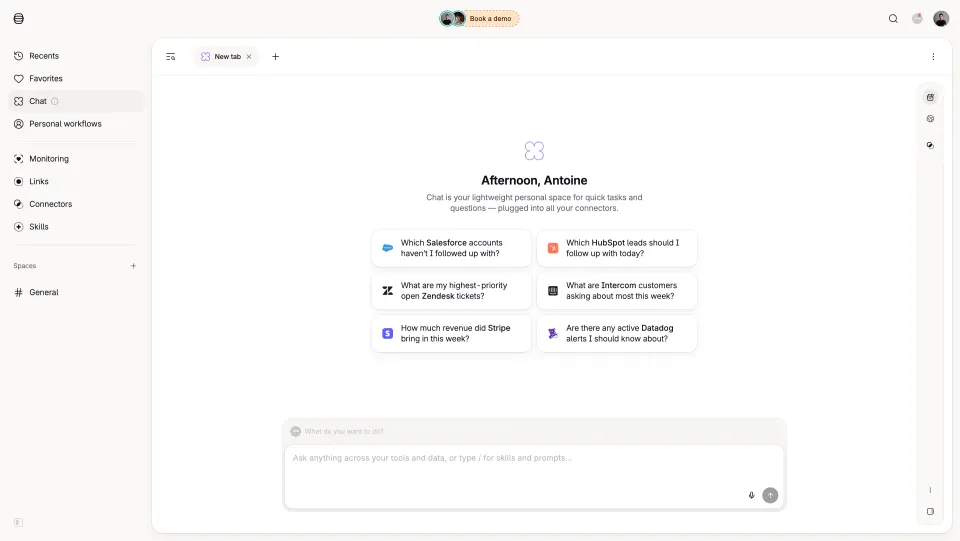
The logos and bold names do two jobs: they make the cards easy to scan, and they show which connections the assistant can use. When suggestions are generated from connected tools, a person with different connectors sees different cards, which is far more useful than a fixed list.
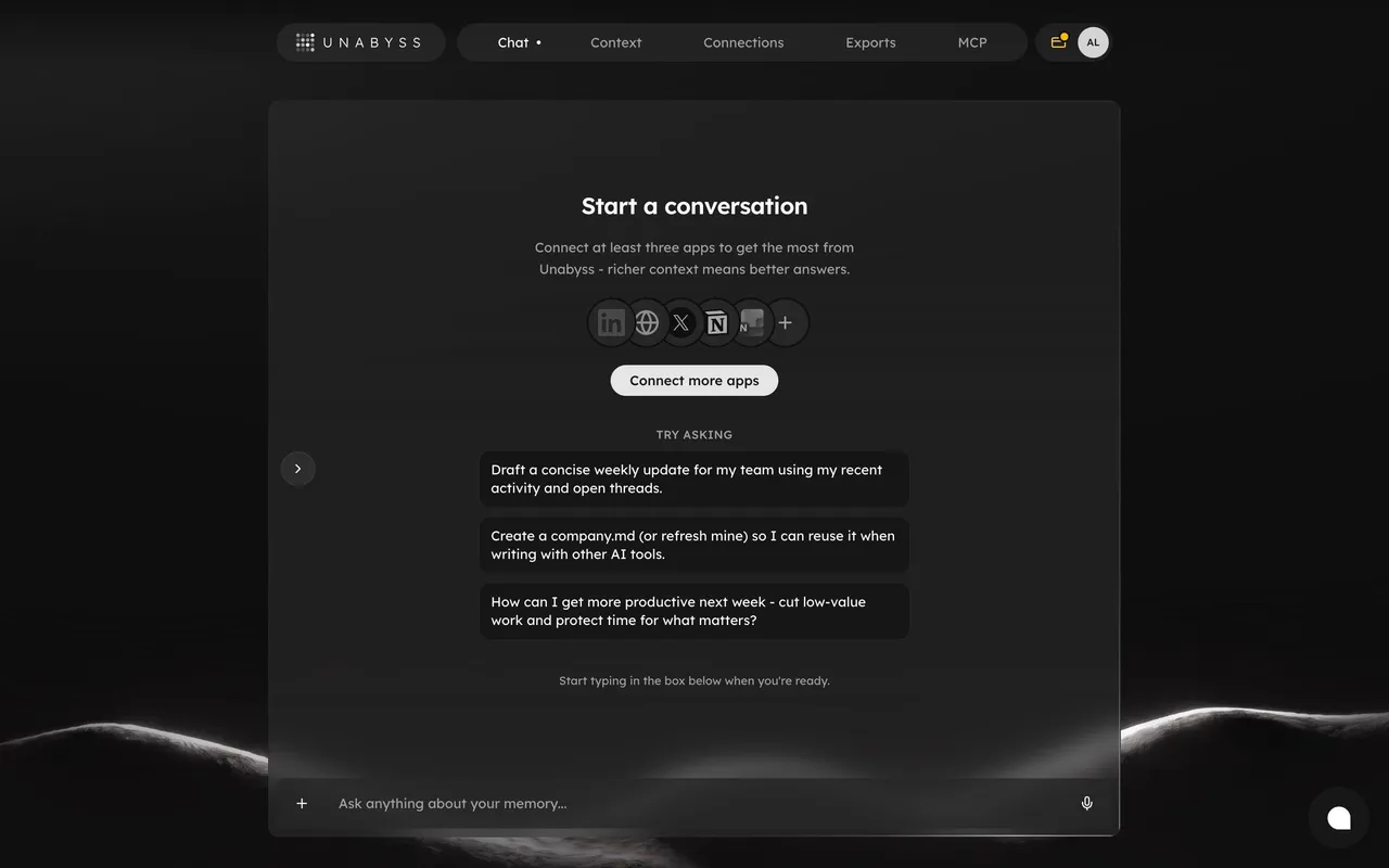
Unabyss tailors its suggestions to the person's context as well. Under a Try asking heading, three cards offer to draft a concise weekly update from recent activity and open threads, create or refresh a company.md for use in other AI tools, and plan a more productive week.
Connect suggestions to missing context
Suggestions can only be as good as the data behind them. When context is thin, say so and offer a way to improve it. Above its suggestions, Unabyss shows Start a conversation, a line explaining that connecting at least three apps gives better answers, a row of connected app icons and a Connect more apps button. Below, a quiet line says Start typing in the box below when you're ready.
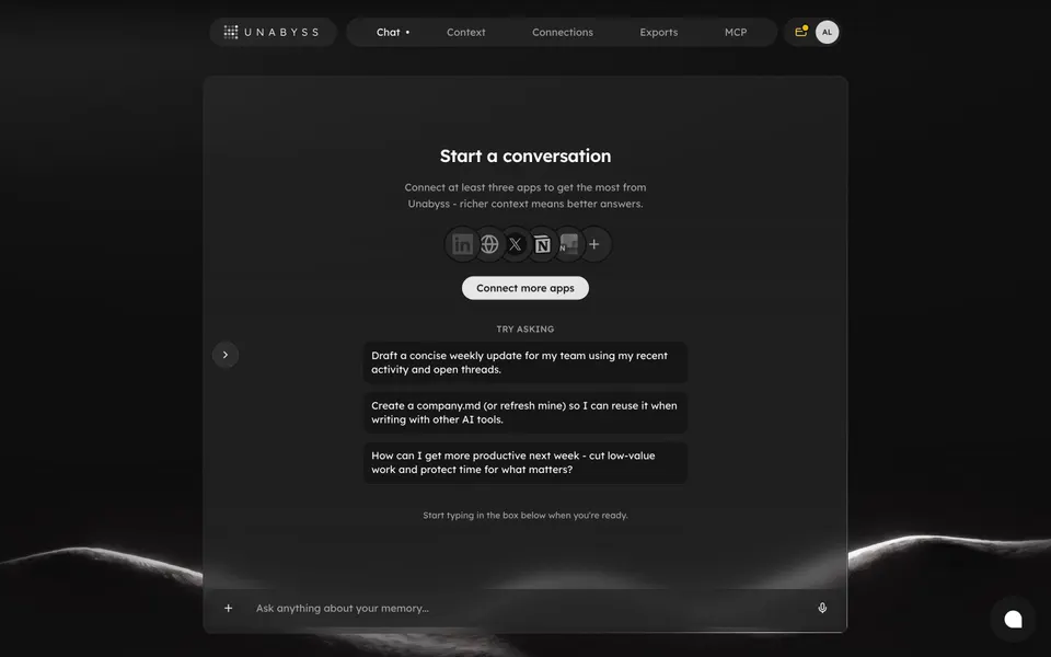
This order matters. The suggestions remain usable straight away, while the connection prompt explains how to get more out of them. Blocking the chat until every connector is set up would delay the first useful answer.
How many suggestions should you show?
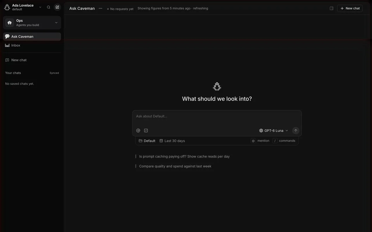
Enough to show range, few enough to read in a glance. Caveman shows two, Unabyss three, Tines six arranged in a two-column grid. Two or three work well when they are long and specific; six works when each card is short and anchored by a logo.
Caveman's two suggestions are plain text lines with a thin left rule, under a centered question, What should we look into?: Is prompt caching paying off? Show cache reads per day, and Compare quality and spend against last week. They sit just below the composer, whose context chips set the project and a Last 30 days range.
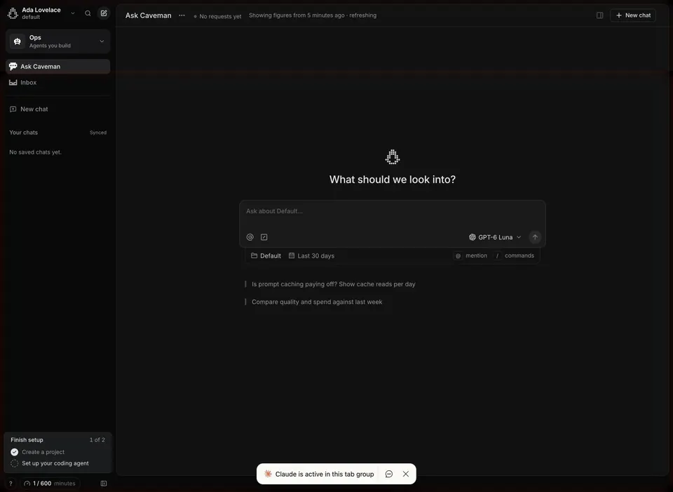
Placing suggestions next to scope controls tells people that the questions will run against the selected project and period. If the scope changes, the suggestions should still make sense, or be regenerated.
Offer follow-ups after an answer
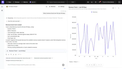
Starter prompts help on an empty chat; follow-ups help keep the analysis moving. Lightdash's analyst builds a revenue trend chart, explains its choices and notes that it could not segment by plan because the explore does not expose a plan field. Under the answer and its feedback icons, three chips offer Add order volume and average order value to the chart, Break down revenue by partner name and Compare revenue by browser type, each with a small arrow.
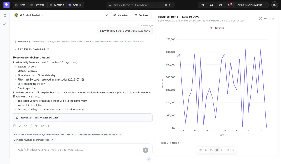
Good follow-ups build on the answer just given and stay within what the data supports. Lightdash's answer states a limitation and the chips do not suggest the breakdown it said was unavailable. Suggesting a request the assistant has just said it cannot fulfil is a quick way to lose trust.
Should a suggestion send the prompt or fill the input?
Both are valid, but the choice should be obvious. Sending immediately suits short questions that need no editing. Filling the input suits long or parameterised prompts that people should review first.
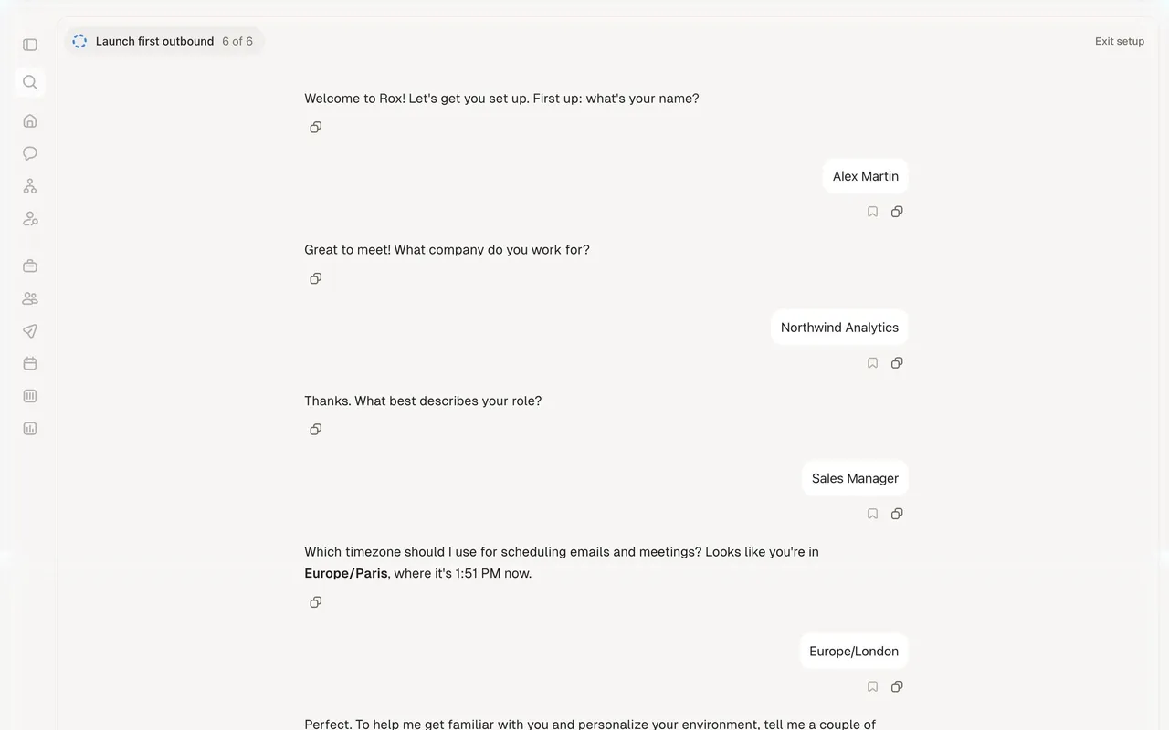
Rox ends its onboarding, labelled Launch first outbound 6 of 6, with a conversation in which the assistant asks Who should I target, and what should I say? The composer is already filled with a suggested multi-step prompt: prospect into the accounts named earlier, then five numbered steps from looking up domains to setting up an outbound agent. The composer header reads Tab to use suggestion.
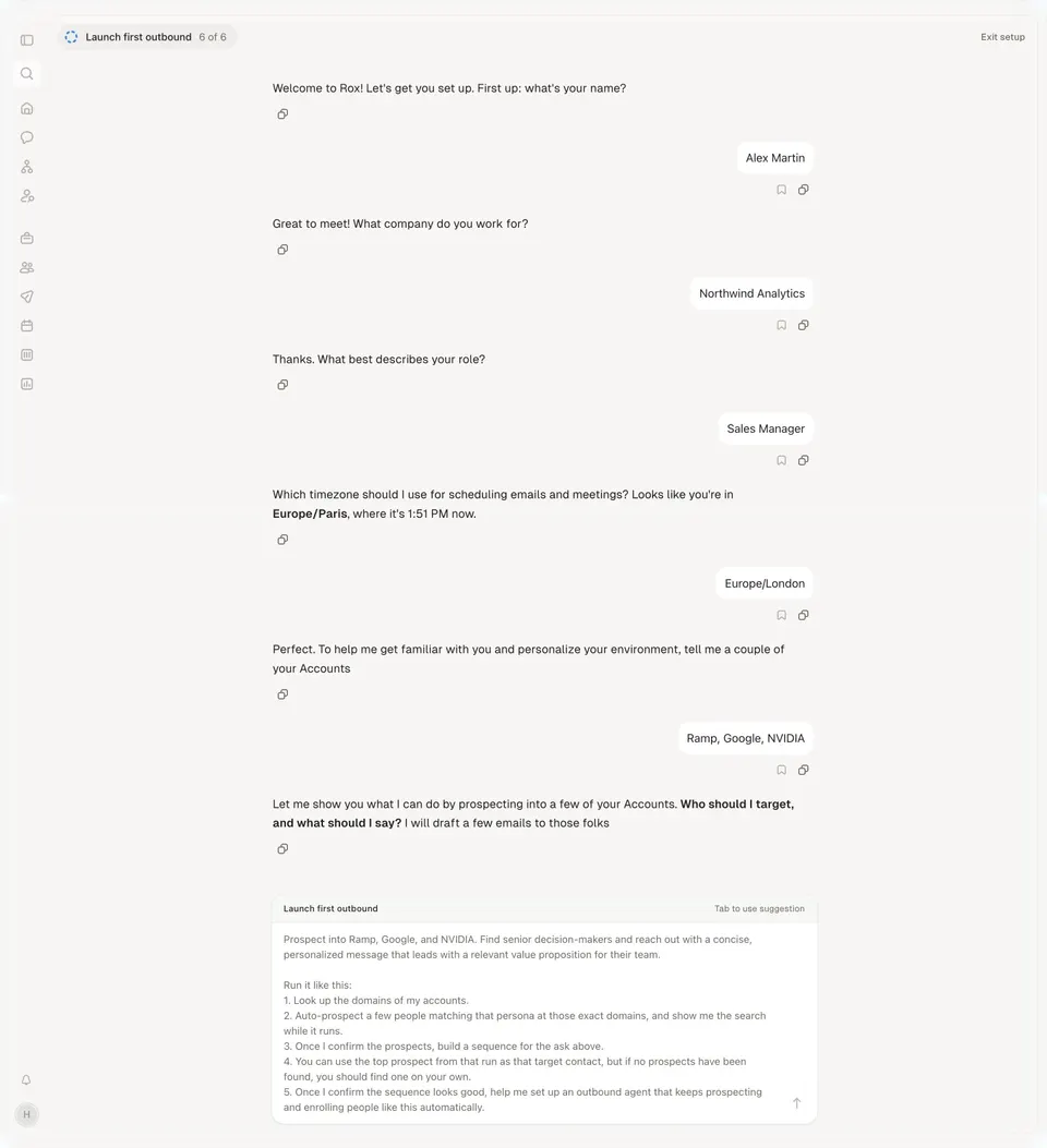
A long prefilled prompt does more than save typing. It shows how to brief the agent: the goal, the order of steps and the points where the agent should wait for confirmation. People can accept it with one key or edit it before sending.
Keep suggestions out of the way once people type
Suggestions are scaffolding. When people start typing, they can fade or move aside so the composer stays the focus. After the first message, starter cards should usually disappear and give way to follow-ups that fit the conversation. Avoid repeating the same starters under every answer.
Rotate or refresh suggestions based on use. Suggestions that nobody clicks, or that lead to poor answers, should be replaced.
Make suggestions accessible
Each suggestion should be a button whose accessible name is the full prompt text, not a truncated label. If a click sends the message, the button should say so for assistive technology; if it fills the input, move focus to the composer with the text selected or the cursor at the end. Logos are decorative when the app name is already in the text. Keep suggestions in a logical reading order after the heading and before or after the composer, consistently.
Prompt suggestions review checklist
- Does each suggestion read like a request a user would type?
- Do suggestions reference the person's real tools, data or context?
- Do they show range without overwhelming the empty state?
- Do they only propose what the assistant can actually do?
- When context is missing, is there a way to add it without blocking the chat?
- Do follow-ups build on the last answer?
- Is it clear whether a click sends or fills the prompt?
- Can long suggestions be reviewed and edited before sending?
- Do starters disappear once the conversation begins?
- Are suggestions buttons with full accessible names and sensible focus behaviour?
Prompt suggestions FAQ
Should prompt suggestions be static or generated?
Static suggestions are fine for a first version. Generated suggestions based on connected tools, recent activity or the last answer are more useful, as long as each one is something the assistant can complete.
Where should suggestions sit relative to the input?
Starter suggestions usually sit between the heading and the composer, or just below it. Follow-ups sit under the latest answer, above the composer.
Should clicking a suggestion send it immediately?
For short, complete questions, yes. For long prompts or ones with parameters, fill the composer so people can edit first, and say how to accept it.
How many prompt suggestions should an empty chat show?
Usually two to six. Fewer, longer suggestions suit specific tasks; more, shorter cards suit assistants connected to many tools.
Related patterns
See Prompt Input for the composer itself, AI Chat for the conversation that follows, Empty State for first-use screens, Third-Party Connection for adding the context that improves suggestions and Onboarding Checklist for guiding first actions outside the chat.