 SaaSFrame
Form Validation
Inline error messages, field states and requirement checklists that guide form input.



Index of all 5 Form Validation examples
Form Validation: design guide
Short answer
Form validation tells people which field needs attention and how to fix it. Show rules before input, validate when a field loses focus or on submit rather than on every keystroke, put a specific message next to the field with an icon as well as red, keep the input, and summarize errors on long forms.
In the libraryas of November 2026
- Examples
- 5
- SaaS products
- 5
- Last added
- Nov 2023
Most common inSign Up 2Account Setup 1Add & Edit 1
Form validation is the feedback a form gives when input is missing or does not match what the product expects: a red outline, a message under the field, a requirement hint, a summary at the bottom of the form. Done well, it prevents the error before it happens and makes the fix obvious when it does.
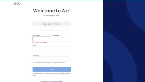
The captured examples cover the common cases: a required field left empty in Air and Zeda.io, a malformed email in Attio, a wallet address rejected by Copperx, and a long Remote form with both an inline error and a summary banner. They show the field states clearly, and also a few wording choices worth avoiding.
What should a validation message say?
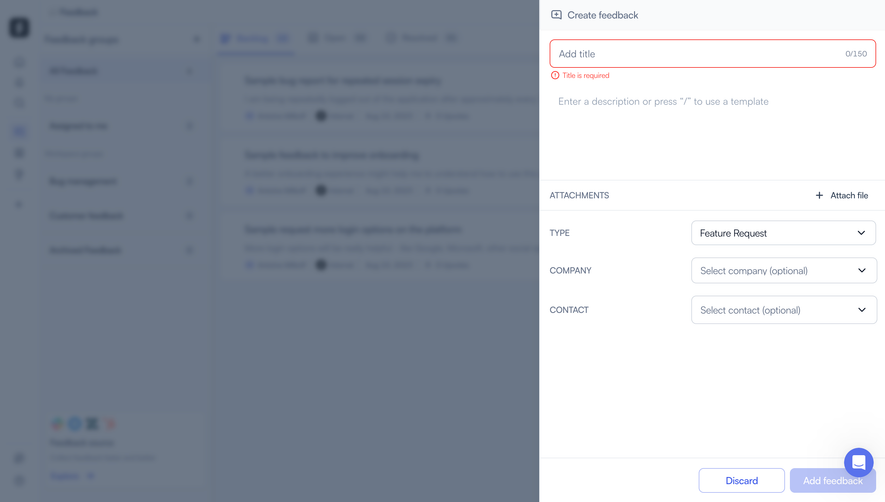
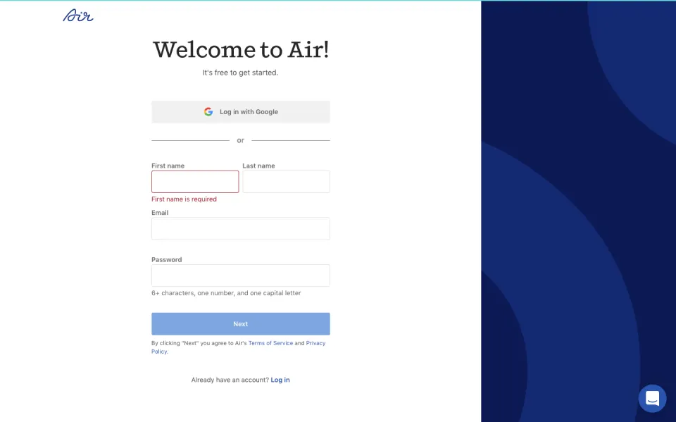
It should name the problem in terms of the field and, when the fix is not obvious, say how to fix it. "First name is required" in Air and "Title is required" in Zeda.io are good for empty fields because the fix is self-evident. For format errors the message needs more: what format is expected, or an example.
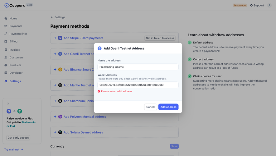
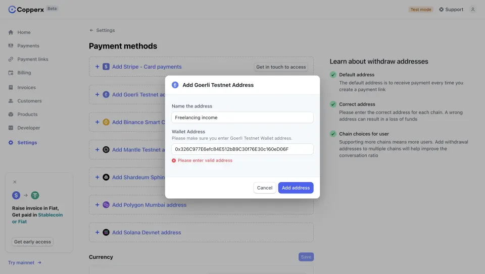
Copperx's "Please enter valid address" tells people something is wrong but not what. The hint above the field ("Please make sure you enter Goerli Testnet Wallet address.") carries the real instruction. Repeating it in the error, for example "This is not a Goerli Testnet address", would let people fix the input without reading the form twice.
Match the message to the actual state
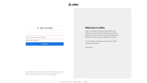
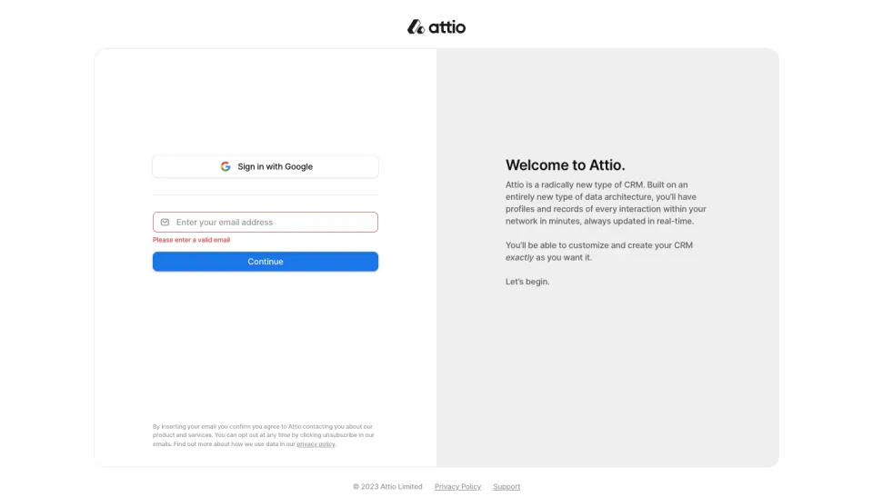
Attio's sign-up card shows an empty email field outlined in red with "Please enter a valid email". The field still displays its placeholder, so the problem is that nothing was entered, not that the format is wrong. Two messages, one for empty and one for malformed, cost little and avoid telling people they made a mistake they did not make.
Show the rules before people type
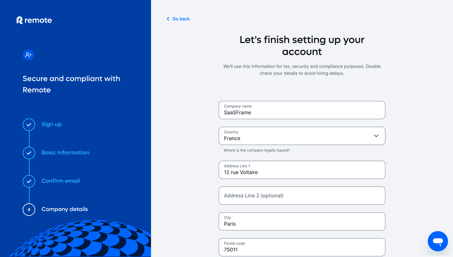
The cheapest error is the one that never happens. Air prints the password rules under the field before any input: "6+ characters, one number, and one capital letter". Remote adds helper text under several fields ("Where is the company legally based?", "We'll only use this if we were unable to reach you by email.").
For rules with several parts, a requirement list that ticks off each rule as it is met works better than a single message that appears after submit. Keep the same wording in the hint and in the error, so people recognize the rule they missed.
When should validation fire?
Validate a field when it loses focus or when the form is submitted, not on every keystroke. Showing "invalid email" after the first letter punishes people for typing. The exception is a live requirement list, where progress toward the rule is helpful rather than accusatory.
Once a field has shown an error, re-check it as people type and clear the error the moment the input becomes valid. Waiting for the next submit to remove a message that no longer applies makes the form feel broken.
Should the submit button be disabled?
In the Air and Zeda.io captures, the main button is dimmed while required fields are empty. That prevents empty submissions, but a disabled button gives no reason, and people may not see which field blocks them. Zeda.io pairs the disabled "Add feedback" button with a visible "Title is required" message, which answers the question.
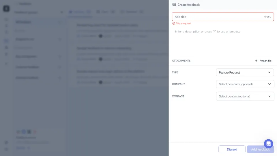
The alternative, used by Copperx and Remote, keeps the button active and validates on click. It lets people discover all errors at once and works better with screen readers, as long as the errors are then clearly shown. If you disable the button, make sure the reason is visible on screen.
Design the field states
An invalid field usually changes in three places: the border, the message under it, and sometimes the label. Remote turns the whole registration number field red, including its label, and starts the message with "Required field" before the explanation. Zeda.io and Copperx add an icon in front of the message.
- Use an icon or a text prefix alongside red, so the state is readable without color.
- Keep the message directly under the field it describes, not in a tooltip that disappears.
- Do not clear the input. Copperx keeps the pasted address so people can correct one character instead of pasting again.
- Reserve space for messages, or accept the layout shift, but never let a message cover the next field.
How should long forms report errors?
On a long form, the field with the error may be off screen when people press submit. Remote handles this with two layers: the field itself is marked, and a banner above the submit button says "Invalid data. Please check the form. The field Your company's registration number is invalid." The field name is a link to the field.
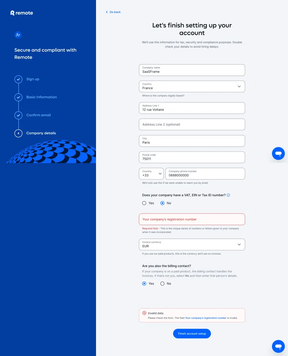
A summary should list every invalid field, link to each one, and move focus to itself or to the first error after submit. Remote's banner uses "invalid" for a field whose inline message says "Required field"; using the same word in both places is clearer.
Explain why strict fields are strict
Some validations protect people from real loss. Copperx's side panel explains that "a wrong address can result in a loss of funds", which justifies a strict check on the wallet field. Remote's intro says the data is used "for tax, security and compliance purposes". When a rule seems fussy, one line of context makes the error feel like protection rather than bureaucracy.
Validate on the server too, and show its errors the same way
Client-side checks catch formats; only the server knows whether an email is already registered or an address is accepted. Return server errors attached to the field they concern and render them with the same component as client errors. A generic toast saying "Something went wrong" after a careful inline system undoes its value.
Make errors accessible
Mark invalid fields with aria-invalid and connect the message with aria-describedby, so screen readers announce it with the field. Keep hints connected the same way. After a failed submit, move focus to the summary or the first invalid field, and announce how many fields need attention.
Form validation review checklist
- Are the rules visible before people type?
- Does each message name the field and the fix?
- Do empty and malformed inputs get different messages?
- Does validation wait for blur or submit, then clear as soon as input is valid?
- Is the error state readable without color?
- Is the input kept after an error?
- If the submit button is disabled, is the reason visible?
- Do long forms have a summary that links to each invalid field?
- Are server errors shown on the right field with the same style?
- Are messages connected to fields for assistive technology?
Form validation FAQ
Should I validate inline or on submit?
Both. Check each field when it loses focus, re-check it live once it has an error, and run the full check on submit for anything people skipped.
Where should the error message go?
Directly under the field, as in every captured example. Add a summary near the submit button when the form is long enough for errors to be off screen.
Is a red border enough?
No. Pair it with a text message and an icon or prefix, so the state is clear without color and people know what to change.
Should I disable the submit button until the form is valid?
It can work for short forms if the blocking field is visibly marked. For longer forms, keep the button active and show all errors on click.
Related patterns
See Text Input for field anatomy, Error State for page-level failures, Sign Up and Contact Form for common validated forms, Alert for summary banners and Wizard for multi-step forms.