 SaaSFrame
Coupon Code
A field to enter a promo, discount or coupon code during checkout or plan selection.



Coupon Code: design guide
Short answer
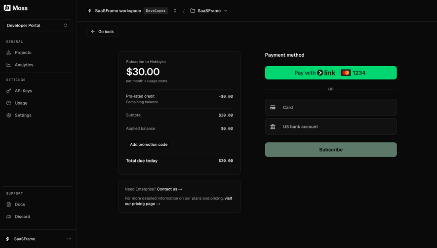
A coupon code field lets buyers enter a promo or discount code at checkout or sign-up. Keep it behind a discreet link unless most buyers have a code, place it next to the total it changes, show the original price, discount and new total with its duration, and explain clearly why a code fails.
In the libraryas of November 2026
- Examples
- 12
- SaaS products
- 11
- Last added
- Oct 2026
Most common inCheckout 8Account Setup 1Add & Edit 1Plans 1Sign Up 1
A coupon code field lets someone enter a promo, discount or referral code while choosing a plan or paying. It is a small control with an outsized effect: shown too prominently, it sends people who have no code off to search for one; hidden too well, it frustrates those who were promised a discount.
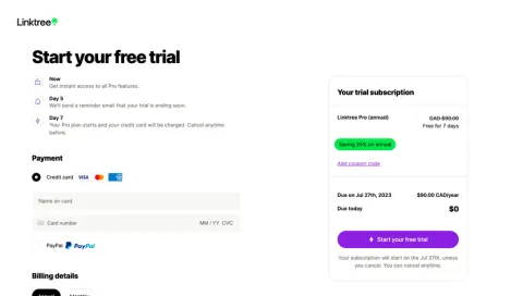
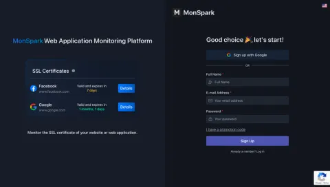
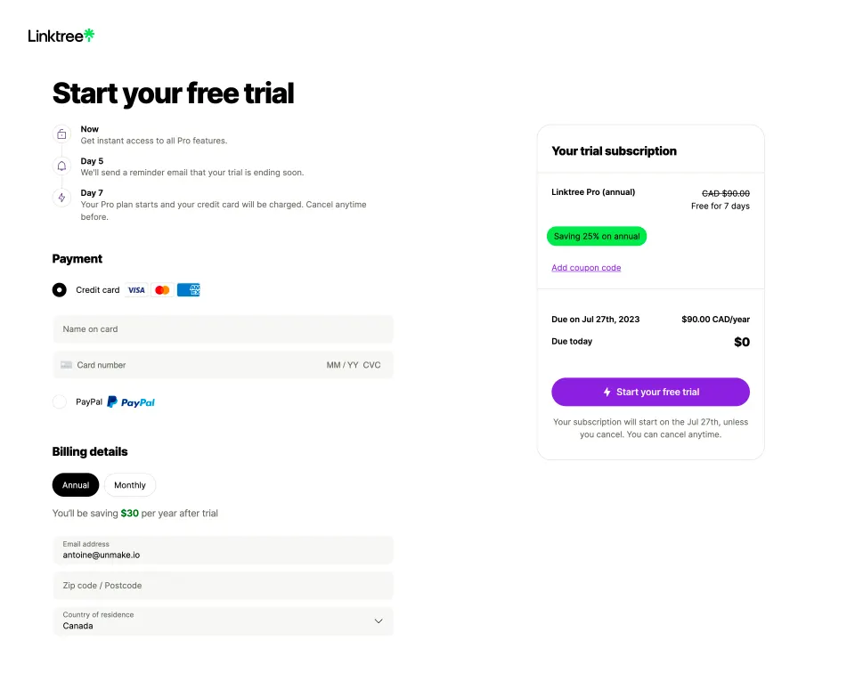
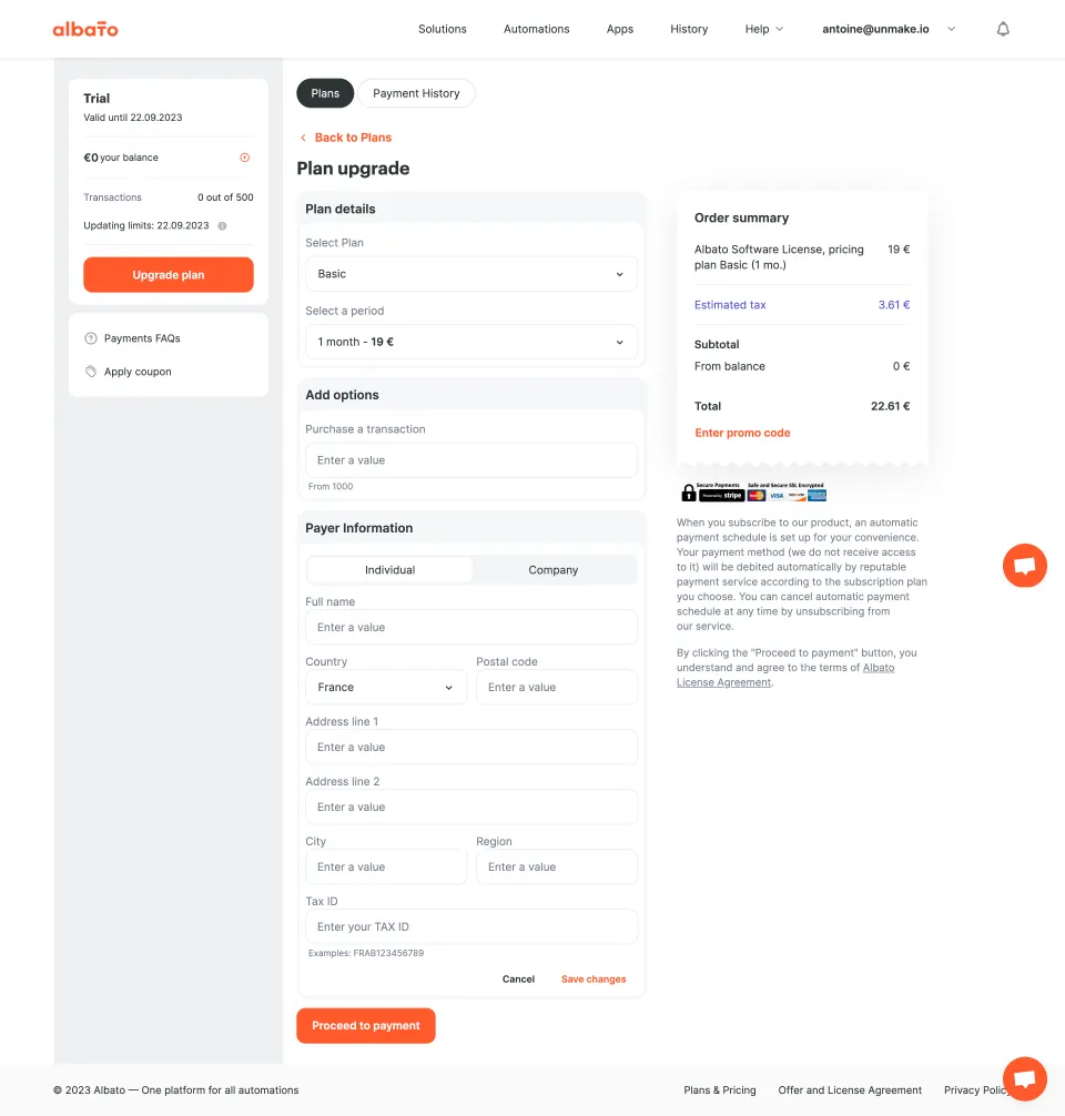
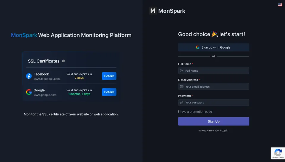
Most of the captured checkouts resolve this the same way. Maze, Miro, Hypercontext, Linktree, Albato and MonSpark all keep the field collapsed behind a link, while Reply shows an open Discount Code input with an Apply button. The sections below cover when each approach fits and what happens after the code is entered.
Should the coupon field be visible or behind a link?
Behind a link, in most self-serve checkouts. A text link such as “I have a coupon” or “Have a promo code?” is easy to find for someone holding a code and easy to ignore for everyone else. An empty open field with an Apply button suggests that a discount exists and that paying full price is the uninformed choice.
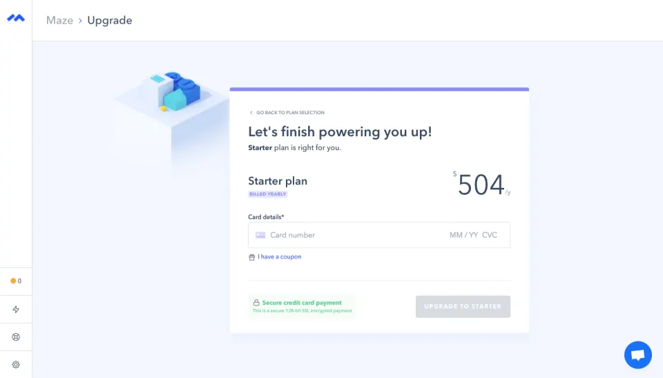
Maze places “I have a coupon” directly under the card details, with a small ticket icon. The link is close to the payment field, so someone looking for it before paying finds it, but it does not compete with the plan name and price at the top of the card.
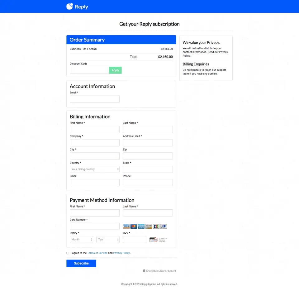
An open field makes sense when most buyers arrive with a code: a partner program, an education discount, a sales-negotiated deal or a hosted checkout used mainly for invoiced plans. Reply’s hosted checkout shows the Discount Code input inside the order summary, directly under the total, with an Apply button.
Where should the field go?
Put it next to the amount it changes. The person entering a code wants to see the total update, so the field belongs in or right below the order summary, not at the bottom of a long billing form. Linktree and Albato both place the link inside the summary card on the right, next to the plan line and above the total.
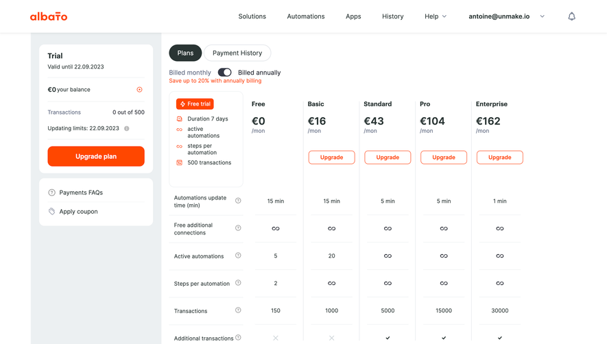
Albato shows the same idea in a two-step upgrade: an “Enter promo code” link in orange closes the order summary, under a total that already includes estimated tax. The sidebar also offers an “Apply coupon” link on the plan page, so a code can be redeemed before the checkout starts.
If the field appears before payment, for example at sign-up, keep it optional and quiet. MonSpark’s sign-up form has an underlined “I have a promotion code” link between the password field and the Sign Up button. Someone who received a code with an invitation can use it from the first step, and everyone else can ignore it.
What should happen once a code is applied?
Show the result in the price, not only in a message. The person should see the original amount, the discount and the new total, with the discount described in words: how much, on what, and for how long.
Hypercontext’s order summary does this clearly. The total payment of $4.25 is shown in the accent color with $5.00 struck through, and a tinted note reads “Additional 15% off your 1st payment applied.” The duration of the discount, first payment only, is stated next to the price.
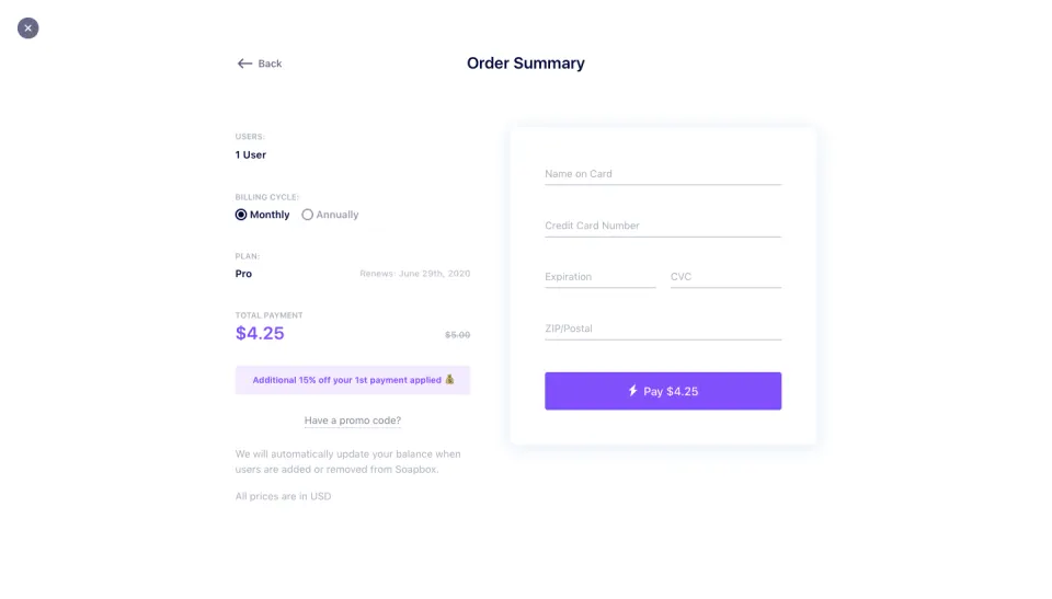
Spell out the duration whenever a discount does not last forever. “15% off your first payment”, “50% off for 3 months” or “25% off every year” lead to very different renewal amounts. Hiding the duration means the person discovers it on the next invoice.
Let people remove a code they applied by mistake, and show which code is active. When only one code can apply at a time, say so instead of silently replacing the previous one.
Write errors that help
A code can fail for several reasons, and each needs its own message:
- Unknown code: “We couldn’t find this code. Check the spelling.”
- Expired: say that it expired, and when, if that helps the person contact support.
- Wrong plan or period: “This code applies to annual plans” is more useful than “Invalid code”, especially when the switch is one click away.
- Already used: say whether it was used on this account or has reached its limit.
- Not combinable: say which existing discount would be replaced.
Keep the entered code in the field after an error, trim spaces, and accept lowercase if your codes are case-insensitive. Validate when the person presses Apply or leaves the field, not on every keystroke, and keep the payment button usable while the code is being checked.
Coupons and other discounts on the same screen
Checkouts often show several price reductions at once: an annual billing saving, a trial at $0 today and a coupon. Linktree shows a “Saving 25% on annual” badge and “$0 due today” above the coupon link; Miro shows “Save 20%” next to yearly billing and a “Have a Promo Code?” link below the billing information. Each reduction should be labeled separately so the person understands where the final amount comes from.
When a trial is involved, say when the discounted price will first be charged. Proof’s free-trial checkout displays “Due Today: $0.00” and the date the card will be charged, with a promo code field under the card number. A code entered there should change the amount shown for that future date, not only today’s $0.
Coupons on the admin side
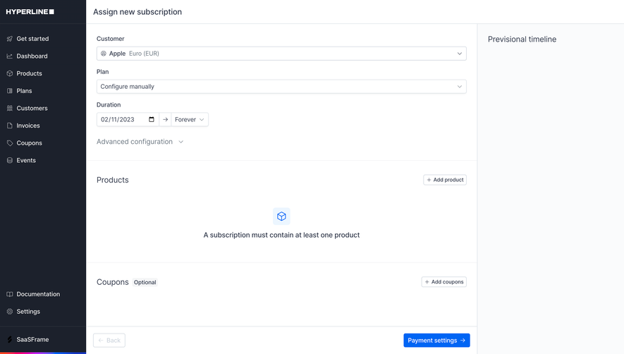
Billing tools that create subscriptions for customers also need a place for coupons. Hyperline’s “Assign new subscription” step lists Products, then a Coupons section marked Optional with an “Add coupons” button, next to a timeline column. Marking the section optional and placing it after the products tells the operator that a coupon modifies a subscription rather than defining it.
Accessibility details
The link that reveals the field should be a button that moves focus into the new input. Give the input a visible label, announce the result of Apply (success or error) to screen readers and tie error text to the field. Do not rely on a green border alone to confirm that a code was accepted.
Coupon code review checklist
- Is the field collapsed behind a clear link unless most buyers have a code?
- Is it placed next to the total it changes?
- Does the total update with the original price, the discount and the new amount?
- Is the discount’s duration stated?
- Can an applied code be seen and removed?
- Do errors explain why a code failed and what to do next?
- Is the entered code kept after an error, with spaces trimmed?
- Are annual savings, trials and coupons labeled separately?
- For trials, does the code change the amount charged at the end of the trial?
- Does the reveal link move focus to the input, and is the result announced?
Coupon code FAQ
Does a visible coupon field hurt conversion?
It can prompt people without a code to leave and search for one. A collapsed link avoids the suggestion while keeping the field easy to find for those who need it.
Should the coupon be entered at sign-up or at checkout?
Checkout is the default, because that is where the price is visible. Offer it at sign-up too when codes arrive with invitations or partner links, and carry it through to checkout automatically.
Can a code be applied from a link?
Yes. A link that pre-fills the code avoids typing errors. Show the applied code and its effect in the summary so the person knows it was recognized.
Promo code, coupon or discount code?
Use the word your marketing uses in the emails and pages that distribute the codes, and keep it consistent across sign-up, checkout and billing settings.
Related patterns
See Pricing and Pricing Toggle for the plan choice before checkout, Billing & Subscription for where discounts appear afterwards, Invoice for how they are itemized, Text Input for field states and errors, and Referral for codes shared between users.