 SaaSFrame
Before / After
Demonstrate transformative value with SaaS Before/After UI patterns. Using sliders and split-screen visuals, these examples highlight the measurable impact your software has on a user's workflow or business outcomes.
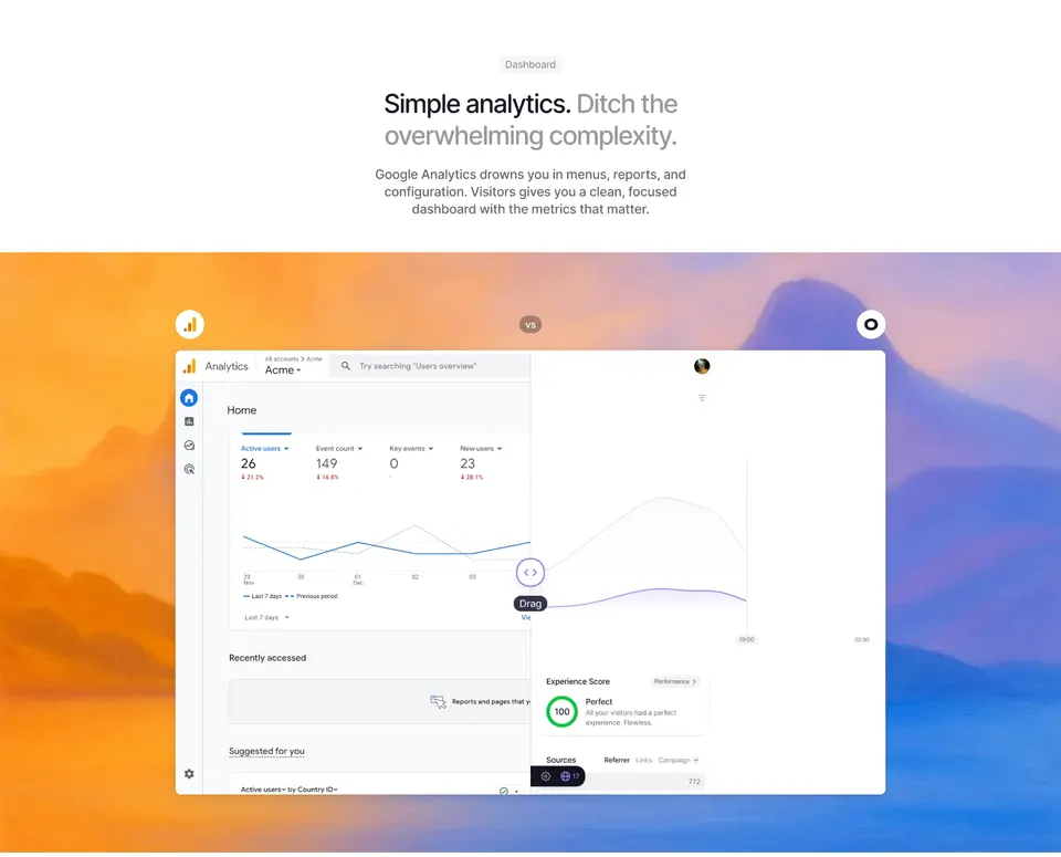

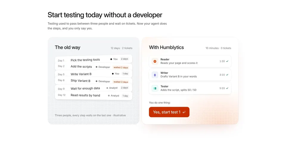

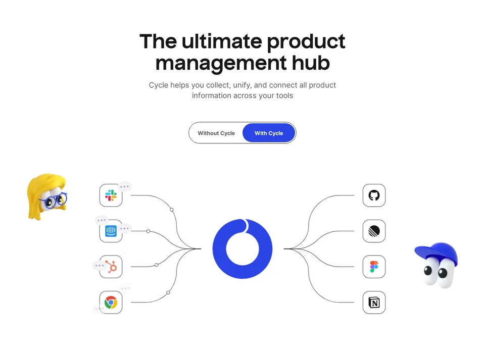

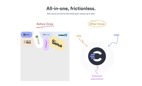
Before / After: design guide
In the libraryas of November 2026
- Examples
- 4
- SaaS products
- 4
- Last added
- Nov 2026
Most common inLanding Page 2Comparison Page 1Early Access Page 1
Recently addedVisitorsHumblyticsCycleCrew
A before-and-after pattern compares two states so people can understand what changed. SaaS websites use it to explain a product's impact, while product interfaces use it for previews, configuration changes, connection flows, and other transitions. The comparison is effective when the difference is meaningful and the conditions are clear.
The pattern is more than two images placed side by side. The viewer needs to know what stayed constant, what changed, and why that change matters. A dramatic visual difference without a trustworthy comparison can create confusion rather than understanding.
Define the change you want the viewer to understand
Choose a specific transformation. A disconnected account becomes connected. A manual workflow becomes organized. A raw document becomes formatted. A configuration preview shows the result of a proposed change. Each comparison should answer one primary question.
Avoid trying to prove every product benefit through one pair of images. If several things change at once, viewers may not know which difference to evaluate. Separate independent changes or provide annotations that distinguish them without overwhelming the comparison.
Write the takeaway in plain language. “Choose which emails become tasks after connecting Gmail” identifies a state transition and its practical consequence. “Everything is better with our product” does not establish what the visual is supposed to demonstrate.
Use comparable framing rather than artificial contrast
The two states should share enough context to make the comparison fair and understandable. Match viewport, scale, content, and relevant conditions where possible. A cluttered low-resolution before image and a polished spacious after image can imply a benefit that comes from presentation rather than the product.
For a workflow comparison, identify the same task or objective in both states. For a configuration preview, preserve the same object. For a performance claim, images alone are not sufficient evidence; the comparison needs an appropriate measurement method and context.
If the examples use different data, explain why. Demonstration data can be useful, but it should not be presented as a controlled real-world outcome. Keep visual storytelling and evidence of results distinct.
Study a real state transition in Superlist
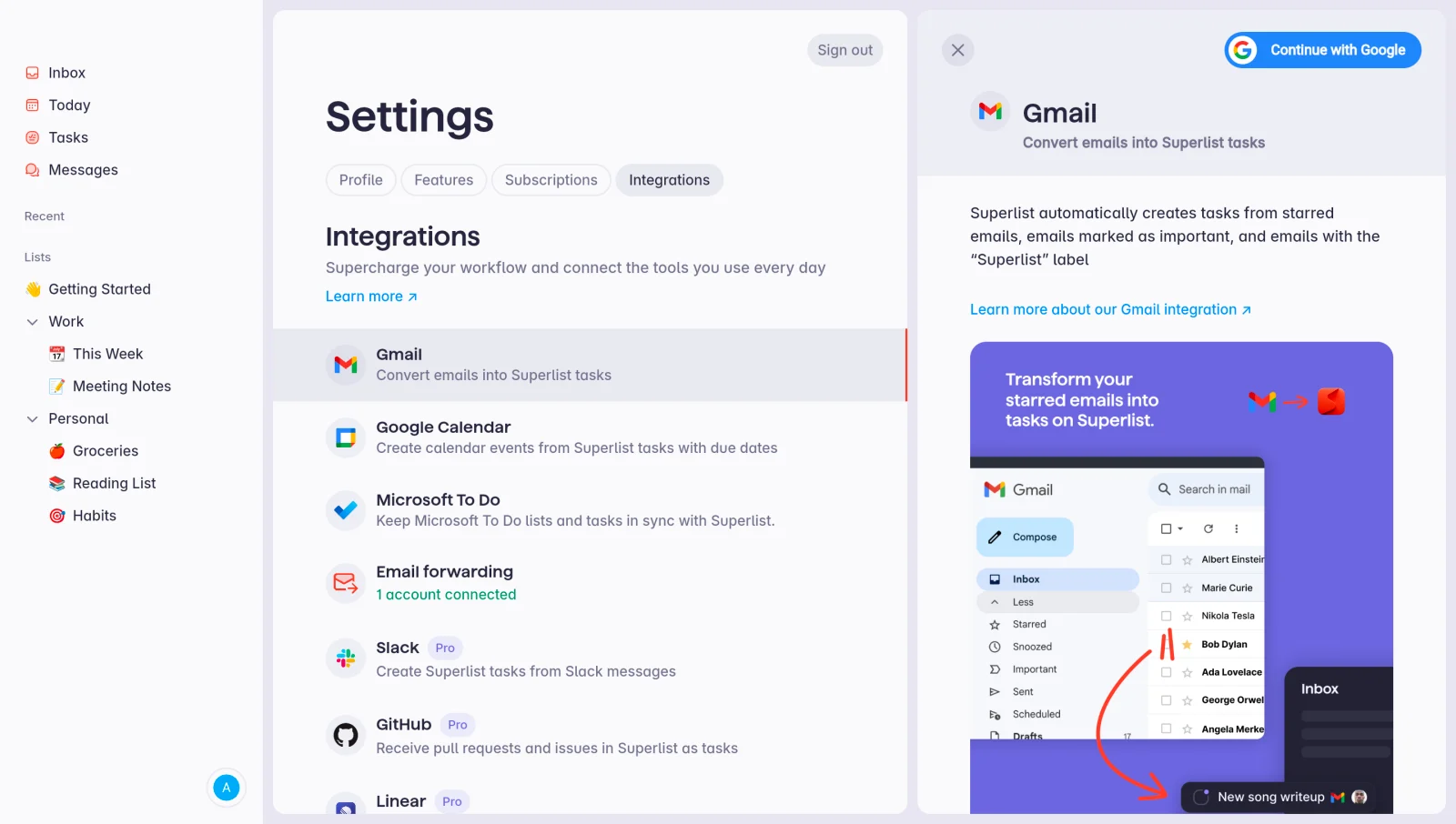
The Superlist Connect Integration reference shows the Gmail integration before connection, including the “Continue with Google” action. The interface focuses on establishing access and introducing the connection.
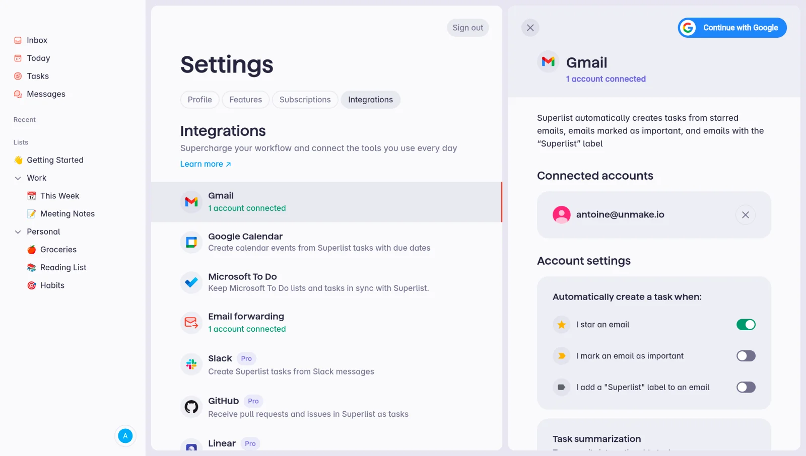
The connected reference shows account identity and options for creating tasks from different kinds of emails. Shared surrounding navigation helps the viewer recognize the same integration area. The meaningful difference is the shift from connecting an account to managing its behavior.
These captures support a visible state comparison. They do not establish that connecting Gmail improved productivity by a particular amount or that every intermediate authorization step worked in a specific way. The strongest lesson is the clear transition in what the user can do next.
Choose the comparison layout for the content
Side-by-side panels work well when both states need simultaneous inspection and the viewport provides enough space. Stacked panels preserve legibility on narrow screens. A toggle can use the same frame efficiently, but users must understand which state they are viewing and remember the previous one.
An interactive slider suits aligned visual content where revealing the same position in each image is meaningful. It is less useful when two interfaces have different layouts, text, or lengths. Sliding across unrelated screenshots can make the comparison feel impressive while hiding the actual change.
For a multistep process, a sequence may be more accurate than a binary before and after. Show the important intermediate state if it explains a necessary action, delay, or constraint. Do not compress a complex implementation into an instantaneous transformation that the product cannot deliver.
Label states and differences explicitly
Use clear state labels such as “Before connecting” and “After connecting,” or “Current” and “Preview.” Labels should describe the relationship rather than relying only on position, color, or visual polish.
Annotations can direct attention to the consequential difference: a connected account appears, a setting becomes available, or a repeated manual step disappears. Keep them close to the relevant content and avoid covering the information being compared.
Supporting copy should explain the practical implication. In the Superlist example, account identity matters because users need to verify which Gmail account is connected. Configuration options matter because authorization and task creation rules are separate decisions. Those observations provide more value than simply saying the after state looks more complete.
Distinguish preview from committed change
In a product interface, an after state may be a preview rather than a saved result. Make that distinction explicit. A person should know whether they are inspecting a possible outcome, applying it, or reviewing a change that already happened.
If the comparison accompanies a destructive or broad action, identify scope and consequences outside the image. A preview of one record should not imply that only one record will change when the action applies to many. Keep selected count, destination, and confirmation behavior understandable.
After applying a change, communicate success and any remaining processing. The interface should not display a completed after state if the underlying operation is still pending or has failed. A visual preview must not become a substitute for accurate status.
Keep comparison claims proportional to the evidence
Screenshots can show visible differences in organization, controls, and content. They cannot by themselves establish conversion gains, time savings, compliance, or long-term performance. If the page makes a quantitative claim, provide the relevant evidence and conditions separately.
Avoid selecting an unusually poor before state solely to exaggerate the result. A useful comparison reflects a realistic starting point and a realistic outcome. If the example is illustrative, label or describe it accordingly rather than implying it is a measured customer result.
Be clear about prerequisites. An after state may require setup, a particular plan, sufficient data, or permissions. Mention conditions that materially affect expectations. The comparison should encourage informed evaluation rather than hide the work required to reach the outcome.
Make interaction optional for understanding
Users should be able to grasp the main difference without manipulating a slider or remembering several rapid toggles. Provide labels and a concise explanation outside the interactive surface. A static pair can be an appropriate fallback for a richer comparison.
If a slider is used, give it an accessible name, keyboard operation, and a visible handle. Do not rely on dragging alone. Ensure labels remain readable at both extremes and that moving the handle does not obscure essential information.
For toggles, communicate the selected state and preserve a stable comparison frame. Avoid unexpected animation that makes it difficult to inspect text. Respect reduced-motion preferences when transitions involve large movement or elaborate effects.
Adapt image scale and sequence for mobile
Two desktop screenshots side by side can become unreadable on a phone. Stack them, crop to the relevant area, or offer an accessible full-size view. Keep enough shared context to show that the images belong to the same comparison.
Cropping should clarify rather than distort. If the important change appears within a settings panel, focus on that panel while explaining the surrounding context. Do not crop away a warning, qualification, or action that changes the meaning of the after state.
On touch devices, ensure comparison gestures do not interfere with normal scrolling. A slider that captures every horizontal or vertical movement can make a long page frustrating. Test the actual control alongside nearby links and buttons.
Maintain references as the product changes
Before-and-after assets often become outdated because one state is updated while the other is forgotten. Review pairs together. Changes to navigation, product names, plans, or controls can weaken comparability even when the core feature remains the same.
Keep a record of what the comparison is intended to demonstrate and when it was captured. This helps future editors update the asset without changing the claim accidentally. For historical references, identify them as design examples rather than current product documentation.
Separate replaceable screenshots from labels and explanatory copy where possible. That makes maintenance easier and keeps important text accessible. Embedded text inside image assets is harder to revise, translate, and expose to assistive technology.
Test whether viewers notice the right difference
Ask people what changed and why it matters without giving them the answer first. If they focus on incidental colors or layout differences rather than the intended benefit, revise framing or annotations.
For product previews, test whether users understand the difference between viewing and applying a change. Include cancellation, errors, partial success, and undo when supported. The comparison should make decisions safer, not merely make the interface more visually engaging.
Evaluate task completion, comprehension, and mistaken expectations alongside engagement. A frequently dragged slider may be entertaining without helping anyone understand the product. The useful outcome is an accurate mental model of the transition.
Frequently asked questions about before-and-after patterns
Is an interactive slider always better than two images?
No. Sliders work best with aligned visual content. Side-by-side or stacked comparisons are often clearer for interfaces with different controls and text.
Can before and after prove time savings?
Images can illustrate a workflow change. A quantified time-saving claim needs appropriate measurement and context. Do not treat a cleaner screenshot as evidence of a specific productivity gain.
Which related patterns make the transition concrete?
Third-party connections provide useful available and connected states. Bulk actions need accurate scope and result feedback, while 3D animation can explain a transformation when movement adds meaning.