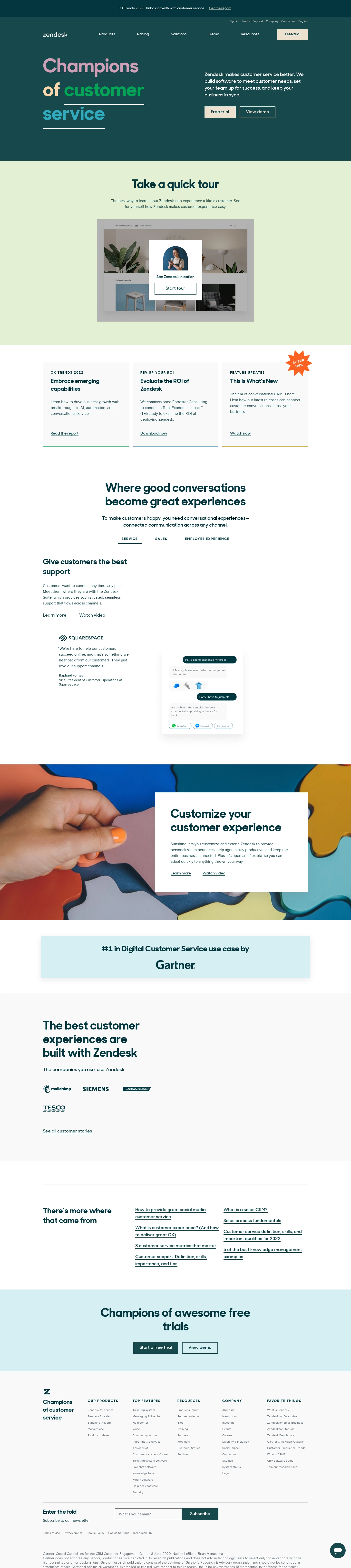
The hero section does so much heavy lifting here. That oversized serif headline "Champions of customer service" with the green highlight on "customer" instantly draws your eye. It's confident without being loud. The dark navy background paired with that minty green accent color creates a palette that feels fresh but trustworthy.
Smart Visual Flow
The page guides you down naturally. Hero, then a quick tour video section, then a three-column feature block, then testimonials. Nothing feels forced. The "Take a quick tour" section with its embedded video preview is a great conversion nudge placed exactly where curiosity peaks. Below that, the Squarespace testimonial with a chat UI mockup gives you something concrete to look at instead of just reading about features.
What Makes It Work
The Gartner endorsement badge sitting on its own in a clean section is a power move. Simple and effective. Company logos from Mailchimp, Siemens, and Tesco add weight without clutter. The sticky top nav stays minimal. Overall the page balances density with breathing room really well. That coral pink accent on the "What's New" badge adds just enough pop to break the two-tone monotony.
 SaaSFrame