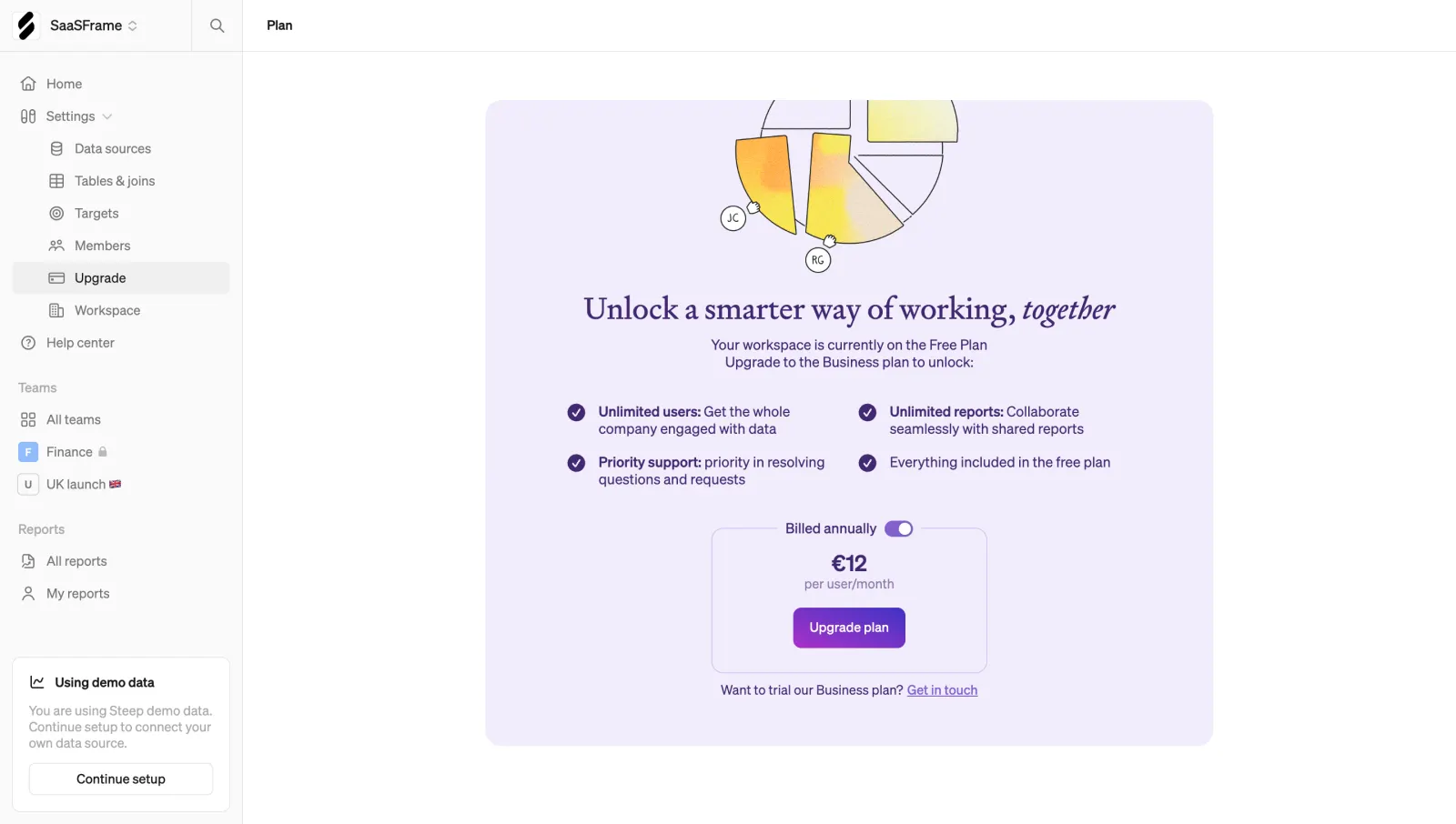
Generate a new design based on this screen, using your own content.
Preview the prompt
# Design from Reference: Steep Upgrading

Create an original, high-fidelity visual design inspired by the reference. Prioritize composition, typography, colors, spacing and component styling over technical implementation.

## Reference

- **Product:** Steep
- **Category:** Upgrading
- **Screenshot:** https://media.saasframe.io/v/0f9cdcbf998718a3f1c1-1600.webp

Analyze the screenshot first. If you can’t access it, ask me for it rather than guessing.

## Content

Write realistic placeholder content for a fictional SaaS product in the same category (no lorem ipsum).

Preserve essential messaging and factual accuracy. Adapt structure and copy length for visual balance; never invent product claims.

## Visual design

Use this context to reproduce the reference’s visual language: layout, typography, colors, spacing, borders, radii and distinctive elements. The screenshot takes priority if descriptions conflict.

### Overall aesthetic

- **Style:** Soft upgrade screen with an ivory-white application shell, lavender promotional panel, serif headline and purple conversion controls.
- **Scale:** Source 2880 × 1630px; sizes estimate a 1440px-wide CSS viewport at 2× capture scale.

### Page composition

- **Shell:** A roughly 240px sidebar contains workspace context, expanded settings, teams, reports and a demo-data setup card.
- **Main panel:** A centered approximately 720 × 640px lavender card contains a cropped collaborative-chart illustration, headline, benefits and pricing.
- **Header:** A simple Plan label sits in the top content bar.

### Information hierarchy

- **Upgrade rationale:** A serif headline and short Free Plan explanation introduce Business-plan benefits.
- **Benefits:** Four check-marked items form two columns, emphasizing unlimited users/reports and priority support.
- **Pricing:** Billed annually toggle sits above a bordered price box showing a per-user/month amount and Upgrade plan action.
- **Alternative:** A small trial/contact line sits below the price box.

### Typography

- **Families:** Serif promotional heading with italic final word, sans-serif UI/body; exact font identities are unverified.
- **Roles:** Estimated headline 30px regular, benefits/body 14px/18px, price 24px bold and button 12–13px medium.
- **Emphasis:** Purple text unifies the promotional content; benefit lead-ins use bold.

### Colors & surfaces

- **Sampled palette:** ICC-aware sRGB samples include white #FFFFFF, lavender #F3EDFD, pale #FAFAFB, deep purple #452775, light #F0F0F1 and gray #767676.
- **Accents:** Purple fills check circles, toggle and upgrade action; chart illustration adds yellow/orange texture.
- **Boundaries:** Main panel is flat and softly rounded; the pricing box uses a fine pale-purple outline.

### Components

- **Promotional card:** Approximately 16px corners with generous centered padding and illustration partly cropped at the top.
- **Benefit grid:** Two equal columns, each with small purple check circle and compact text.
- **Price module:** Approximately 274 × 144px outlined rectangle with rounded corners, centered amount/unit and purple gradient button.
- **Sidebar:** Selected Upgrade row uses pale-gray fill; lower demo-data card has outlined Continue setup action.

### Visual rhythm

- **Spacing:** Illustration, headline, benefits and pricing form a centered vertical sequence with broad gaps.
- **Contrast:** The structured sidebar contrasts with the softer editorial promotion; large outer white margins isolate the offer.

### Responsive

- **Recommended adaptation:** Only desktop is observed. Collapse sidebar, stack benefits and make the promotional panel fluid.
- **Pricing:** Keep billing toggle, unit and action together; allow the headline to wrap naturally.

### Adaptation guidance

- **Preserve:** Keep current-plan context, specific benefits and clear billing cadence before the upgrade action.
- **Adapt:** Use actual plan features and current prices. Do not treat the screenshot's amount or annual-billing state as a universal product rule.

## Direction

Keep the reference’s visual language (type, color, spacing, radii) but adapt the layout freely to the content.

## Output

Produce a high-fidelity static visual mockup of the full screen.

Deliver a polished, cohesive design with precise alignment, hierarchy and spacing. Produce the requested visual artifact, not just a description. If unsupported, explain the limitation.
 SaaSFrame