Prompt 652 words Copy
# Design from Reference: Pivot Features Page

Create an original, high-fidelity visual design inspired by the reference. Prioritize composition, typography, colors, spacing, and component styling over technical implementation.

## Reference

- **Product:** Pivot
- **Category:** Features Page
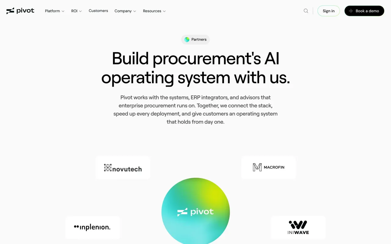
- **Screenshot:** attached to this message (also available at https://media.saasframe.io/v/c2959df6633504637bd9-1600.webp)
- **Source:** https://www.pivotapp.ai/platform/procure-to-pay

Analyze the attached screenshot first. If no image is attached, open the screenshot link; if neither is accessible, ask for it rather than guessing.

## Visual Design Context

### Overall aesthetic

- **Character:** Light, airy enterprise product marketing: off-white canvas, crisp floating UI cards, lime-to-cyan glows sitting under product fragments.

### Page composition

- **Capture:** 2880 × 22462 screenshot pixels; 2× CSS scale (1440px viewport).
- **Structure:** Split hero (copy left, approval card right over a gradient panel); logo marquee; problem section with wide diagram panel; six alternating feature rows with accordions; customer story carousel; integration logo grid; FAQ split (title left, questions right); four resource cards; closing CTA; gradient footer.

### Information hierarchy

- **Priority:** Promise, proof logos, problem, then capabilities in reading order of the invoice lifecycle. Each row exposes one expanded sub-point and collapses the rest.

### Typography

- **Families:** Roobert for headings, DM Sans for body.
- **CSS scale:** Hero 40px, row headings 28px, sub-point titles 12px semibold, body 12–14px, FAQ questions 13px.

### Colors & surfaces

- **Palette:** Page #FAFAFA, cards #FFFFFF, text #060609 and #464646, dividers #E6E6E6.
- **Accents:** Lime #F0FF00 and cyan glows behind product cards; thin gradient progress bar on the active accordion item; yellow "Approve" button in the UI card.

### Components

- **Elements:** Floating product cards (invoice, PO match, AI agent form), accordion feature lists, logo tiles, story carousel cards, FAQ rows with chevrons, resource cards with dark illustrations.
- **Geometry:** Content about 1140px wide, rows 50/50, card radii 8–12px, section gaps 120px+.

### Responsive

- **Mobile capture:** Rows stack with the UI fragment below the text, logos wrap into a grid, FAQ goes full width.

### Adaptation guidance

- **Transfer:** Give each product module its own page with a lifecycle-ordered sequence of rows and one UI fragment per row. Replace fragments with your own product UI.

## Content

**Instructions:**

Generate realistic example content that fits the selected design reference.

Create appropriate headlines, descriptions, labels, buttons, and supporting copy based on the type of interface being designed.

If a product or business description is provided, use it to guide the content.

Otherwise, invent a plausible fictional SaaS product appropriate for the reference.

Keep the content concise, coherent, and visually balanced.

Do not present fictional statistics, customer names, or testimonials as verified facts.

## Design Direction

**Instructions:**

Use the reference screenshot as the main source of visual inspiration rather than a strict layout template.

Preserve its most distinctive design characteristics, such as typography, visual rhythm, color relationships, component treatments, and overall aesthetic.

Feel free to modify section arrangements, proportions, spacing, and individual components to better suit my content.

Introduce original design decisions where they improve usability, composition, or brand consistency.

The result should clearly reflect the reference's visual language without looking like a direct reproduction.

Follow the visual identity of the reference design.

Use its typography, color palette, component styling, and overall aesthetic as the primary design direction.

Do not introduce an unrelated visual identity.

## Output

**Instructions:**

Generate a high-fidelity visual mockup of the requested interface.

Present the design as a polished, realistic website or product UI screenshot.

Prioritize visual composition, typography, spacing, colors, alignment, and component details.

Use the available image-generation or visual-design capabilities.

Do not replace the mockup with source code, a written design specification, or a textual description.

If direct visual generation is unavailable, clearly explain the limitation.

## Constraints

- Use the actual screenshot as the primary visual reference.
- Preserve essential messaging and factual accuracy.
- Prioritize visual quality and consistency.
- Do not invent unsupported product claims.
- Adapt structure and copy length for visual balance.
Reference image Attach it to your message: assistants can’t open image links. Open in ChatGPT ↗ Open in Claude ↗
Build it in Lovable ↗ v0 ↗ Figma Make ↗
Opening a tool copies the screenshot so you can paste it with your prompt.
 SaaSFrame