Prompt 684 words Copy
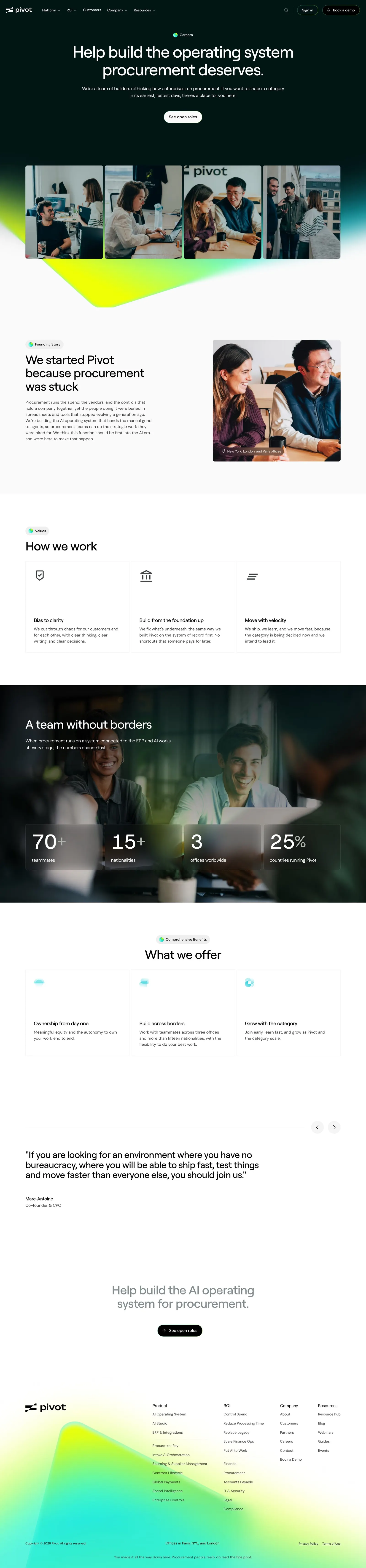
# Design from Reference: Pivot Careers Page

Create an original, high-fidelity visual design inspired by the reference. Prioritize composition, typography, colors, spacing, and component styling over technical implementation.

## Reference

- **Product:** Pivot
- **Category:** Careers Page
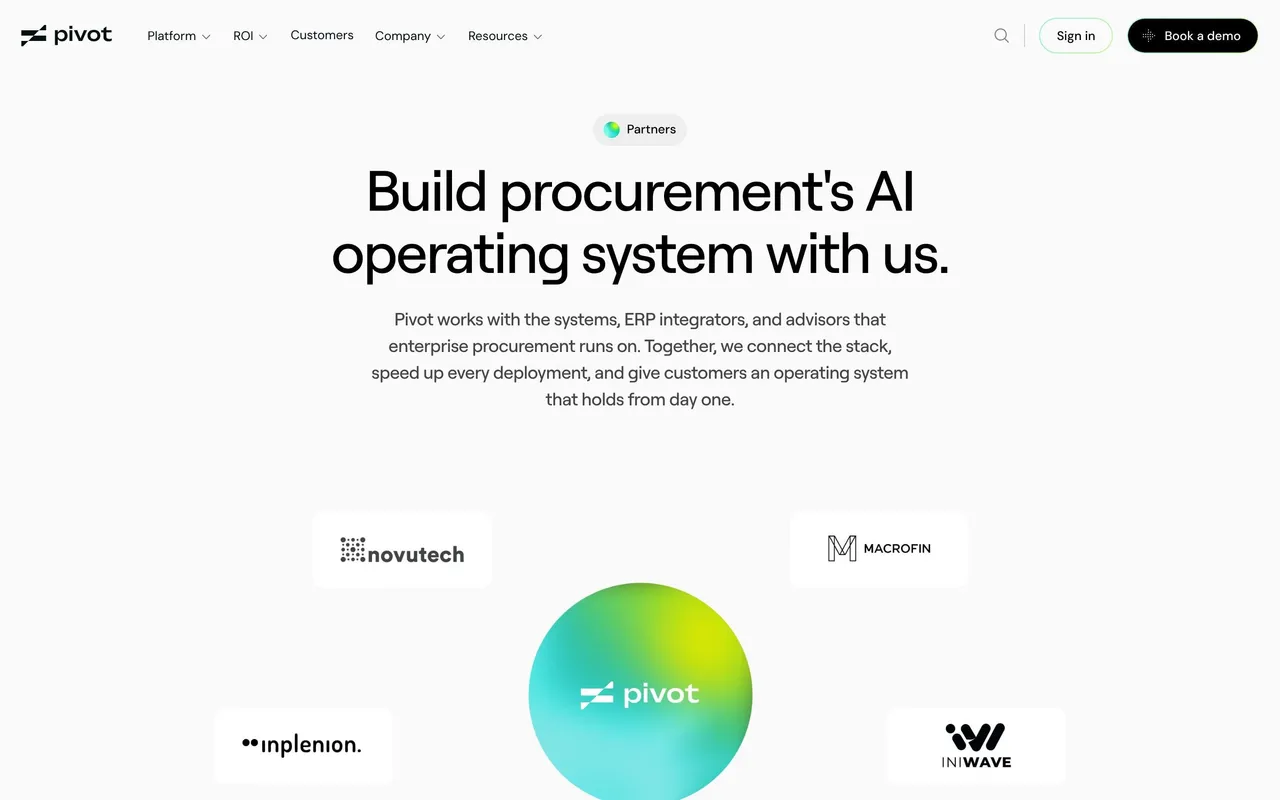
- **Screenshot:** attached to this message (also available at https://media.saasframe.io/v/47a11a2d6578270e2f50-1600.webp)
- **Source:** https://www.pivotapp.ai/company/careers

Analyze the attached screenshot first. If no image is attached, open the screenshot link; if neither is accessible, ask for it rather than guessing.

## Visual Design Context

### Overall aesthetic

- **Character:** Premium enterprise minimalism shared with the rest of Pivot's site: off-white canvas, near-black hero, lime-to-cyan gradient as the only saturated colour, warm candid team photography.

### Page composition

- **Capture:** 2880 × 12352 screenshot pixels; 2× CSS scale (1440px viewport).
- **Structure:** Dark centered hero with badge, headline, one pill CTA and a four-photo strip over a gradient wedge; founding story split (text left, photo right); three value cards; full-bleed photo band with four metric tiles; three benefit cards with carousel arrows; large founder quote; centered closing statement with CTA; gradient-washed footer.

### Information hierarchy

- **Priority:** Mission headline first, then people (photos), then story, values, proof numbers and benefits. Open roles are reached by the two pill buttons rather than an on-page list.

### Typography

- **Families:** Geometric grotesk for headings (Roobert), neutral sans for body (DM Sans).
- **CSS scale:** Hero about 44px centered, section headings 32–36px, card titles 16px, body 14–16px, labels 12px; medium weight headings with tight tracking.

### Colors & surfaces

- **Palette:** Page #FAFAFA, hero #011515, headings #060609, body #464646, cards white with hairline gray borders.
- **Accents:** Acid lime #F0FF00 to mint to cyan gradient as wedge and footer wash; small gradient-dot badges.

### Components

- **Elements:** Pill buttons (white on dark, black on light), gradient-dot badges, outlined value cards with line icons, frosted metric tiles over a photo, quote block, circular carousel arrows.
- **Geometry:** Content about 1140px wide, radii 8–12px, generous 120–160px section gaps.

### Responsive

- **Mobile capture:** Photo strip and cards stack into a single column, metric tiles go two by two, the quote wraps to full width.

### Adaptation guidance

- **Transfer:** Lead with mission and real team photos, keep values and benefits to three short cards each, and use one band of hard numbers. Replace photos, figures and the quote with your own.

## Content

**Instructions:**

Generate realistic example content that fits the selected design reference.

Create appropriate headlines, descriptions, labels, buttons, and supporting copy based on the type of interface being designed.

If a product or business description is provided, use it to guide the content.

Otherwise, invent a plausible fictional SaaS product appropriate for the reference.

Keep the content concise, coherent, and visually balanced.

Do not present fictional statistics, customer names, or testimonials as verified facts.

## Design Direction

**Instructions:**

Use the reference screenshot as the main source of visual inspiration rather than a strict layout template.

Preserve its most distinctive design characteristics, such as typography, visual rhythm, color relationships, component treatments, and overall aesthetic.

Feel free to modify section arrangements, proportions, spacing, and individual components to better suit my content.

Introduce original design decisions where they improve usability, composition, or brand consistency.

The result should clearly reflect the reference's visual language without looking like a direct reproduction.

Follow the visual identity of the reference design.

Use its typography, color palette, component styling, and overall aesthetic as the primary design direction.

Do not introduce an unrelated visual identity.

## Output

**Instructions:**

Generate a high-fidelity visual mockup of the requested interface.

Present the design as a polished, realistic website or product UI screenshot.

Prioritize visual composition, typography, spacing, colors, alignment, and component details.

Use the available image-generation or visual-design capabilities.

Do not replace the mockup with source code, a written design specification, or a textual description.

If direct visual generation is unavailable, clearly explain the limitation.

## Constraints

- Use the actual screenshot as the primary visual reference.
- Preserve essential messaging and factual accuracy.
- Prioritize visual quality and consistency.
- Do not invent unsupported product claims.
- Adapt structure and copy length for visual balance.
Reference image Attach it to your message: assistants can’t open image links. Open in ChatGPT ↗ Open in Claude ↗
Build it in Lovable ↗ v0 ↗ Figma Make ↗
Opening a tool copies the screenshot so you can paste it with your prompt.
 SaaSFrame