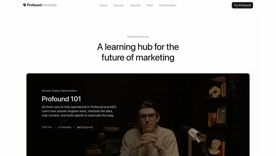
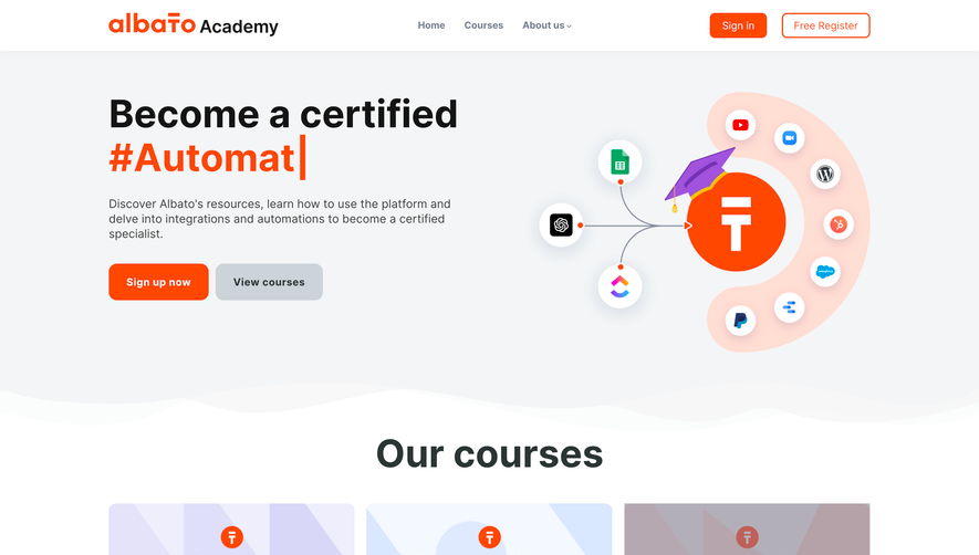
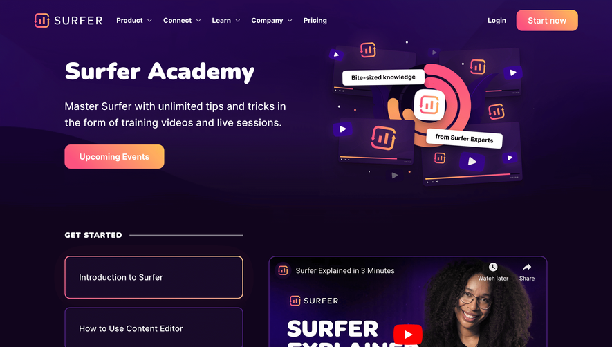
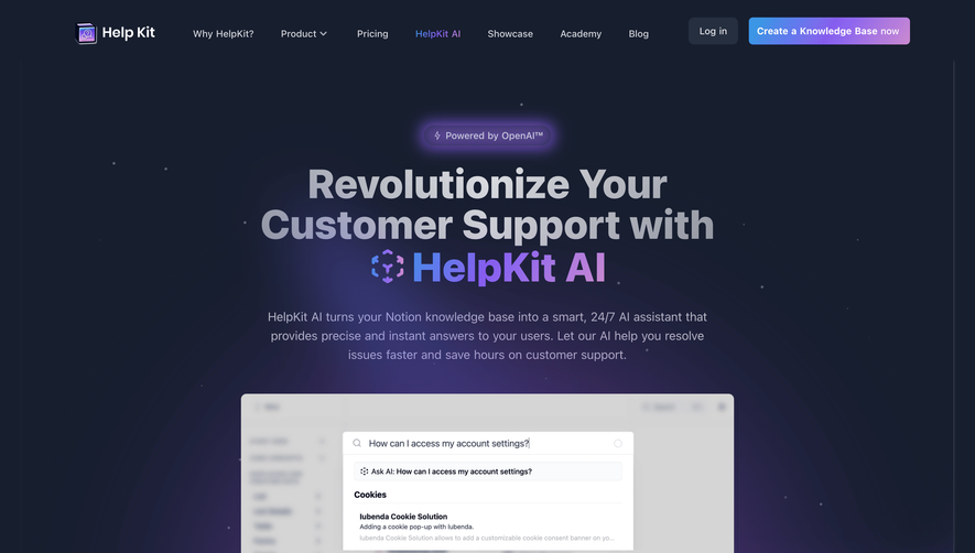
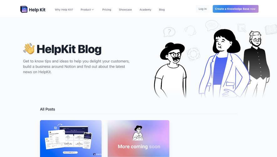
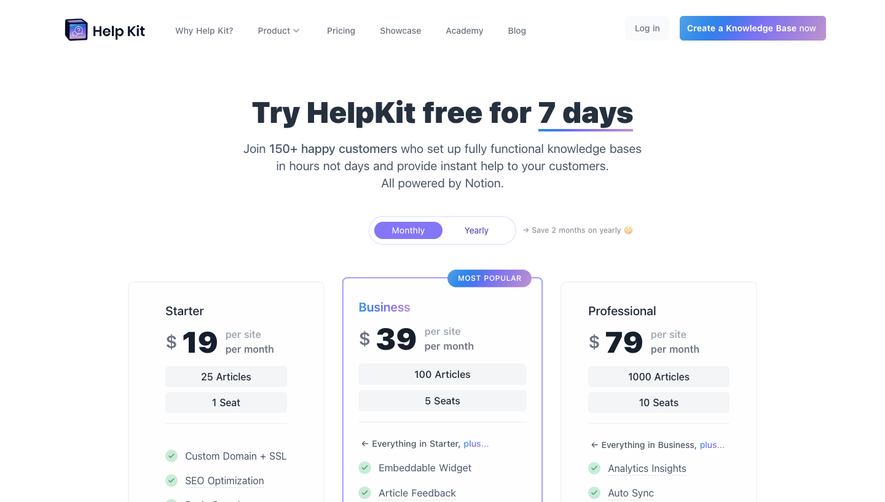
Generate a new design based on this screen, using your own content.
Preview the prompt
# Design from Reference: Help Kit Academy

Create an original, high-fidelity visual design inspired by the reference. Prioritize composition, typography, colors, spacing and component styling over technical implementation.

## Reference

- **Product:** Help Kit
- **Category:** Academy
- **Screenshot:** https://media.saasframe.io/o/b5f1123b94db9ae5bea1.webp

Analyze the screenshot first. If you can’t access it, ask me for it rather than guessing.

## Content

Write realistic placeholder content for a fictional SaaS product in the same category (no lorem ipsum).

Preserve essential messaging and factual accuracy. Adapt structure and copy length for visual balance; never invent product claims.

## Visual design

Use this context to reproduce the reference’s visual language: layout, typography, colors, spacing, borders, radii and distinctive elements. The screenshot takes priority if descriptions conflict.

### Overall aesthetic

- **Character:** An extensive educational landing page with a bright near-white canvas, dark navy headings and blue-to-purple gradient highlights. Screenshots, light outlined cards and hand-drawn arrows give a tutorial/reference-library feel.
- **Image basis:** The 1440 × 17992 screenshot was inspected through all thirteen readable crops at approximately 1400 px wide. Dimensions below refer to inspection scale; CSS pixel ratio and font identities are unverified.

### Page composition

- **Navigation and hero:** A top brand mark sits beside seven numbered chapter links and a Bookmark control. The centered hero contains an award badge, large three-line title, short explanation, overlapping avatars and a small rating/quote. Faded help-center thumbnails frame the sides.
- **Definition:** A centered numbered introduction precedes a two-column explanation with gradient-outlined callout pills and a large screenshot plus two smaller examples.
- **Characteristics:** Seven alternating text/illustration blocks cover responsive design, search, customization, analytics, search visibility, widgets and custom domains. A centered bar chart and two circular percentage callouts follow.
- **Category structure:** Four topic groups surround a central help-center preview and template action. Each group has an emoji-style icon, heading, short text and three outlined example-question chips.
- **Writing guidance:** Five horizontally arranged topic tabs precede one large two-column lesson with paragraphs, takeaway note and a tall screenshot montage.
- **Examples:** A long two-column gallery sits to the right of a narrow category-filter sidebar. Each example card includes a screenshot, title, link and category-count metadata.
- **Resources:** A centered introduction and seven category pills precede a four-column tool grid; the shown selection includes a partial second row.
- **Checklist and closing:** A narrow two-column checklist panel leads to sharing text, an eight-icon sharing strip, an award badge and a HelpKit product promotion. A dark navy four-column footer closes the page, with a small help launcher lower right.

### Information hierarchy

- **Chapter system:** Small pale numbers, centered bold headings and explanatory introductions make the long page navigable in sections.
- **Hero:** Approximately 58 px bold display text dominates; gradient words supply emphasis without changing scale.
- **Lessons:** Short badge labels precede approximately 30 px headings and readable body copy. Product screenshots substantiate each concept.
- **Reference browsing:** Gallery cards emphasize screenshot previews, then titles and links. Filters and category counts support scanning.
- **Action hierarchy:** Template, resource-filter, share and product actions are localized to their sections rather than repeated as a dominant full-page CTA.
- **Observed state:** The first writing tab has a stronger outline; a knowledge-base resource pill is tinted. Checklist boxes are empty. No filter results transition or checked state is observed.

### Typography

- **Display:** Hero text is approximately 58 px bold with tight tracking and compact line-height. Chapter headings are around 34–36 px bold.
- **Lesson headings:** Approximately 29–31 px semibold/bold, with two-line wrapping where needed.
- **Reading:** Introductory paragraphs are around 18 px with 27 px line-height; lesson body text is approximately 16–18 px with 24–27 px line-height.
- **Cards and controls:** Example titles use around 16 px, metadata around 12 px, and resource descriptions around 13 px. Navigation is around 14 px, with small monospaced-looking chapter numbers.
- **Type certainty:** The principal type is a clean sans-serif. Its exact family, weights and CSS line metrics cannot be verified from the screenshot.

### Colors & surfaces

- **Measured base:** Near-white #FDFDFD dominates; pale surfaces include #F8FAFD, #F9FAF8 and #F3F5F7.
- **Measured darks:** Navy #262A4D, #1A1F44, #111119 and #323257 occur in footer/screenshot artwork and dark text regions.
- **Accent system:** Blue-to-purple gradients mark selected words, image frames, chip outlines and the final CTA. Pale lavender borders unify cards.
- **Supporting color:** Soft green/orange badge accents distinguish lesson themes; colorful website screenshots supply most saturated variation.
- **Depth:** Screenshots often sit over gradient backing shapes with soft shadows. Pale dot grids and fine background grids remain decorative and low contrast.

### Components

- **Chapter links:** Each top item pairs a tiny number with a concise label; Bookmark uses a small outlined rounded rectangle and icon.
- **Lesson badges:** Small softly tinted pills combine an icon and uppercase label. Illustrations use overlapping browser/device panels, rounded backing shapes and occasional rotation.
- **Chart:** Two vertical purple/lavender bars sit over horizontal grid lines; separate outlined circles display large percentages and labels.
- **Question chips:** Thin lavender-bordered rounded rectangles contain small leading help icons and example questions. They are arranged in short centered stacks around the category preview.
- **Writing tabs:** Five roughly 214 × 103 px outlined tiles combine pale purple icons and centered labels. The active first tile has a stronger purple border.
- **Gallery cards:** Approximately 433 px wide with fine lavender borders, small corners, padded landscape screenshots, title/link text and right-side count metadata. The sidebar uses radio-like circles beneath a filter heading.
- **Resource cards:** Four approximately 302 px wide panels use screenshot thumbnails, a tiny category chip, title and truncated description.
- **Checklist:** A roughly 653 px wide pale panel has generous padding and two columns of text items, each with an empty small square checkbox and short explanation.
- **Sharing/footer:** Eight outlined square sharing controls sit on a raised white strip. The footer uses four link columns on dark navy, with a small purple help pill. Hover text in an illustration does not prove a live hover state.

### Visual rhythm

- **Long-form structure:** Large vertical gaps and repeated numbered introductions prevent the exceptionally long page from becoming one continuous text wall.
- **Alternating lessons:** Text/image sides reverse repeatedly, while chapter introductions remain centered.
- **Width changes:** Broad lesson and gallery regions contrast with narrower centered explanations, chart, checklist and sharing blocks.
- **Grid repetition:** Gallery rows use two columns, resource cards use four, and the checklist uses two. Consistent thin outlines connect these different densities.
- **Decorative flow:** Curled arrows mark transitions; faded thumbnails and subtle dot patterns fill peripheral space without replacing content.

### Responsive

- **Evidence limit:** The page discusses responsiveness and contains device illustrations, but only this wide page layout is observed.
- **Recommended navigation:** Convert seven chapter links into a compact accessible chapter menu; keep clear section anchors.
- **Recommended lessons:** Stack alternating text/image pairs consistently, placing explanation before artwork.
- **Recommended directories:** Move filters above the gallery, reduce example/tool columns progressively and wrap category chips.
- **Recommended checklist:** Collapse to one column, preserve label/checkbox association and avoid tiny screenshot text as essential information.

### Adaptation guidance

- **Preserve:** Keep the chapter-based learning sequence, gradient emphasis, alternating demonstrations and structured reference galleries.
- **Build:** Reuse chapter-intro, lesson, question-chip, example-card, resource-card and checklist-item components.
- **Content scale:** Use strong anchors and clear filter states to support the long page; avoid adding decoration where the repeated components already provide structure.
- **Separate evidence:** Treat embedded third-party screenshots as examples and preserve their aspect ratios; do not infer current service capabilities from them.
- **Validate:** Confirm typefaces, actual CSS spacing, gradient/text contrast, keyboard tabs/filters, checklist state and small-screen navigation.

## Direction

Keep the reference’s visual language (type, color, spacing, radii) but adapt the layout freely to the content.

## Output

Produce a high-fidelity static visual mockup of the full screen.

Deliver a polished, cohesive design with precise alignment, hierarchy and spacing. Produce the requested visual artifact, not just a description. If unsupported, explain the limitation.
 SaaSFrame