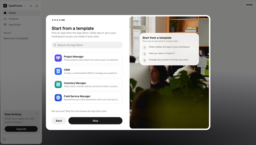
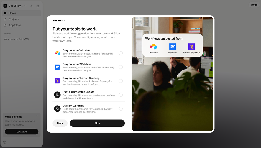
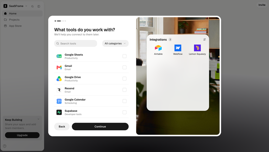
Generate a new design based on this screen, using your own content.
Preview the prompt
# Design from Reference: Cycle User Onboarding

Create an original, high-fidelity visual design inspired by the reference. Prioritize composition, typography, colors, spacing and component styling over technical implementation.

## Reference

- **Product:** Cycle
- **Category:** User Onboarding
- **Screenshot:** https://media.saasframe.io/o/235d19b875e0097c68b2.webp

Analyze the screenshot first. If you can’t access it, ask me for it rather than guessing.

## Content

Write realistic placeholder content for a fictional SaaS product in the same category (no lorem ipsum).

Preserve essential messaging and factual accuracy. Adapt structure and copy length for visual balance; never invent product claims.

## Visual design

Use this context to reproduce the reference’s visual language: layout, typography, colors, spacing, borders, radii and distinctive elements. The screenshot takes priority if descriptions conflict.

### Overall aesthetic

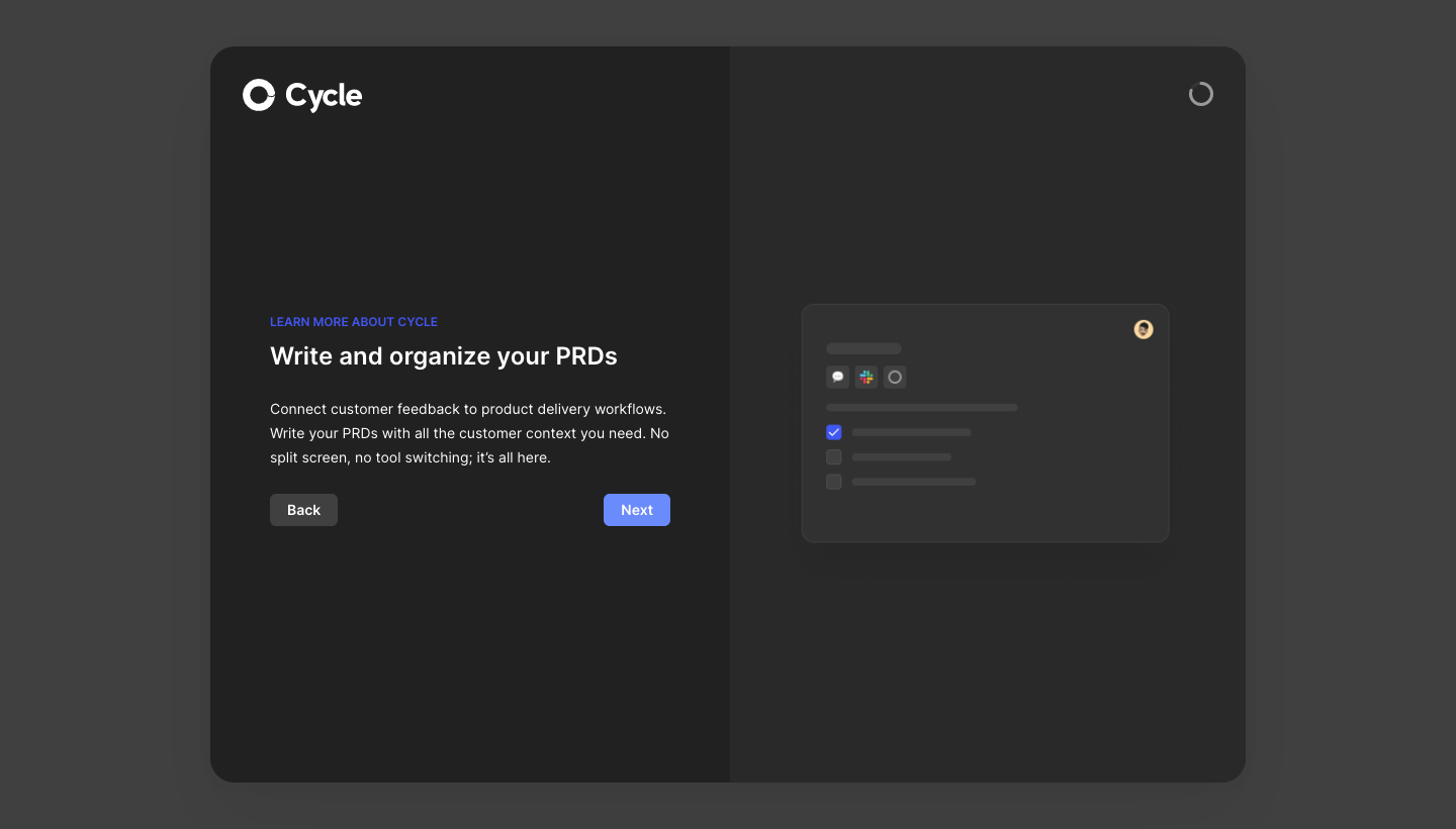
- **Character:** A dark product-introduction step with a balanced split panel, concise explanatory copy and a simplified product illustration.
- **Evidence scale:** Original 1440 × 821 pixels. Dimensions below are image-pixel estimates; actual CSS scale is unverified.

### Page composition

- **Canvas:** Medium-charcoal viewport surrounds a centered approximately 1024 × 730 px rounded container, beginning near x208, y46.
- **Split:** Two equal columns use subtly different dark fills, divided by a straight vertical boundary.
- **Left:** White Cycle logo at upper left; a content block around the vertical center contains blue eyebrow, title, three-line explanation and Back/Next actions.
- **Right:** Centered schematic document card with small integration icons, checklist rows and avatar; a small circular progress/loading-looking mark sits near the upper right.

### Information hierarchy

- **Message:** The bold PRD-organization heading is the main textual landmark.
- **Context:** Small blue uppercase eyebrow introduces the product-learning step.
- **Navigation:** Blue Next is emphasized over gray Back, positioned at opposite ends of the copy block.
- **Illustration:** Low-contrast document marks support the explanation without competing with it; no actual document text is readable.

### Typography

- **Title:** Unverified sans-serif, approximately 24 px semibold with 30 px line height.
- **Body:** Approximately 14 px regular, 24 px line height in light gray.
- **Eyebrow:** Around 12 px semibold uppercase in blue.
- **Buttons:** Approximately 14 px semibold white text, centered.
- **Tracking:** Slightly open eyebrow spacing, otherwise neutral.

### Colors & surfaces

- **Canvas:** Measured #404040 outer background.
- **Split panel:** Near-black #212121 left and dark #292929 right.
- **Illustration:** #313131 card surface with darker/lighter gray schematic marks.
- **Accents:** Bright blue eyebrow, blue Next fill and checked illustration box.
- **Type:** White branding/title and softer gray body copy preserve dark-mode hierarchy.

### Components

- **Main shell:** Approximately 24 px radius with a soft dark shadow beneath.
- **Copy block:** Roughly 396 px wide, inset about 60 px from the left panel edge.
- **Buttons:** Approximately 66 × 32 px rounded rectangles; Back is gray, Next is blue.
- **Illustration card:** Approximately 364 × 236 px, 12 px radius, fine lighter edge and broad soft shadow.
- **Illustration details:** Three small integration-style square icons, one blue checked row, two unchecked rows, horizontal gray text bars and a tiny circular avatar.
- **Top indicator:** A small incomplete gray ring is visible; animation and actual loading semantics are unverified.

### Visual rhythm

- **Text grouping:** About 16 px separates eyebrow and title, with roughly 28 px before explanatory copy.
- **Action spacing:** Buttons sit around 24 px below the paragraph.
- **Balance:** Copy and illustration align around the same vertical midpoint, while the logo remains a distant top anchor.
- **Restraint:** Large empty dark areas isolate the instructional content.

### Responsive

- **Observed limit:** Desktop only; no mobile step layout is verified.
- **Recommendation:** Stack copy above illustration and reduce outer padding while keeping Back/Next in a stable row.
- **Short viewports:** Allow scrolling rather than clipping the title or navigation.

### Adaptation guidance

- **Retain:** Explain one concept per step with a compact schematic and clear forward navigation.
- **Implement:** Use adjacent dark surfaces, low-contrast illustration details and one blue action emphasis.
- **Verify:** Confirm font, scale, progress semantics and navigation behavior independently; no setup step was advanced.

## Direction

Keep the reference’s visual language (type, color, spacing, radii) but adapt the layout freely to the content.

## Output

Produce a high-fidelity static visual mockup of the full screen.

Deliver a polished, cohesive design with precise alignment, hierarchy and spacing. Produce the requested visual artifact, not just a description. If unsupported, explain the limitation.
 SaaSFrame