Prompt 807 words Copy
# Design from Reference: Caveman Cloud Home Dashboard

Create an original, high-fidelity visual design inspired by the reference. Prioritize composition, typography, colors, spacing, and component styling over technical implementation.

## Reference

- **Product:** Caveman
- **Category:** Checklist
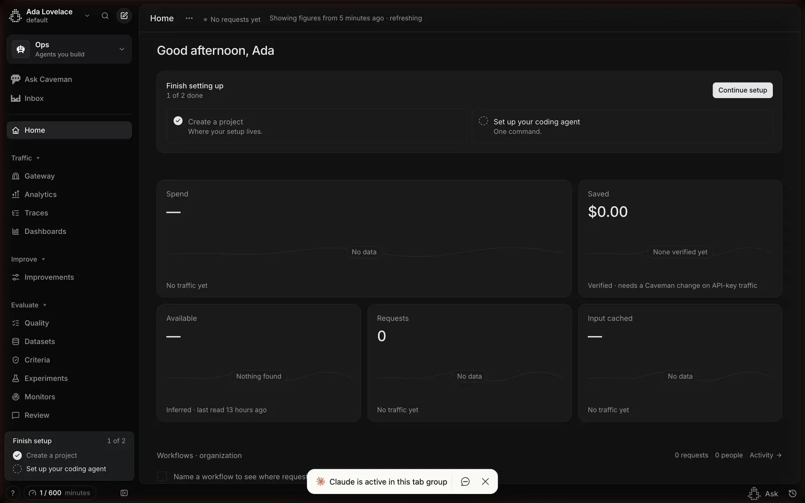
- **Screenshot:** attached to this message (also available at https://media.saasframe.io/v/2c6856c4548aaeea70c6-1600.webp)
- **Source:** https://platform.caveman.so/home

Analyze the attached screenshot first. If no image is attached, open the screenshot link; if neither is accessible, ask for it rather than guessing.

## Visual Design Context

## Overall aesthetic
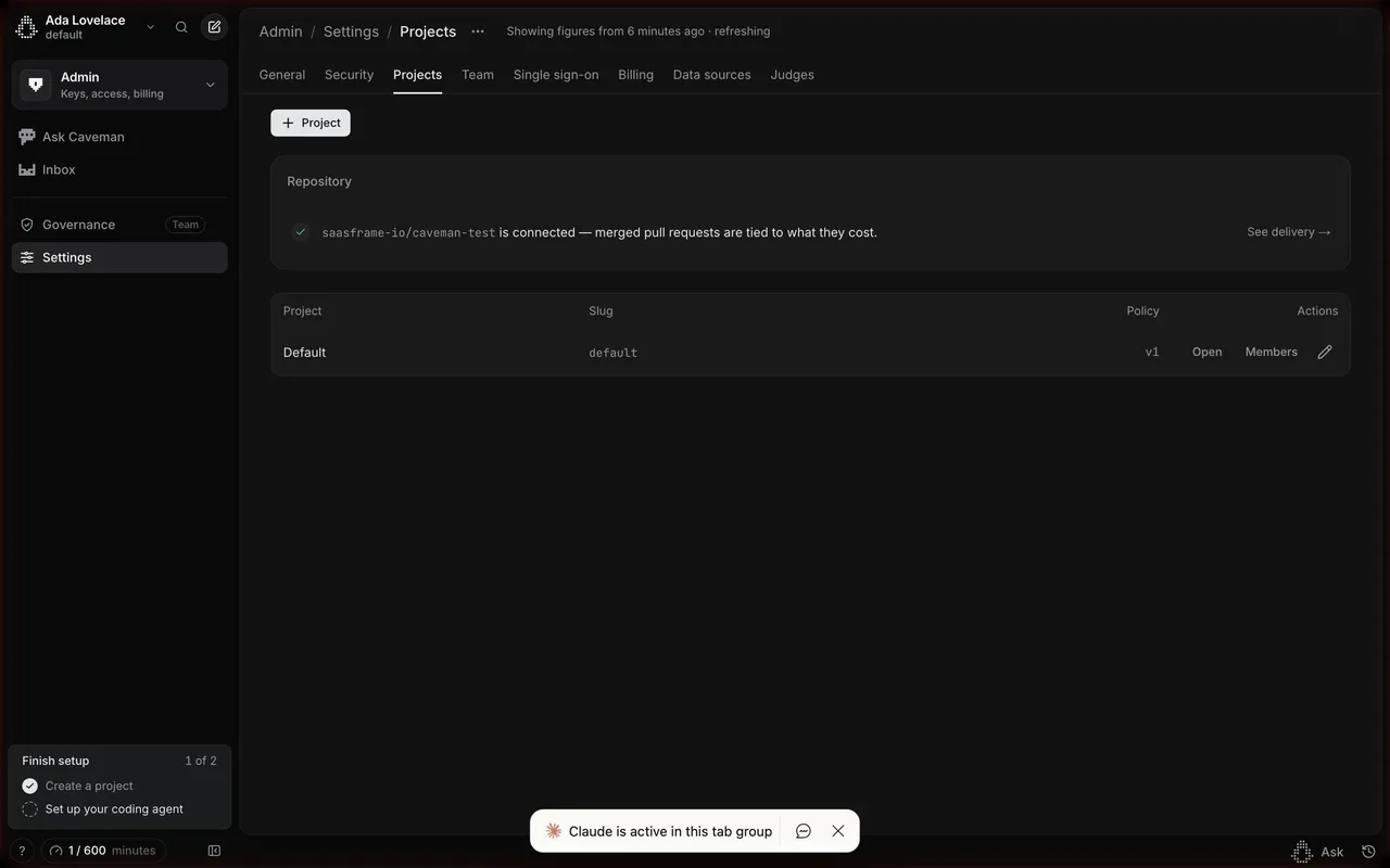
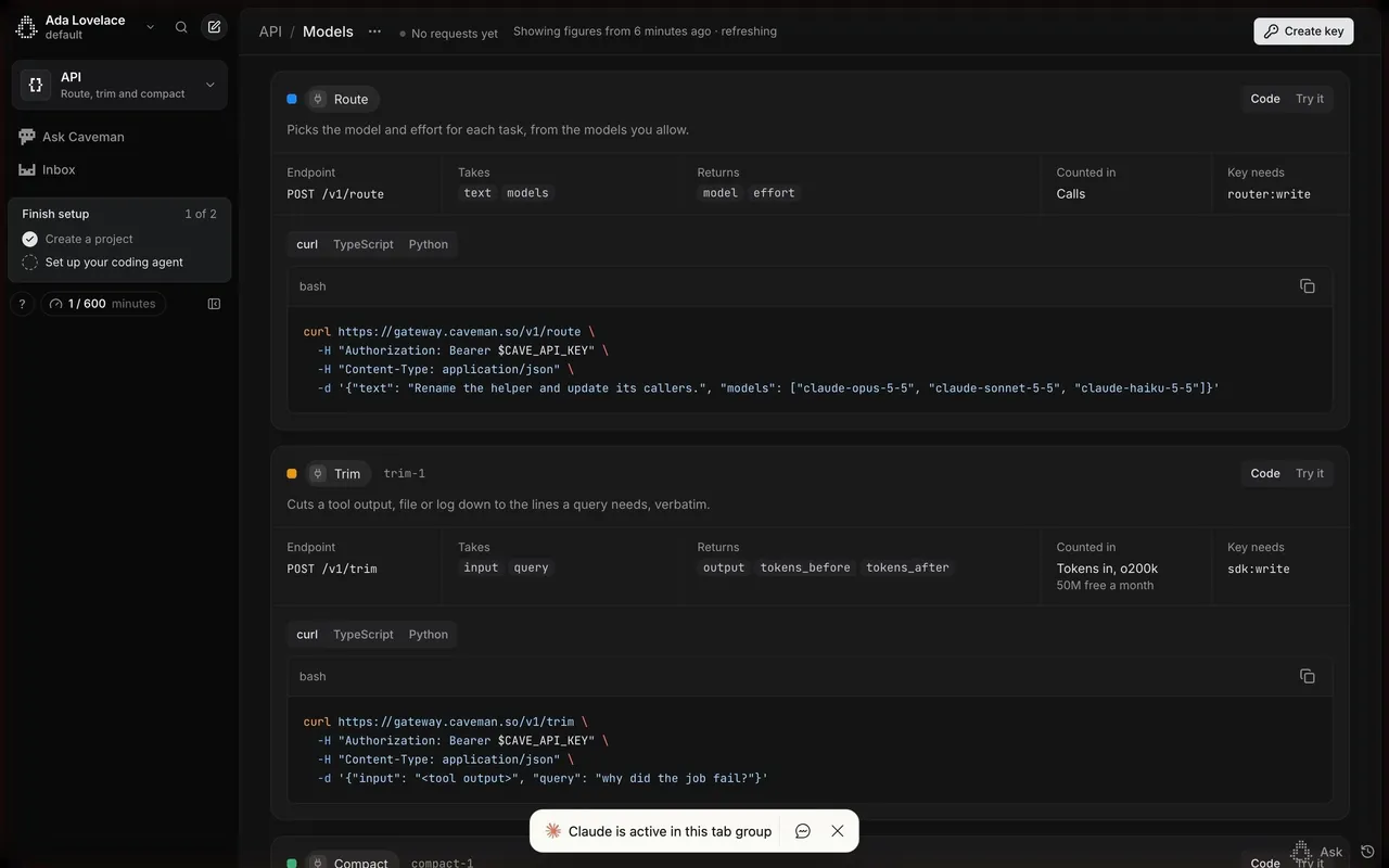
Caveman makes coding agents cheaper: Caveman Code (one app for every coding agent), Caveman Cloud (agent cost observability and optimization) and an open-source CLI. The marketing site is a near-black, high-contrast developer brand with a playful streak: pixel-art cavemen, terse "caveman speak" asides ("Same model. Same work. Few token. Small bill."), live benchmark charts and terminal-style demos. The Caveman Code app is the opposite: a bright, minimal chat interface close to ChatGPT or Claude, with a pixel caveman mascot on the empty state.

## Typography
Geist Sans for the site, with enormous, tightly tracked headlines (95–200px, weight 450–600, about -5% letter spacing) and monospace labels in uppercase for eyebrows and breadcrumbs ("CAVEMAN / CONTACT"). The app uses the system UI font: 22px for the empty-state title, 13–15px for UI text, and a monospace style for plan names ("pro_", "max $100_").

## Colors & surfaces
Site: #000000 to #0E0E0E backgrounds, #161616 / #181818 panels, white and light grey text, light grey #F3F3F3 buttons with dark text (42px, 14px radius), occasional light sections (#F3F3F3 / #FAFAFA), a green #5FD39A for savings and an orange #F36716 accent. App: white and #F5F5F5 surfaces, #E7E7E7 borders, near-black #1F1F21 text and primary button, a black "Recommended" band on plans. Caveman Cloud uses a dark Linear-like UI in Inter.

## Components
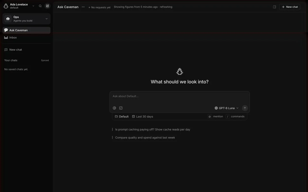
Announcement pill ("New Caveman Code"), split hero with download and web buttons, social proof (120k GitHub stars, #1 on Hacker News, Y Combinator), benchmark bar charts with savings percentages, interactive compression demos, comparison cards, press list, dated news feed. App: collapsible sidebar with projects and a queue view, centered empty state with mascot, large message composer with agent picker, run location (Cloud) and run count, settings with a left navigation, plan cards with pixel-art characters.

## Layout
Site content up to about 1280px with full-bleed dark sections; long pages with many demo blocks. App: 260px sidebar and a centered chat column; settings use a 240px navigation and a 900px content column.

## Tone
Confident and funny: short, cost-focused claims backed by benchmarks, with deliberate caveman phrasing as a signature.

### Overall aesthetic
Dark analytics dashboard in a Linear-like style.

### Page composition
Sidebar with workspace switcher, header with breadcrumbs, greeting, setup card with four steps, grid of metric cards.

### Typography
Inter 20px greeting, 13px labels, 26px numbers.

### Colors & surfaces
#09090A page, #121213 cards, hairline borders, light grey button.

### Components
Setup checklist card, metric cards with empty charts, sidebar sections, usage meter.

### Responsive
Metric grid collapses.

### Adaptation guidance
Put "saved" next to "spend" so a cost tool shows value, not just cost.

## Content

**Instructions:**

Generate realistic example content that fits the selected design reference.

Create appropriate headlines, descriptions, labels, buttons, and supporting copy based on the type of interface being designed.

If a product or business description is provided, use it to guide the content.

Otherwise, invent a plausible fictional SaaS product appropriate for the reference.

Keep the content concise, coherent, and visually balanced.

Do not present fictional statistics, customer names, or testimonials as verified facts.

## Design Direction

**Instructions:**

Use the reference screenshot as the main source of visual inspiration rather than a strict layout template.

Preserve its most distinctive design characteristics, such as typography, visual rhythm, color relationships, component treatments, and overall aesthetic.

Feel free to modify section arrangements, proportions, spacing, and individual components to better suit my content.

Introduce original design decisions where they improve usability, composition, or brand consistency.

The result should clearly reflect the reference's visual language without looking like a direct reproduction.

Follow the visual identity of the reference design.

Use its typography, color palette, component styling, and overall aesthetic as the primary design direction.

Do not introduce an unrelated visual identity.

## Output

**Instructions:**

Generate a high-fidelity visual mockup of the requested interface.

Present the design as a polished, realistic website or product UI screenshot.

Prioritize visual composition, typography, spacing, colors, alignment, and component details.

Use the available image-generation or visual-design capabilities.

Do not replace the mockup with source code, a written design specification, or a textual description.

If direct visual generation is unavailable, clearly explain the limitation.

## Constraints

- Use the actual screenshot as the primary visual reference.
- Preserve essential messaging and factual accuracy.
- Prioritize visual quality and consistency.
- Do not invent unsupported product claims.
- Adapt structure and copy length for visual balance.
Reference image Attach it to your message: assistants can’t open image links. Open in ChatGPT ↗ Open in Claude ↗
Build it in Lovable ↗ v0 ↗ Figma Make ↗
Opening a tool copies the screenshot so you can paste it with your prompt.
 SaaSFrame