Prompt 665 words Copy
# Design from Reference: Attio Blog Feed

Create an original, high-fidelity visual design inspired by the reference. Prioritize composition, typography, colors, spacing, and component styling over technical implementation.

## Reference

- **Product:** Attio
- **Category:** Blog Feed
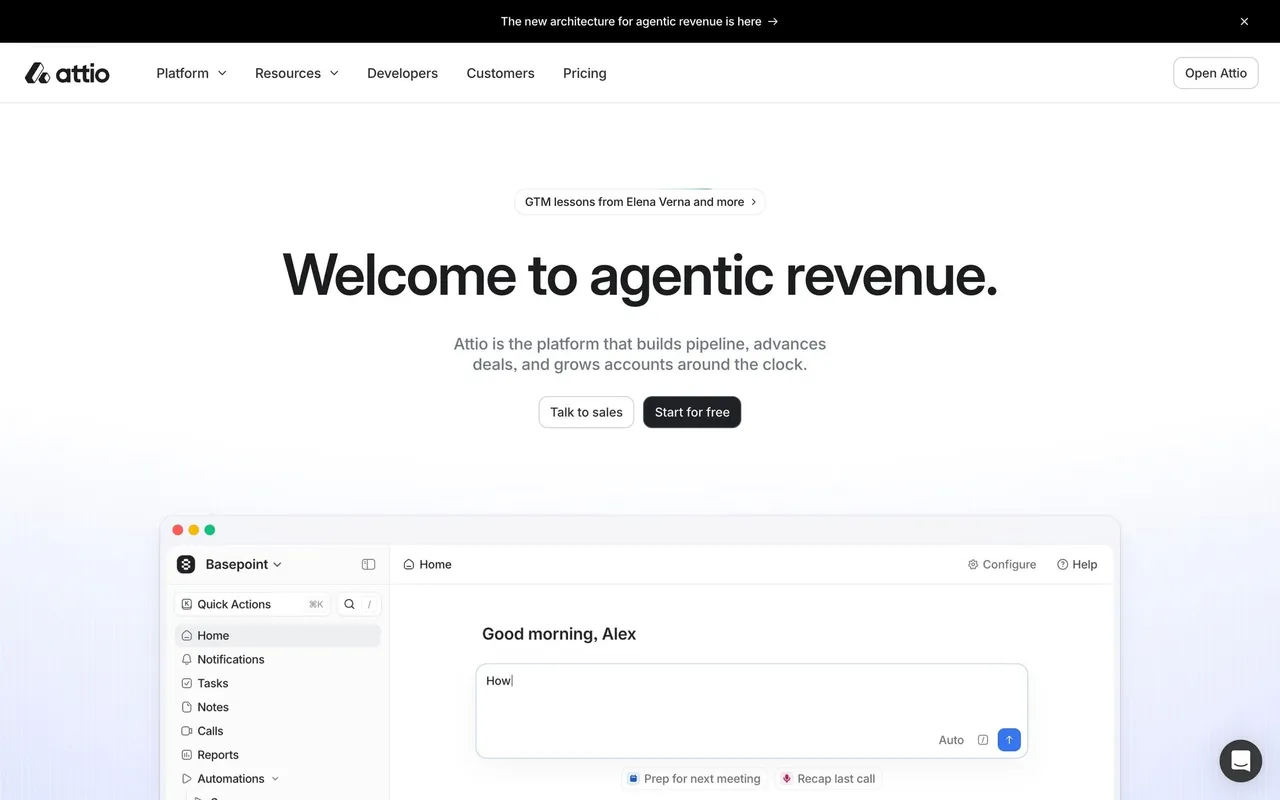
- **Screenshot:** attached to this message (also available at https://media.saasframe.io/v/4ac71e0a72646ed5dae6-1600.webp)
- **Source:** https://attio.com/blog

Analyze the attached screenshot first. If no image is attached, open the screenshot link; if neither is accessible, ask for it rather than guessing.

## Visual Design Context

### Brand
Attio is the CRM for agentic revenue: agents and workflows build pipeline, advance deals and grow accounts, grounded in a shared "Universal Context" layer. Precise, technical and calm.

### Website
White and #FBFBFB pages with a black announcement bar, sticky navigation with mega menus and a soft blue-violet haze under the hero. Inter Display semibold headlines (64px hero, 40px sections) with tight tracking, Inter 12 to 16px body, JetBrains Mono for bracketed labels such as [ DEVELOPER PLATFORM ] or CUSTOMERS / GRANOLA [CS 05]. Every claim is shown with large Attio app windows, workflow nodes or chat suggestions. Blue #266DF0 accents, mint highlights, near-black footers. Manifesto pages switch to Tiempos serif on warm beige and sage.

### Product (app.attio.com)
Dark interface by default (#101112 base, #17181A panels) with Inter, colored object icons (People blue, Companies blue, Deals orange, Users teal, Workspaces purple), thin borders and 8 to 12px radii, blue #266DF0 primary buttons with keyboard hints. Left sidebar (Home, Tasks, Notes, Emails, Calls, Reports, Sequences, Workflows, records, Getting started checklist), toolbars with view settings, sort and filter, spreadsheet-like tables and kanban boards. Ask Attio is a chat side panel and a prompt on Home. Onboarding is a dark split screen run by an AI concierge with a live preview of the workspace; empty states use grey line illustrations on a faint grid.

### Tone
Short, confident sentences in sentence case; second person; numbers and shortcuts visible.

### Overall aesthetic
Editorial grid with bracketed categories.

### Page composition
Featured post, post grid, pagination, footer.

### Typography
Inter Display titles, mono categories and dates.

### Colors & surfaces
White, cover images.

### Components
Post cards with author avatars.

### Responsive
One column.

### Adaptation guidance
Use bracketed mono labels for categories.

## Content

**Instructions:**

Generate realistic example content that fits the selected design reference.

Create appropriate headlines, descriptions, labels, buttons, and supporting copy based on the type of interface being designed.

If a product or business description is provided, use it to guide the content.

Otherwise, invent a plausible fictional SaaS product appropriate for the reference.

Keep the content concise, coherent, and visually balanced.

Do not present fictional statistics, customer names, or testimonials as verified facts.

## Design Direction

**Instructions:**

Use the reference screenshot as the main source of visual inspiration rather than a strict layout template.

Preserve its most distinctive design characteristics, such as typography, visual rhythm, color relationships, component treatments, and overall aesthetic.

Feel free to modify section arrangements, proportions, spacing, and individual components to better suit my content.

Introduce original design decisions where they improve usability, composition, or brand consistency.

The result should clearly reflect the reference's visual language without looking like a direct reproduction.

Follow the visual identity of the reference design.

Use its typography, color palette, component styling, and overall aesthetic as the primary design direction.

Do not introduce an unrelated visual identity.

## Output

**Instructions:**

Generate a high-fidelity visual mockup of the requested interface.

Present the design as a polished, realistic website or product UI screenshot.

Prioritize visual composition, typography, spacing, colors, alignment, and component details.

Use the available image-generation or visual-design capabilities.

Do not replace the mockup with source code, a written design specification, or a textual description.

If direct visual generation is unavailable, clearly explain the limitation.

## Constraints

- Use the actual screenshot as the primary visual reference.
- Preserve essential messaging and factual accuracy.
- Prioritize visual quality and consistency.
- Do not invent unsupported product claims.
- Adapt structure and copy length for visual balance.
Reference image Attach it to your message: assistants can’t open image links. Open in ChatGPT ↗ Open in Claude ↗
Build it in Lovable ↗ v0 ↗ Figma Make ↗
Opening a tool copies the screenshot so you can paste it with your prompt.
 SaaSFrame