SaaSFrame
About this section
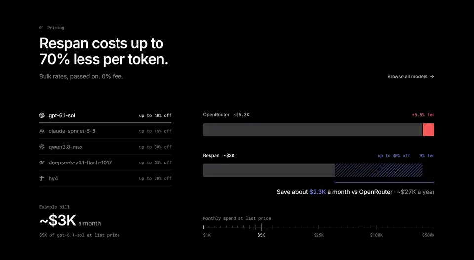
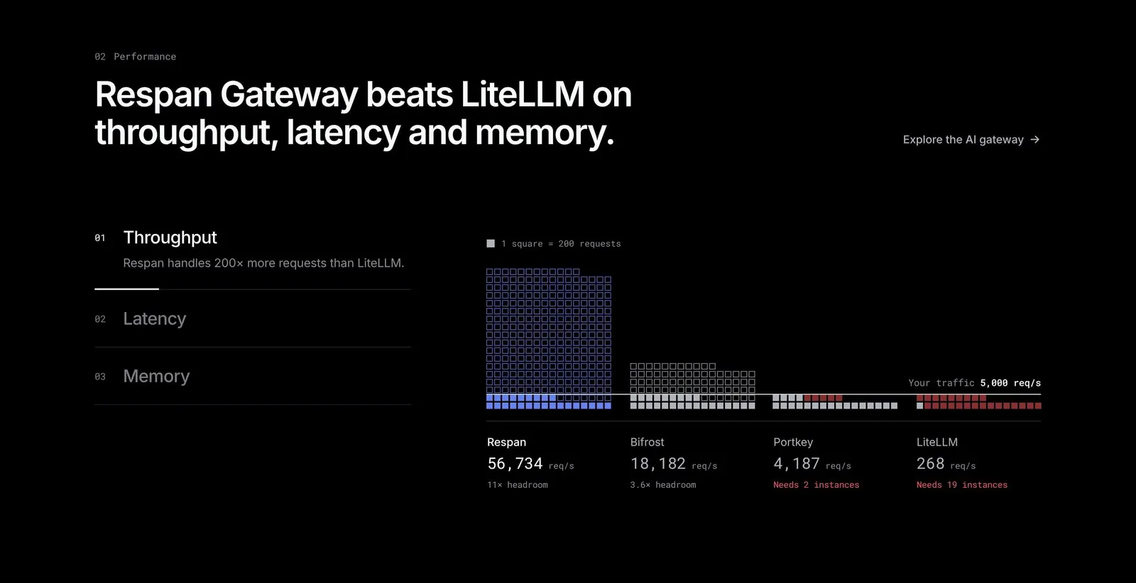
Respan's comparison section benchmarks its gateway against three rivals with a waffle chart of tiny squares, set on black. Tabs for throughput, latency and memory sit on the left, with the active one expanded. Monospace figures under each column and red tinted squares for the weaker results make the gap clear.