Prompt 707 words Copy
# Design from Reference: Slash Accounting Page

Create an original, high-fidelity visual design inspired by the reference. Prioritize composition, typography, colors, spacing, and component styling over technical implementation.

## Reference

- **Product:** Slash
- **Category:** Features Page
- **Screenshot:** attached to this message (also available at https://media.saasframe.io/v/0c82a6ee72a97d8af190-1600.webp)
- **Source:** https://www.slash.com/platform/accounting

Analyze the attached screenshot first. If no image is attached, open the screenshot link; if neither is accessible, ask for it rather than guessing.

## Visual Design Context

## Overall aesthetic
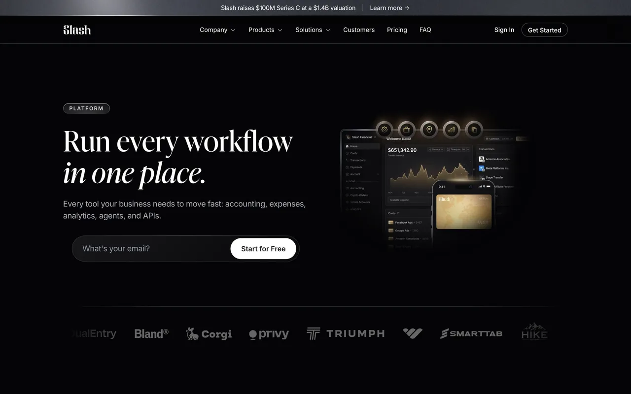
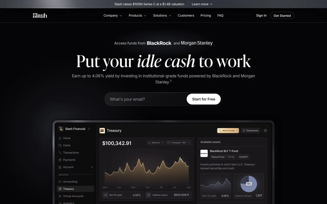
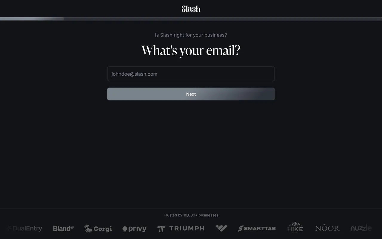
Slash is a business banking platform (cards, banking, treasury, stablecoin payments) with a dark, luxurious editorial look: near-black pages, an elegant serif for headlines, cinematic renders of metal cards and phones, and restrained white calls to action.

## Typography
Marketing headlines use Ivy Presto, a high-contrast serif, at 52–72px weight 400 with slight positive tracking; body and UI text use Inter 14–20px with tight negative tracking. The product app uses Inter only: 24px semibold step titles, 14px labels at weight 450–525.

## Colors & surfaces
Marketing: #040406 and #0B0C0E backgrounds, #18181B / #1C1D22 cards, greys #5E616E to #C7C9D1 for secondary text, white text, white pill buttons with dark text (48px tall, fully rounded) and an occasional warm gold (#CCB493) on pricing. App: warm near-black #181816 panels, hairline borders, 6–8px radii and a golden-yellow primary button.

## Components
Top announcement bar ("Slash raises $100M Series C"), mega-menu nav, email-capture hero inputs with a white Get Started button, logo marquees, bento feature grids with product UI fragments, testimonial carousels ("Real words, real impact"), pricing cards, FAQ accordions and a repeated "Apply in less than 10 minutes today" CTA band. App: vertical stepper wizard, compact form inputs, upload drop zones, option cards.

## Layout
Marketing content width 1216px with a narrower 832–1024px reading column; generous vertical spacing between sections. The app frames a left rail (stepper, benefits, testimonial) and a centered 450px form column.

## Tone
Confident and minimal copy, finance-grade trust cues (FDIC insurance, Column N.A. disclosures, footnote numbers on claims).

### Overall aesthetic
Dark feature page with accounting UI fragments.

### Page composition
Hero with integration badge, feature sections with transaction tables, testimonials, platform grid, pricing, FAQ, CTA.

### Typography
Ivy Presto 36–64px headings, Inter 14–24px body.

### Colors & surfaces
Black backgrounds, white and grey table fragments, accounting tool logos.

### Components
Transaction list previews, logo badges, accordion.

### Responsive
Tables crop into scrollable cards.

### Adaptation guidance
Show categorisation in a real table fragment and list supported integrations up front.

## Content

**Instructions:**

Generate realistic example content that fits the selected design reference.

Create appropriate headlines, descriptions, labels, buttons, and supporting copy based on the type of interface being designed.

If a product or business description is provided, use it to guide the content.

Otherwise, invent a plausible fictional SaaS product appropriate for the reference.

Keep the content concise, coherent, and visually balanced.

Do not present fictional statistics, customer names, or testimonials as verified facts.

## Design Direction

**Instructions:**

Use the reference screenshot as the main source of visual inspiration rather than a strict layout template.

Preserve its most distinctive design characteristics, such as typography, visual rhythm, color relationships, component treatments, and overall aesthetic.

Feel free to modify section arrangements, proportions, spacing, and individual components to better suit my content.

Introduce original design decisions where they improve usability, composition, or brand consistency.

The result should clearly reflect the reference's visual language without looking like a direct reproduction.

Follow the visual identity of the reference design.

Use its typography, color palette, component styling, and overall aesthetic as the primary design direction.

Do not introduce an unrelated visual identity.

## Output

**Instructions:**

Generate a high-fidelity visual mockup of the requested interface.

Present the design as a polished, realistic website or product UI screenshot.

Prioritize visual composition, typography, spacing, colors, alignment, and component details.

Use the available image-generation or visual-design capabilities.

Do not replace the mockup with source code, a written design specification, or a textual description.

If direct visual generation is unavailable, clearly explain the limitation.

## Constraints

- Use the actual screenshot as the primary visual reference.
- Preserve essential messaging and factual accuracy.
- Prioritize visual quality and consistency.
- Do not invent unsupported product claims.
- Adapt structure and copy length for visual balance.
Reference image Attach it to your message: assistants can’t open image links. Open in ChatGPT ↗ Open in Claude ↗
Build it in Lovable ↗ v0 ↗ Figma Make ↗
Opening a tool copies the screenshot so you can paste it with your prompt.
 SaaSFrame