Prompt 819 words Copy
# Design from Reference: Privacyboard Privacyboard for SaaS

Create an original, high-fidelity visual design inspired by the reference. Prioritize composition, typography, colors, spacing, and component styling over technical implementation.

## Reference

- **Product:** Privacyboard
- **Category:** Use Cases
- **Screenshot:** attached to this message (also available at https://media.saasframe.io/v/a73ed8d998143dac6c32-1600.webp)
- **Source:** https://privacyboard.io/for/saas

Analyze the attached screenshot first. If no image is attached, open the screenshot link; if neither is accessible, ask for it rather than guessing.

## Visual Design Context

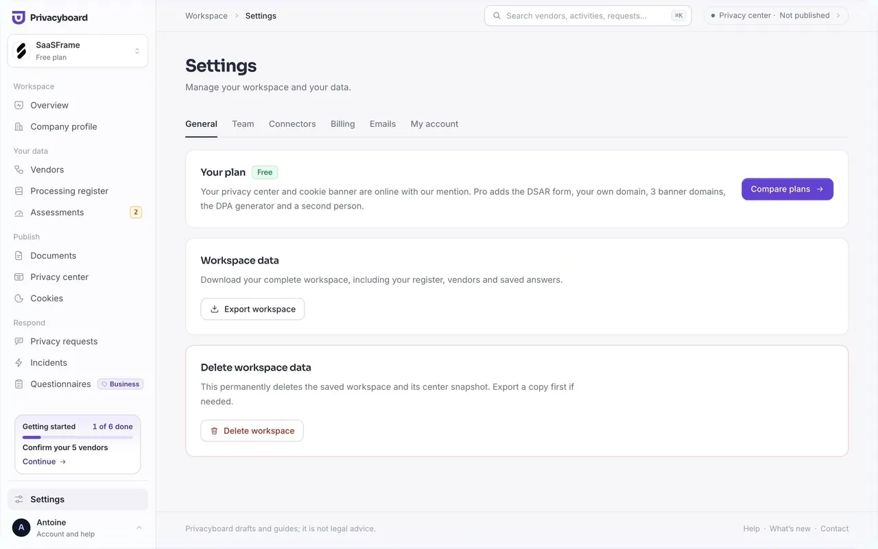
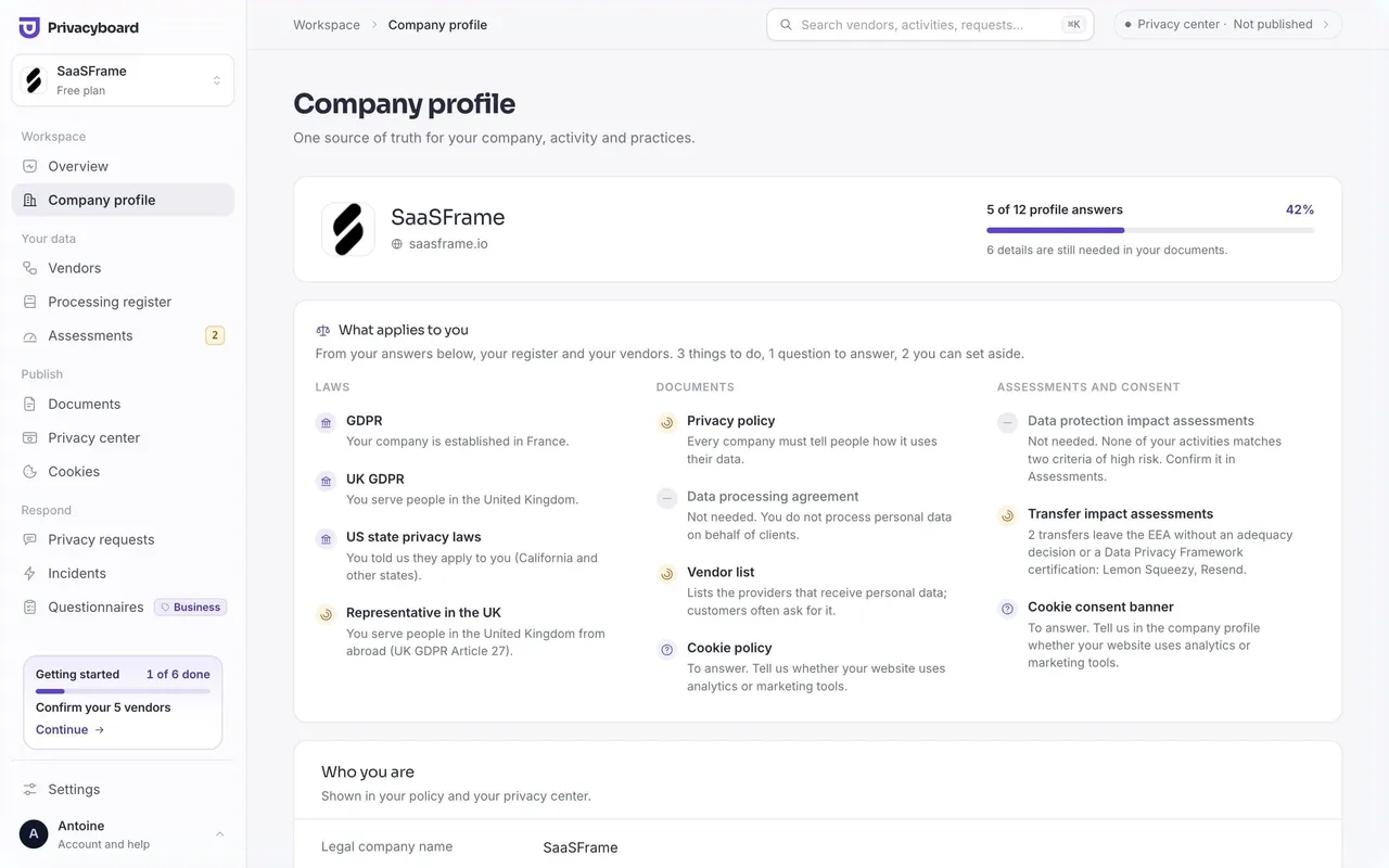
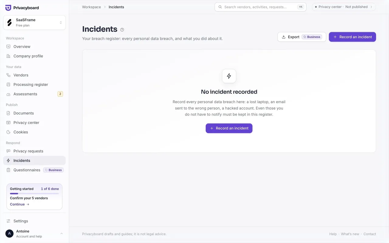
## Privacyboard — shared visual language
- **Theme:** Light, calm compliance tool. Cool off-white canvas #F6F6F9 with white cards (#FFFFFF, #FBFBFD for inner rows), thin #ECECF1 borders and almost no shadow; one violet accent carries every primary action.
- **Typography:** Sora for headings (page h1 Sora 28px w700, lh 32.2px, ls -0.784px, #262B3F; onboarding h1 Sora 24px w600), Inter for everything else (body Inter 14–14.5px w400, lh ~22px, #6B7185; labels 13px w500). Small uppercase mono eyebrows (ui-monospace 11px, wide tracking, violet) mark steps such as "NEXT STEP · 1 OF 6 DONE".
- **Colors:** Ink #262B3F, secondary #444A60 / #4B516A, muted #6B7185, placeholder #9AA0B4. Accent violet #6241D3 for primary buttons, selected chips and progress; tint #F1EFFF for selected chips and badges. Warning amber #FDF4E3 background with #A15C07 text ("to confirm", "TIA needed"); green for done states.
- **Components:** 240px left sidebar grouped by job (Workspace, Your data, Publish, Respond) with 1.5px-stroke icons, a workspace switcher card on top and the account at the bottom. Top bar with breadcrumb, a ⌘K search field and a privacy center status pill. Buttons 10px radius (violet filled or white outlined), pill chips 999px radius with a check when selected, tables in a white card with sortable headers and status pills, modals 14px radius over a dark scrim.
- **Layout:** Content column up to 1240px, 48px side padding, generous vertical spacing; each page opens with an h1, a one-line explanation and its actions on the right. A footer line repeats "Privacyboard drafts and guides; it is not legal advice."
- **Tone:** Plain, reassuring second-person copy that names the next action and the time it takes ("6 steps left, about 14 minutes"); legal terms are explained inline rather than assumed.

### Overall aesthetic
- **Mood:** Audience landing page in the site’s light style, organised around buyer situations.
### Page composition
- **Hero:** Breadcrumb, eyebrow pill "For SaaS and startups", four-line h1 (end in grey), intro, buttons, privacy center card on the right.
- **Body:** "In short" facts, 4 situation cards, three alternating text/visual rows, 3-step row, 10-card grid, security grid, two-column plan advice, pricing, FAQ, related features, dark CTA.
### Typography
- **h1:** Sora 54px w500, lh 56.16px, ls -2.16px, #171717.
- **Card titles:** Sora 16px w550, lh 24.8px; body Inter 15–18px #55555C.
### Colors & surfaces
- **Base:** #F7F7F8 page, white 20px cards, #F4F1FD tints, #111114 dark CTA.
### Components
- **Situation cards:** Small icon tile, title, two lines.
- **Buttons:** Primary violet #6241D3, 44px, 10px radius.
### Responsive
- **Mobile:** Grids become one column; pricing cards stack.
### Adaptation guidance
- **Lesson:** For a segment page, list the situations that segment runs into and map each to the product.

## Content

**Instructions:**

Generate realistic example content that fits the selected design reference.

Create appropriate headlines, descriptions, labels, buttons, and supporting copy based on the type of interface being designed.

If a product or business description is provided, use it to guide the content.

Otherwise, invent a plausible fictional SaaS product appropriate for the reference.

Keep the content concise, coherent, and visually balanced.

Do not present fictional statistics, customer names, or testimonials as verified facts.

## Design Direction

**Instructions:**

Use the reference screenshot as the main source of visual inspiration rather than a strict layout template.

Preserve its most distinctive design characteristics, such as typography, visual rhythm, color relationships, component treatments, and overall aesthetic.

Feel free to modify section arrangements, proportions, spacing, and individual components to better suit my content.

Introduce original design decisions where they improve usability, composition, or brand consistency.

The result should clearly reflect the reference's visual language without looking like a direct reproduction.

Follow the visual identity of the reference design.

Use its typography, color palette, component styling, and overall aesthetic as the primary design direction.

Do not introduce an unrelated visual identity.

## Output

**Instructions:**

Generate a high-fidelity visual mockup of the requested interface.

Present the design as a polished, realistic website or product UI screenshot.

Prioritize visual composition, typography, spacing, colors, alignment, and component details.

Use the available image-generation or visual-design capabilities.

Do not replace the mockup with source code, a written design specification, or a textual description.

If direct visual generation is unavailable, clearly explain the limitation.

## Constraints

- Use the actual screenshot as the primary visual reference.
- Preserve essential messaging and factual accuracy.
- Prioritize visual quality and consistency.
- Do not invent unsupported product claims.
- Adapt structure and copy length for visual balance.
Reference image Attach it to your message: assistants can’t open image links. Open in ChatGPT ↗ Open in Claude ↗
Build it in Lovable ↗ v0 ↗ Figma Make ↗
Opening a tool copies the screenshot so you can paste it with your prompt.
 SaaSFrame