Prompt 770 words Copy
# Design from Reference: Parallel Finance Use Case

Create an original, high-fidelity visual design inspired by the reference. Prioritize composition, typography, colors, spacing, and component styling over technical implementation.

## Reference

- **Product:** Parallel
- **Category:** Use Cases
- **Screenshot:** attached to this message (also available at https://media.saasframe.io/v/c70de893b08dd2bd629b-1600.webp)
- **Source:** https://parallel.ai/solutions/finance

Analyze the attached screenshot first. If no image is attached, open the screenshot link; if neither is accessible, ask for it rather than guessing.

## Visual Design Context

## Overall aesthetic
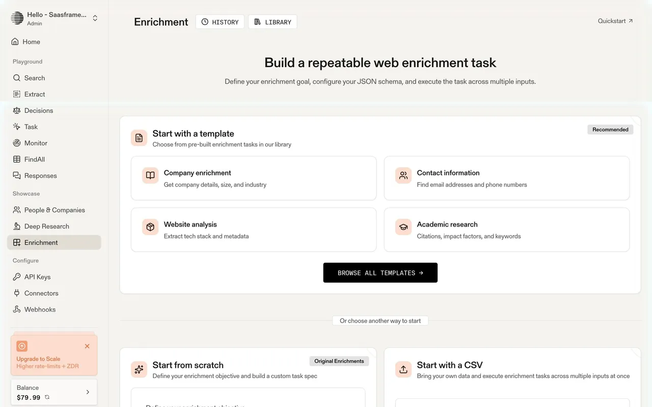
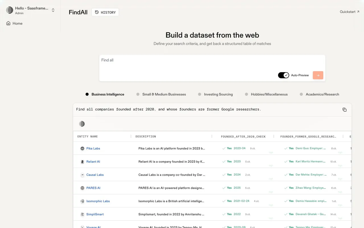
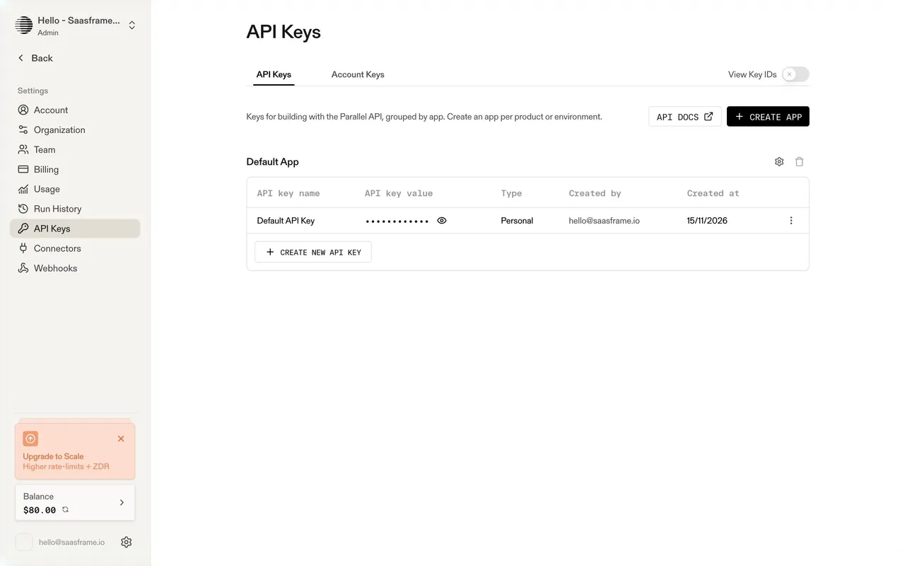
Parallel builds web search and research APIs for AI agents. The marketing site has a calm, editorial, almost archival feel: warm off-white backgrounds, monochrome UI with mono uppercase labels, technical diagrams and live product demos, plus a "Human / Machine" toggle in the header that switches the site to an agent-readable version. The platform (playground and settings) is warm beige and minimal, with orange used sparingly for primary actions.

## Typography
Marketing uses Gerstner Programm (a grotesk) for headings at a restrained 36px and body text, with a monospace for labels, buttons and demo content in uppercase ("START BUILDING FOR FREE"). The platform uses a sans serif at 28–36px for page titles, 14–15px UI text and monospace uppercase button labels ("GET API CODE", "SEARCH").

## Colors & surfaces
Marketing: #FFFFFF and warm greys (#F5F4F1, #EBE9E3, #F6F6F6), charcoal #434343 buttons (34px, 4px radius), muted blue accents (#8FB6CC, #548FD1) and an orange #FB631B used for highlights. Platform: #F4F3F0 page, white cards, #E0DDD6 secondary buttons (8px radius), orange #FF580A for primary actions and pale orange #FCDDCF badges, near-black #171717 for dark buttons.

## Components
Announcement bar, Human / Machine toggle, interactive API demos (Research, Monitor, Search, Extract tabs with a Run button), logo walls, case study cards, pricing cards, savings calculator with a slider, integration directory with category filters. Platform: sidebar grouped into Playground, Showcase and Configure, balance card and upgrade banner, query inputs with chips, mode selects, results panels with Human / Machine views, data tables with citations and confidence, settings tabs with tables.

## Layout
Marketing content around 1200px with wide gutters and generous vertical spacing. Platform: 240px sidebar and content up to about 1200px; onboarding is a split screen with the form on the left and an animated sphere of web imagery on the right.

## Tone
Precise and calm, aimed at engineers building agents: "Where agents find answers", "Web Research APIs for AIs".

### Overall aesthetic
Industry landing page with data-table hero.

### Page composition
Hero with CTAs, tabbed demo table, logos, case study, benchmark callout, use-case blocks.

### Typography
Gerstner Programm headings, monospace table headers and numbers.

### Colors & surfaces
Warm neutrals, green and red deltas in the table.

### Components
Tabs, data table, badge, case study card.

### Responsive
Table scrolls; sections stack.

### Adaptation guidance
For vertical pages, show the product on that industry's data in the hero.

## Content

**Instructions:**

Generate realistic example content that fits the selected design reference.

Create appropriate headlines, descriptions, labels, buttons, and supporting copy based on the type of interface being designed.

If a product or business description is provided, use it to guide the content.

Otherwise, invent a plausible fictional SaaS product appropriate for the reference.

Keep the content concise, coherent, and visually balanced.

Do not present fictional statistics, customer names, or testimonials as verified facts.

## Design Direction

**Instructions:**

Use the reference screenshot as the main source of visual inspiration rather than a strict layout template.

Preserve its most distinctive design characteristics, such as typography, visual rhythm, color relationships, component treatments, and overall aesthetic.

Feel free to modify section arrangements, proportions, spacing, and individual components to better suit my content.

Introduce original design decisions where they improve usability, composition, or brand consistency.

The result should clearly reflect the reference's visual language without looking like a direct reproduction.

Follow the visual identity of the reference design.

Use its typography, color palette, component styling, and overall aesthetic as the primary design direction.

Do not introduce an unrelated visual identity.

## Output

**Instructions:**

Generate a high-fidelity visual mockup of the requested interface.

Present the design as a polished, realistic website or product UI screenshot.

Prioritize visual composition, typography, spacing, colors, alignment, and component details.

Use the available image-generation or visual-design capabilities.

Do not replace the mockup with source code, a written design specification, or a textual description.

If direct visual generation is unavailable, clearly explain the limitation.

## Constraints

- Use the actual screenshot as the primary visual reference.
- Preserve essential messaging and factual accuracy.
- Prioritize visual quality and consistency.
- Do not invent unsupported product claims.
- Adapt structure and copy length for visual balance.
Reference image Attach it to your message: assistants can’t open image links. Open in ChatGPT ↗ Open in Claude ↗
Build it in Lovable ↗ v0 ↗ Figma Make ↗
Opening a tool copies the screenshot so you can paste it with your prompt.
 SaaSFrame