Prompt 1,455 words Copy
# Design from Reference: Mapbox Landing Page

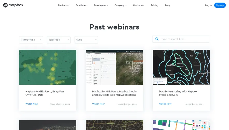
Create an original, high-fidelity visual design inspired by the reference. Prioritize composition, typography, colors, spacing, and component styling over technical implementation.

## Reference

- **Product:** Mapbox
- **Category:** Landing Page
- **Screenshot:** attached to this message (also available at https://media.saasframe.io/o/d9ac9260f8b5369a1026.webp)
- **Source:** https://www.mapbox.com/

Analyze the attached screenshot first. If no image is attached, open the screenshot link; if neither is accessible, ask for it rather than guessing.

## Visual Design Context

### Overall aesthetic

- **Style:** Dark developer-platform landing page with oversized white typography, vivid blue actions and large map/device imagery.
- **Character:** Technical product demonstrations dominate, while restrained gray copy and broad dark space keep the long page cohesive.
- **Capture:** The image measures 1440 × 9042 pixels. CSS estimates assume approximately 1:1 capture scale; browser scale and font identity are unverified.

### Page composition

- **Header:** A compact horizontal navigation places the white wordmark left, grouped product/company links centrally and login/signup right.
- **Hero:** A large centered two-line headline, two-line supporting description and blue start action lead the page.
- **Media carousel:** A large central video thumbnail with play icon sits over partially visible neighboring slides, with two small navigation chevrons below.
- **Customer proof:** A small uppercase label introduces ten customer logos in two rows, followed by a story link.
- **Product sequence:** Navigation, Studio, Maps, Search, Vision, Data and Atlas appear as large spaced sections pairing explanatory copy and product imagery.
- **Navigation and maps:** Oversized phone/tablet map mockups extend across the width, sometimes cropped at the viewport edges.
- **Customer showcase:** A dark elevated horizontal panel pairs a customer story with phone and paper-route imagery.
- **Closing:** A rounded conversion panel offers signup and sales routes, followed by a broad footer with three link columns and lower legal/social details.
- **Overlays:** A compact cookie notice appears near the footer and a back-to-top control sits at right.

### Information hierarchy

- **Hero proposition:** The largest type establishes mapping and location for developers; supporting copy and action follow centrally.
- **Visual proof:** The carousel and customer logos precede detailed product explanations.
- **Product headings:** Large white names anchor each feature section, above muted descriptions and outlined destination pills.
- **Demonstration priority:** Devices and maps occupy substantially more area than the copy, emphasizing product output.
- **Showcase distinction:** A small green category badge and customer logo distinguish the case-study panel from product sections.
- **Conversion:** The final panel repeats free signup as a filled blue action and contact as an outlined alternative.
- **Footer:** Small uppercase labels organize product, company and developer links.

### Typography

- **Family:** A rounded geometric sans-serif is visible; exact font identity is unverified.
- **Hero heading:** Approximately 76–80-pixel CSS size, bold, with around 80-pixel line height and tight tracking.
- **Hero description:** Approximately 24 pixels with 34-pixel line height.
- **Product headings:** Approximately 40–44 pixels, bold, with 50-pixel line height.
- **Body copy:** Approximately 18–20 pixels with 30–32-pixel line height, using visibly relaxed tracking.
- **Actions:** Approximately 14–16 pixels, semibold, within compact pill controls.
- **Labels:** Small uppercase customer/showcase/footer labels use around 11–12 pixels with increased tracking.
- **Footer links:** Approximately 14 pixels with a generous 40-pixel vertical cadence.

### Colors & surfaces

- **Measured canvas:** Near-black #0E1011 fills most of the page.
- **Measured panel tones:** #161A1E, #181C1F and #1F222A occur among elevated dark surfaces and product imagery.
- **Measured highlights:** White #FFFFFF supports headings and logos; #010101 and #111111 appear in device frames/dark artwork.
- **Accent roles:** Bright blue marks signup and primary actions; a green badge identifies the customer showcase.
- **Secondary text:** Cool gray descriptions and logos reduce contrast relative to white headings.
- **Image palette:** Cyan routes, warm data dots, satellite terrain, bright white search UI and road footage provide most color variation.
- **Depth:** Device frames, layered interface panels and carousel shadows create dimensionality; the base page remains mostly flat.

### Components

- **Header signup:** A small bright-blue pill sits beside login; grouped links include down chevrons.
- **Hero action:** A blue pill approximately 234 × 48 pixels contains a white start label.
- **Video tile:** A large rounded central thumbnail shows an in-car demonstration with a white triangular play icon.
- **Customer grid:** Ten monochrome gray logos align in two evenly spaced rows.
- **Outlined product links:** Thin gray pill borders contain white labels and right arrows beneath descriptions.
- **Navigation mockups:** A phone and larger landscape tablet show dark route maps, turn guidance, speed information and control overlays.
- **Studio illustration:** A desktop map editor is surrounded by floating layer/color panels, demonstrating map customization.
- **Map examples:** Large dark data and satellite/terrain views appear within rounded device-like frames.
- **Search illustration:** A phone map is overlapped by search suggestions and category panels.
- **Customer showcase:** A wide rounded charcoal panel combines a small badge, logo, short copy and story control with large route-planning imagery.
- **Vision, Data and Atlas:** Road-detection footage, a dark point/area map and a multi-device map-editor montage support their respective sections.
- **Cookie notice:** A compact dark rounded bar contains a policy link and small blue agreement button near the footer.
- **State scope:** Carousel, media and product mockups are static captured presentations; their live interactions are not evidenced.

### Visual rhythm

- **Container:** Most copy aligns around 80-pixel side gutters, while selected imagery expands beyond the usual container.
- **Section pacing:** Very large vertical breaks separate product modules across the long page.
- **Alternation:** Left/right text-image pairings alternate with full-width device compositions and a horizontal showcase card.
- **Contrast cadence:** Bright detailed map UI repeatedly emerges from the dark background, then returns to quiet text-led space.
- **Action consistency:** Filled blue primary pills and outlined secondary pills recur with stable shape and scale.
- **Footer density:** The final link region becomes more compact while retaining broad horizontal spacing.

### Responsive

- **Recommendation — navigation:** Collapse the long header menu while retaining login and signup.
- **Recommendation — hero:** Scale large type fluidly and keep the start action visible before oversized media.
- **Recommendation — imagery:** Fit/crop device mockups deliberately and provide enlarged views when map labels become too small.
- **Recommendation — pairings:** Stack text and visuals consistently on narrow screens; preserve heading-to-demonstration association.
- **Recommendation — footer and overlays:** Wrap columns and ensure cookie/back-to-top controls do not obscure links. No mobile page layout is evidenced.

### Adaptation guidance

- **Preserve product-led storytelling:** Lead with developer value and visual proof, then introduce individual mapping capabilities.
- **Reuse dark contrast:** Keep near-black canvas, white headings, gray copy and blue actions consistent.
- **Give maps room:** Use large accurate product demonstrations rather than replacing them with generic decorative imagery.
- **Standardize section modules:** Share heading, description and outlined-link patterns while allowing varied visual compositions.
- **Separate customer proof:** Retain logos and the showcase as distinct evidence layers.
- **Define interactions separately:** Carousel progression, video playback, map behavior and cookie acceptance require implementation beyond the static capture.

## Content

**Instructions:**

Generate realistic example content that fits the selected design reference.

Create appropriate headlines, descriptions, labels, buttons, and supporting copy based on the type of interface being designed.

If a product or business description is provided, use it to guide the content.

Otherwise, invent a plausible fictional SaaS product appropriate for the reference.

Keep the content concise, coherent, and visually balanced.

Do not present fictional statistics, customer names, or testimonials as verified facts.

## Design Direction

**Instructions:**

Use the reference screenshot as the main source of visual inspiration rather than a strict layout template.

Preserve its most distinctive design characteristics, such as typography, visual rhythm, color relationships, component treatments, and overall aesthetic.

Feel free to modify section arrangements, proportions, spacing, and individual components to better suit my content.

Introduce original design decisions where they improve usability, composition, or brand consistency.

The result should clearly reflect the reference's visual language without looking like a direct reproduction.

Follow the visual identity of the reference design.

Use its typography, color palette, component styling, and overall aesthetic as the primary design direction.

Do not introduce an unrelated visual identity.

## Output

**Instructions:**

Generate a high-fidelity visual mockup of the requested interface.

Present the design as a polished, realistic website or product UI screenshot.

Prioritize visual composition, typography, spacing, colors, alignment, and component details.

Use the available image-generation or visual-design capabilities.

Do not replace the mockup with source code, a written design specification, or a textual description.

If direct visual generation is unavailable, clearly explain the limitation.

## Constraints

- Use the actual screenshot as the primary visual reference.
- Preserve essential messaging and factual accuracy.
- Prioritize visual quality and consistency.
- Do not invent unsupported product claims.
- Adapt structure and copy length for visual balance.
Reference image Attach it to your message: assistants can’t open image links. Open in ChatGPT ↗ Open in Claude ↗
Build it in Lovable ↗ v0 ↗ Figma Make ↗
Opening a tool copies the screenshot so you can paste it with your prompt.
 SaaSFrame