Generate a new design based on this screen, using your own content.
Preview the prompt
# Design from Reference: Loops Appearance Customization

Create an original, high-fidelity visual design inspired by the reference. Prioritize composition, typography, colors, spacing and component styling over technical implementation.

## Reference

- **Product:** Loops
- **Category:** Appearance Customization
- **Screenshot:** https://media.saasframe.io/v/43ca46b34db92fbfd325-1600.webp

Analyze the screenshot first. If you can’t access it, ask me for it rather than guessing.

## Content

Write realistic placeholder content for a fictional SaaS product in the same category (no lorem ipsum).

Preserve essential messaging and factual accuracy. Adapt structure and copy length for visual balance; never invent product claims.

## Visual design

Use this context to reproduce the reference’s visual language: layout, typography, colors, spacing, borders, radii and distinctive elements. The screenshot takes priority if descriptions conflict.

### Overall aesthetic

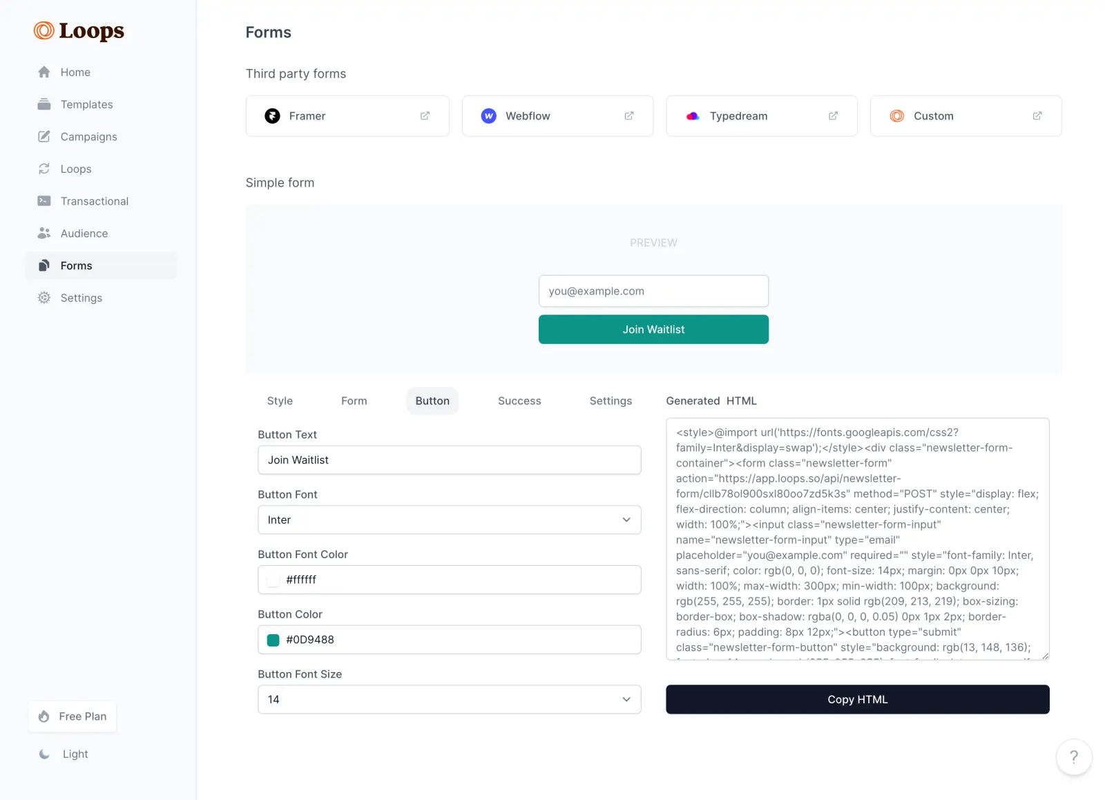
- **Character:** A restrained form-builder dashboard uses pale-gray navigation, white controls, dark slate typography and teal for the live preview action.
- **Evidence scale:** The screenshot is 2880 × 2084 pixels. Dimensions below estimate CSS pixels at an unverified 2× capture density.

### Page composition

- **Sidebar:** A roughly 256-pixel-wide rail contains the Loops wordmark, eight icon-and-label destinations and plan/theme controls near the bottom.
- **Top content:** The Forms title precedes four third-party integration tiles for Framer, Webflow, Typedream and Custom.
- **Preview:** A large pale panel centers a simple email field and Join Waitlist button below a muted PREVIEW label.
- **Editor/output split:** The lower area places a five-tab customization editor on the left and a Generated HTML text area with a full-width copy action on the right.

### Information hierarchy

- **Location:** Forms is selected in the sidebar, with its page title repeated at the top of the main content.
- **Workflow:** Third-party options are separate from the simple-form preview, which makes the rendered result visible before configuration controls.
- **Active editing:** Button is the selected editor tab; labeled fields expose text, font, text color, fill color and size.
- **Export:** The HTML panel and dark Copy HTML action make the generated output a clear secondary destination.

### Typography

- **Page title:** Approximately 22 pixels semibold with a compact line-height.
- **Labels and navigation:** Mostly 14–16 pixels, regular-to-medium weight; field labels are smaller than section labels.
- **Preview text:** The visible font setting reads Inter and size 14. This is evidence of the selected preview configuration, not proof of the dashboard's font family.
- **Output text:** The HTML area uses compact gray text with approximately 20-pixel leading; its rendered appearance is proportional rather than strongly monospaced.

### Colors & surfaces

- **Measured base:** ICC-to-sRGB sampling identifies #FFFFFF for controls/canvas, #F9FAFB for pale surfaces, #F3F4F6 for selected backgrounds and #0F1828 for dark foreground/action areas.
- **Measured support:** #687281 supplies muted text and #D0D5DB outlines.
- **Preview accent:** The sampled dominant teal is #009788; the visible configured field reads #0D9488. Preserve the distinction between screenshot pixels and the displayed configuration value.
- **Visual depth:** Inputs use thin borders and subtle shadows; broad panels remain flat and softly differentiated.

### Components

- **Integration tiles:** Four outlined rounded rectangles, roughly 250–265 pixels wide and 54 pixels tall, with an app mark left and external-link icon right.
- **Preview form:** A centered approximately 300-pixel-wide email field and teal action stack with a small gap; both have roughly 6-pixel rounding.
- **Editor tabs:** Style, Form, Button, Success and Settings share one row; Button sits on a pale rounded active background.
- **Configuration fields:** Full-width outlined controls are about 38–40 pixels tall. Font and size fields include dropdown chevrons; color rows include small swatches.
- **Output area:** A tall bordered text area with resize grip sits above a roughly 40-pixel-high dark Copy HTML button.
- **Utilities:** The sidebar plan control is a small white chip, theme control uses a moon symbol and a circular help button sits at bottom right.

### Visual rhythm

- **Main alignment:** Content begins approximately 64 pixels after the sidebar edge; third-party tiles and preview share the same broad horizontal bounds.
- **Vertical grouping:** Clear 40–50-pixel gaps separate integration options, preview and customization areas.
- **Control cadence:** Editor labels sit close above their fields, while successive settings have consistent roughly 20-pixel separation.
- **Column balance:** The editor and output occupy similar widths, with a modest central gutter and aligned upper labels.

### Responsive

- **Observed scope:** Only the desktop Button-tab state is visible; no dropdown, focus or success view is shown.
- **Recommended layout:** Collapse the sidebar, wrap integration tiles and stack generated output beneath customization controls on narrow screens.
- **Recommended preview:** Keep the sample form fluid within padded bounds, preserve horizontal tab access and prevent long HTML content from widening the page.

### Adaptation guidance

- **Builder pattern:** Separate destination integrations, live preview, property editing and generated output into clearly labeled regions.
- **Configuration fidelity:** Keep displayed settings synchronized with preview/output; distinguish configured hex values from screenshot sampling when reconstructing tokens.
- **Interaction detail:** Provide persistent labels, accessible color inputs, clear copy feedback and keyboard focus. Use the visible Inter setting only for the configured form unless other evidence confirms the application font.

## Direction

Keep the reference’s visual language (type, color, spacing, radii) but adapt the layout freely to the content.

## Output

Produce a high-fidelity static visual mockup of the full screen.

Deliver a polished, cohesive design with precise alignment, hierarchy and spacing. Produce the requested visual artifact, not just a description. If unsupported, explain the limitation.
 SaaSFrame