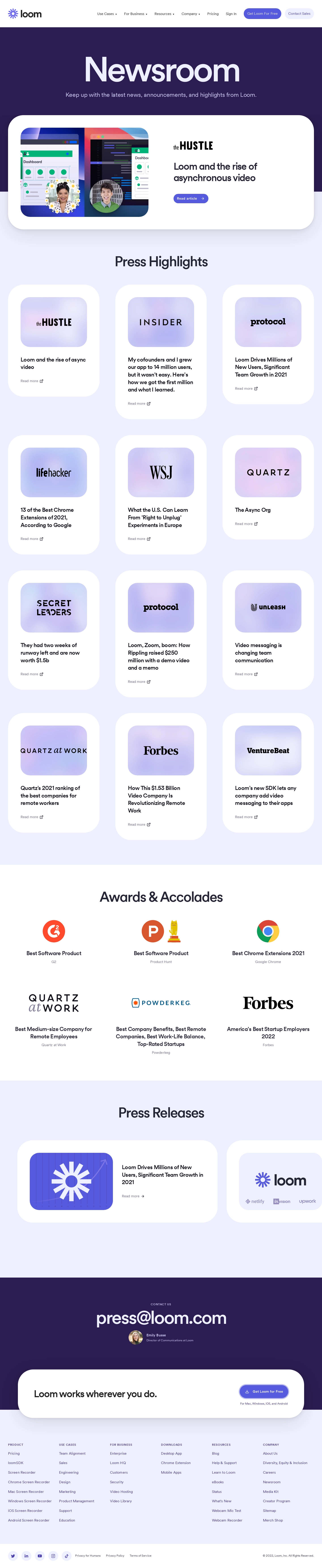
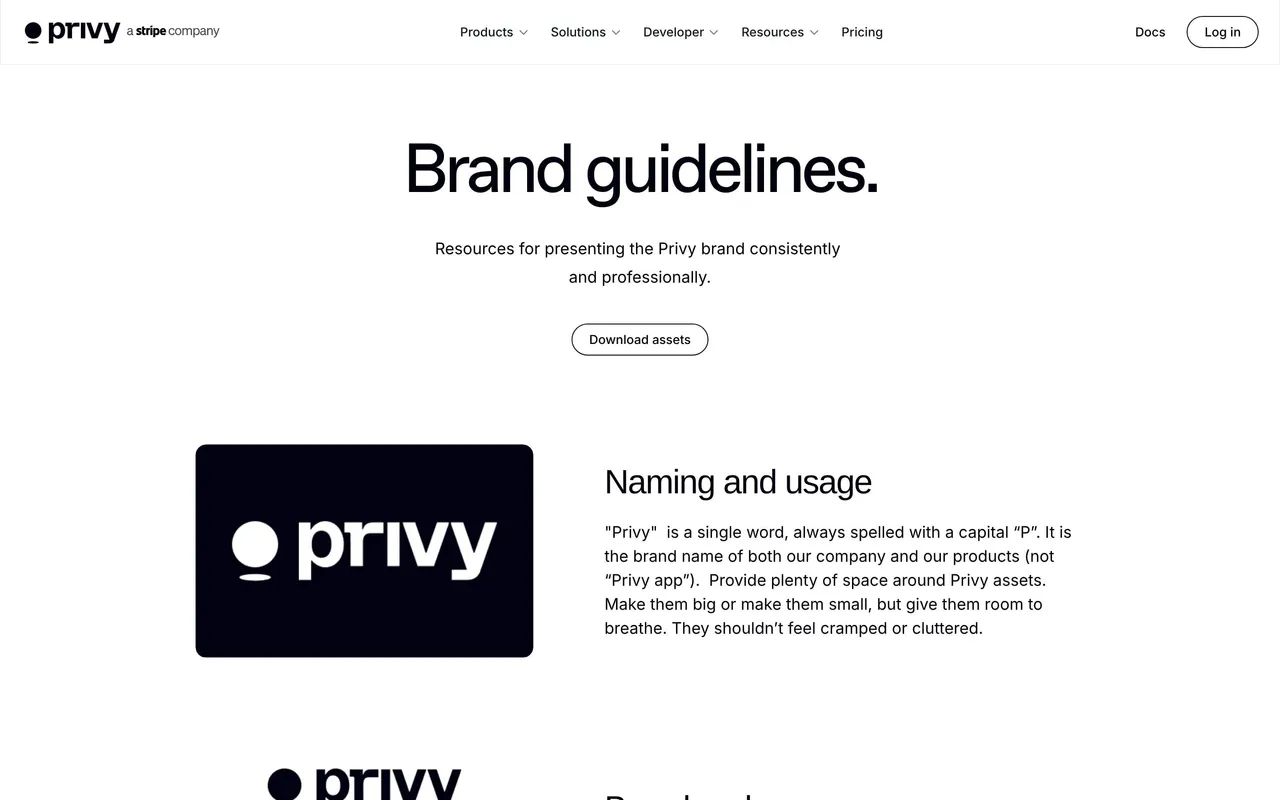
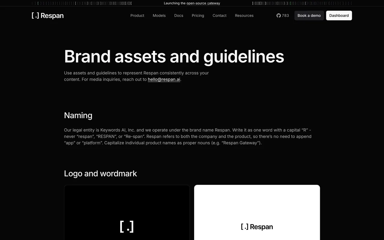
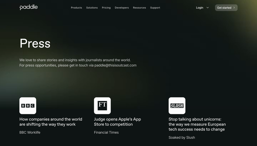
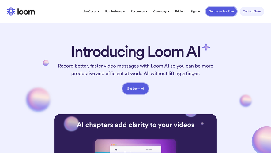
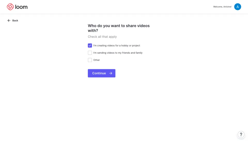
Loom's newsroom page opens with a bold deep purple hero section and that big serif "Newsroom" headline. It's confident. The featured article from The Hustle sits right below with a clean card layout and a subtle browser mockup that adds depth without feeling gimmicky.
Grid Work That Breathes
The Press Highlights section uses a 3-column card grid with generous white space. Each card gets a publication logo, a brief excerpt, and a "Read more" link. No clutter. The logos alone do heavy lifting for credibility. Below that, a second row follows the same pattern with WSJ, Lifehacker, and Quartz. Consistency without monotony.
Purple Does the Heavy Lifting
That signature Loom purple ties everything together. It frames the hero, accents the award badges, and anchors the press release section lower down. The typography shifts between a decorative serif for headlines and clean sans-serif for body text, creating a natural hierarchy. The Awards & Accolades section with G2, Forbes, and Powderkeg badges is a smart trust signal. Simple but effective layout overall.
 SaaSFrame