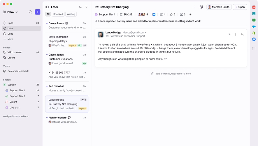
Generate a new design based on this screen, using your own content.
Preview the prompt
# Design from Reference: Front Chat

Create an original, high-fidelity visual design inspired by the reference. Prioritize composition, typography, colors, spacing and component styling over technical implementation.

## Reference

- **Product:** Front
- **Category:** Chat
- **Screenshot:** https://media.saasframe.io/v/d7c28f90a40fb025b6ed-1600.webp

Analyze the screenshot first. If you can’t access it, ask me for it rather than guessing.

## Content

Write realistic placeholder content for a fictional SaaS product in the same category (no lorem ipsum).

Preserve essential messaging and factual accuracy. Adapt structure and copy length for visual balance; never invent product claims.

## Visual design

Use this context to reproduce the reference’s visual language: layout, typography, colors, spacing, borders, radii and distinctive elements. The screenshot takes priority if descriptions conflict.

### Overall aesthetic
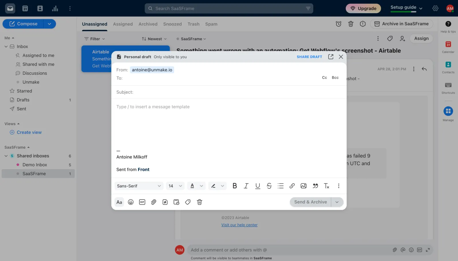
- **Character:** White email-composer modal over a dimmed shared-inbox application, with cool-gray chrome and blue draft accents.
- **Visual emphasis:** A large blank editor and dense formatting toolbar define the task.
- **Scale:** The source measures 5760 × 3284 px. Dimensions below estimate a 1440 × 821 CSS layout at 4× scale; device ratio and zoom are unverified.

### Page composition
- **Shell:** Dark top bar, left inbox navigation, message list/content and right app rail remain visible behind the dimmer.
- **Composer:** A centered approximately 740 × 500 CSS px panel has rounded corners and shadow.
- **Header:** Personal draft/privacy label sits left; share, pop-out and close controls right.
- **Fields:** From, To and Subject rows precede a large blank body with a template hint and short signature.
- **Toolbars:** Formatting controls occupy one lower row; insertion/utility icons and pale send action occupy the bottom row.

### Information hierarchy
- **Draft state:** The header explicitly indicates a personal draft visible only to the user.
- **Addressing:** Sender is populated; recipient and subject are empty.
- **Body:** A pale template hint marks the blank composition area.
- **Actions:** Share draft is a blue header link; Send & Archive appears pale/disabled.
- **State:** No message is sent, shared or archived in this task.

### Typography
- **Family:** Neutral interface sans-serif; exact identity is unverified.
- **Header/fields:** Approximately 13–14 px, with bold draft label.
- **Body:** Around 14 px; placeholder is muted.
- **Formatting:** Visible font/size selectors are UI controls, not verified rendered email CSS.
- **Signature:** Plain text with bold brand word.

### Colors & surfaces
- **Measured base:** ICC-aware sRGB sampling yields #FFFFFF and #F3F4F6.
- **Measured chrome:** #E0E4EA appears in composer header/controls.
- **Measured composites:** #B2B2B2, #ACACAC and #9DA1A3 occur in dimmed background regions; these are overlay-composited colors.
- **Measured dark/accent:** #001429 and #344252 appear in shell chrome; #0A59AC is a blue accent.
- **Depth:** Soft shadow and roughly 14 px corners elevate the composer.

### Components
- **Address fields:** Plain horizontal rows use thin separators; Cc/Bcc controls sit at the recipient row's right.
- **Editor:** Large white body region has no visible content beyond signature.
- **Formatting bar:** Font, size, text color/highlight, bold/italic/underline/strike, lists, link, image and quote controls run horizontally.
- **Bottom tools:** Small icon buttons provide additional insertion/utility actions.
- **Send group:** Pale rounded split button contains Send & Archive and a down chevron.
- **Header utilities:** Share draft, pop-out and X remain compact.

### Visual rhythm
- **Rows:** Compact addressing contrasts with the tall blank editor.
- **Alignment:** Labels and body content share a consistent left inset.
- **Toolbar density:** Repeated small controls form two orderly lower bands.
- **Overlay:** Background recedes while preserving inbox context.

### Responsive
- **Evidence limit:** Only desktop is shown; recommendations follow.
- **Composer:** Use full-screen width on mobile.
- **Tools:** Collapse formatting into accessible overflow groups.
- **Actions:** Keep send state and addressing visible without obscuring body content.

### Adaptation guidance
- **Reusable pattern:** Separate draft privacy, addressing, body and formatting/action zones.
- **State clarity:** Explain disabled sending and distinguish personal/shared drafts.
- **Privacy:** Avoid reproducing sender/recipient details in reusable examples.
- **Accessibility:** Label icon controls, preserve keyboard editing and trap/restore modal focus.

## Direction

Keep the reference’s visual language (type, color, spacing, radii) but adapt the layout freely to the content.

## Output

Produce a high-fidelity static visual mockup of the full screen.

Deliver a polished, cohesive design with precise alignment, hierarchy and spacing. Produce the requested visual artifact, not just a description. If unsupported, explain the limitation.
 SaaSFrame