Prompt 755 words Copy
# Design from Reference: Composal Knowledge Documents

Create an original, high-fidelity visual design inspired by the reference. Prioritize composition, typography, colors, spacing, and component styling over technical implementation.

## Reference

- **Product:** Composal
- **Category:** Details
- **Screenshot:** attached to this message (also available at https://media.saasframe.io/v/87ff234418471f30a475-1600.webp)
- **Source:** https://composal.com/saasframe/verify/acme-notes/knowledge

Analyze the attached screenshot first. If no image is attached, open the screenshot link; if neither is accessible, ask for it rather than guessing.

## Visual Design Context

## Overall aesthetic
Composal is a QA platform where browser agents test real user flows. The marketing site is clean and bright: white pages, very large tight headlines, product UI fragments (pull request checks, run timelines, terminal output) and a signature acid-yellow accent. The Verify app is a dense, developer-tool dark interface in near-black, close to Linear or Vercel.

## Typography
Geist everywhere, with Geist Mono for prompts, commands and code. Marketing headlines are Geist 600 at 60–96px with very tight tracking (about -3px at 84px); body copy 16–18px. The app uses small type: 18px semibold page titles, 13–14px labels, 11–12px metadata.

## Colors & surfaces
Marketing: #FFFFFF backgrounds, #F6F8FA and #F3F4F6 panels, near-black #111827 / #161616 text and UI mockups, acid yellow #F1F93C for highlights and primary buttons, rose #F43F5E for failures. App: #0A0A0A to #161616 surfaces, hairline borders, white primary buttons, yellow #F1F93C reserved for the demo badge and key calls to action, green/red/orange status dots.

## Components
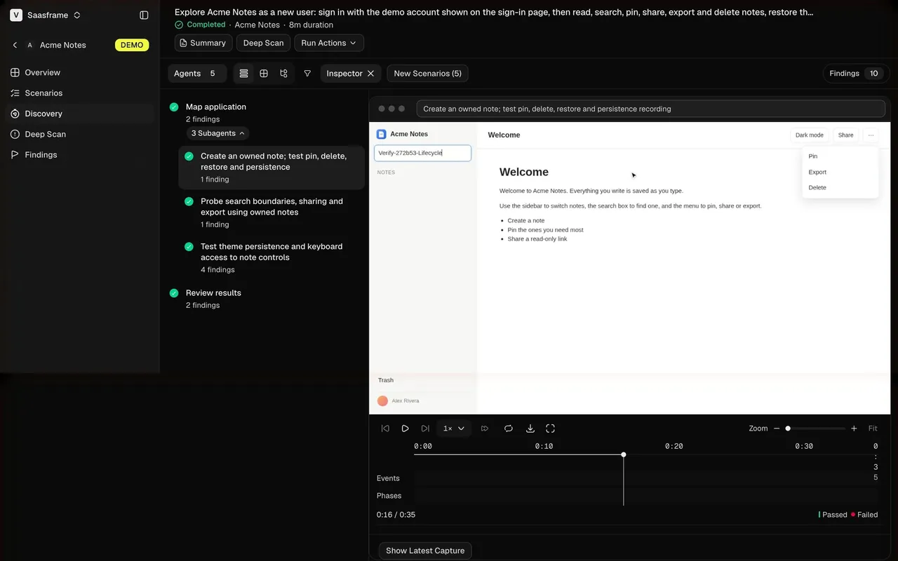
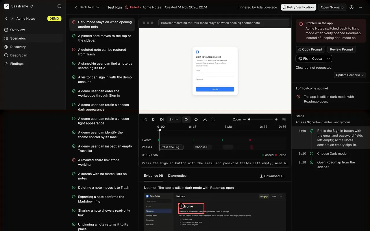
Product UI fragments as illustrations (scenario runs on a pull request, failure cards, product maps), terminal blocks, numbered step lists, waitlist form with invite code. App: collapsible sidebar with project switcher, tables with priority pills (P0–P4) and status dots, run timelines with video recording and step logs, stat rows, empty states with a single action, onboarding cards with chevrons.

## Layout
Marketing content centered around 1200px with alternating text and UI fragment sections; generous white space. The app uses a 240px sidebar and a content column up to about 1480px; onboarding steps are a single centered 600px column with the logo top-left and "Exit setup" top-right.

## Tone
Direct, engineer-to-engineer copy in sentence case: "Find bugs before your users do", "What should we scan?", "Add a test user to start your scan."

### Overall aesthetic
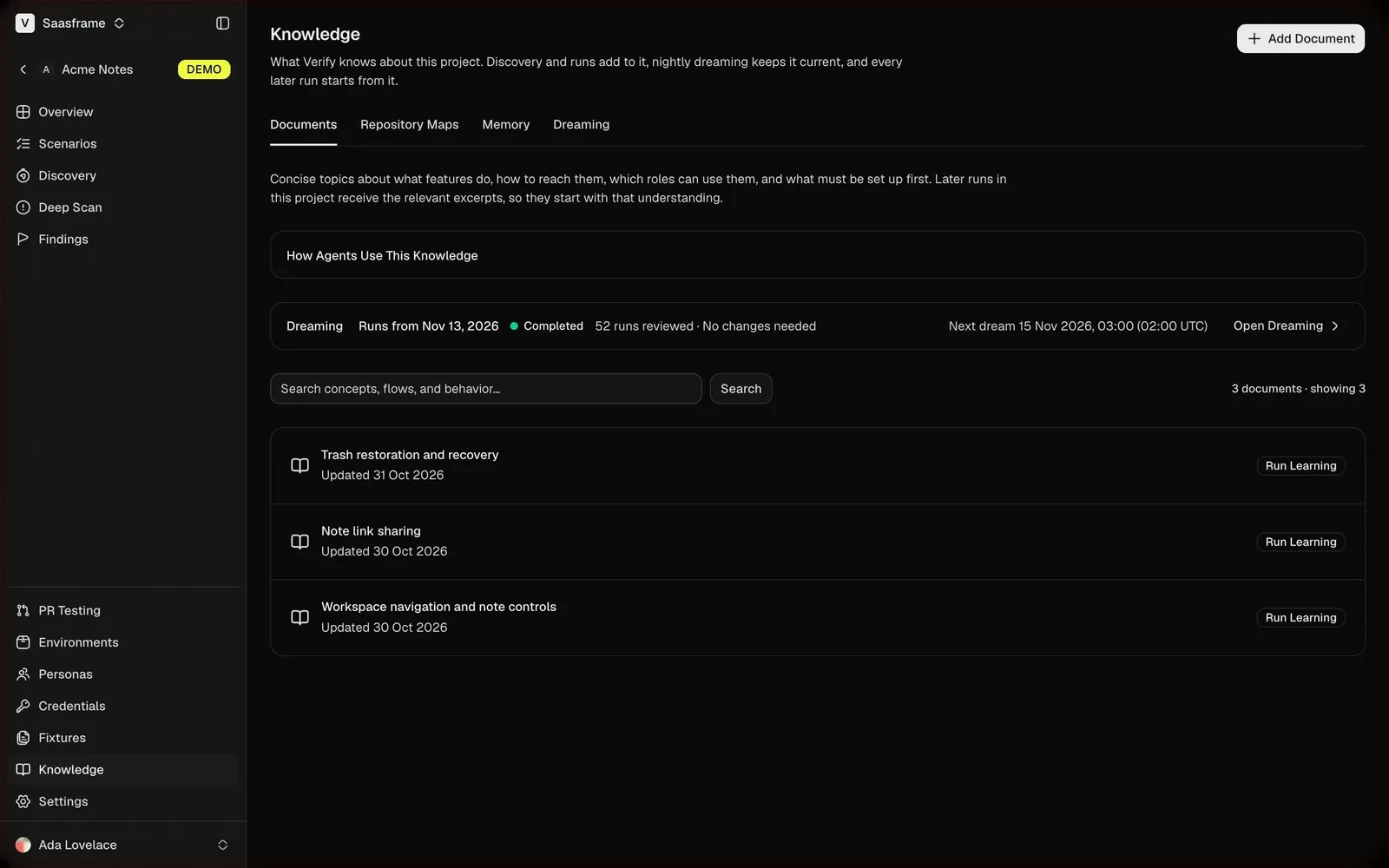
Dark knowledge base page for an AI system.

### Page composition
Title with subline and Add Document, tabs, explanation, How Agents Use This Knowledge card, dreaming status row, search, documents list.

### Typography
Geist 18px title, 13–14px body.

### Colors & surfaces
Near-black page, #161616 rows, white buttons.

### Components
Tabs, status row with link, searchable list with row actions.

### Responsive
Rows stack their action under the title.

### Adaptation guidance
Make an AI product's memory visible and editable so users can see what it has learned.

## Content

**Instructions:**

Generate realistic example content that fits the selected design reference.

Create appropriate headlines, descriptions, labels, buttons, and supporting copy based on the type of interface being designed.

If a product or business description is provided, use it to guide the content.

Otherwise, invent a plausible fictional SaaS product appropriate for the reference.

Keep the content concise, coherent, and visually balanced.

Do not present fictional statistics, customer names, or testimonials as verified facts.

## Design Direction

**Instructions:**

Use the reference screenshot as the main source of visual inspiration rather than a strict layout template.

Preserve its most distinctive design characteristics, such as typography, visual rhythm, color relationships, component treatments, and overall aesthetic.

Feel free to modify section arrangements, proportions, spacing, and individual components to better suit my content.

Introduce original design decisions where they improve usability, composition, or brand consistency.

The result should clearly reflect the reference's visual language without looking like a direct reproduction.

Follow the visual identity of the reference design.

Use its typography, color palette, component styling, and overall aesthetic as the primary design direction.

Do not introduce an unrelated visual identity.

## Output

**Instructions:**

Generate a high-fidelity visual mockup of the requested interface.

Present the design as a polished, realistic website or product UI screenshot.

Prioritize visual composition, typography, spacing, colors, alignment, and component details.

Use the available image-generation or visual-design capabilities.

Do not replace the mockup with source code, a written design specification, or a textual description.

If direct visual generation is unavailable, clearly explain the limitation.

## Constraints

- Use the actual screenshot as the primary visual reference.
- Preserve essential messaging and factual accuracy.
- Prioritize visual quality and consistency.
- Do not invent unsupported product claims.
- Adapt structure and copy length for visual balance.
Reference image Attach it to your message: assistants can’t open image links. Open in ChatGPT ↗ Open in Claude ↗
Build it in Lovable ↗ v0 ↗ Figma Make ↗
Opening a tool copies the screenshot so you can paste it with your prompt.
 SaaSFrame