Prompt 805 words Copy
# Design from Reference: AskAiRank Brand Settings

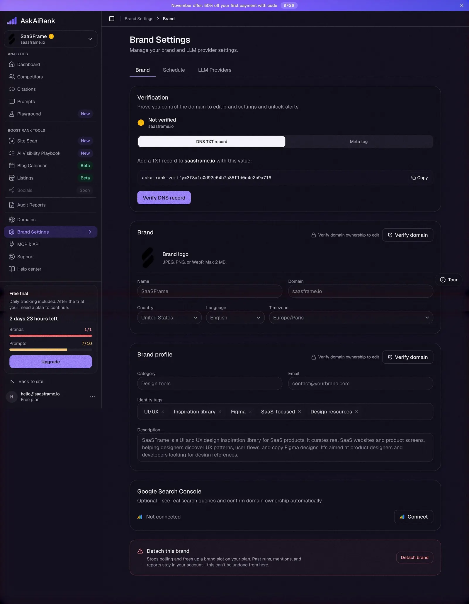
Create an original, high-fidelity visual design inspired by the reference. Prioritize composition, typography, colors, spacing, and component styling over technical implementation.

## Reference

- **Product:** AskAiRank
- **Category:** Settings
- **Screenshot:** attached to this message (also available at https://media.saasframe.io/v/e81ac5c9dc8f0e9a2bcf-1600.webp)
- **Source:** https://app.askairank.com/settings/brand

Analyze the attached screenshot first. If no image is attached, open the screenshot link; if neither is accessible, ask for it rather than guessing.

## Visual Design Context

## Overall aesthetic
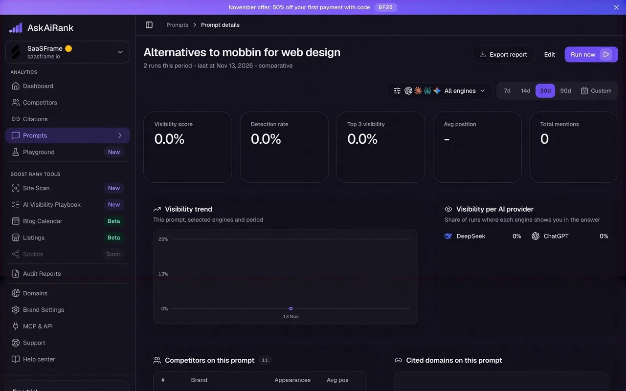
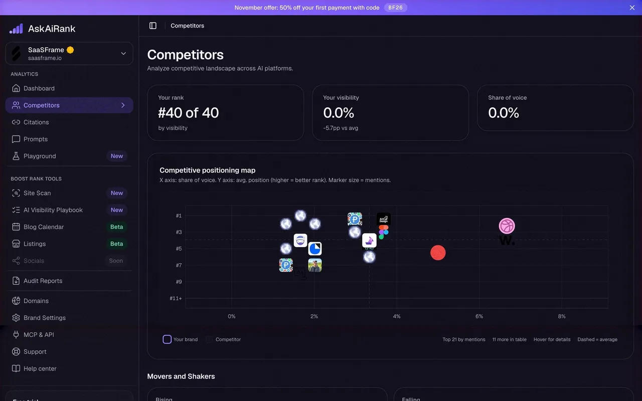
AskAiRank is an AI visibility (AEO/GEO) tracker for indie SaaS. Two moods share one identity: a deep violet-black product app and a mostly light marketing site with violet gradients, dark product screenshots and a dark footer. Feels technical but friendly: dense metrics, rounded cards, soft glows, small "New"/"Beta" pills.

## Typography
Geist everywhere (Geist Variable on marketing), Geist Mono for numbers in code blocks. Marketing H1 is very large and light (88px, weight 400, tight -3px tracking) with one phrase tinted violet; app H1 is 26–30px semibold with slight negative tracking. Body is 13.5–16px, muted lavender-grey (#A8A6B3) on dark, near-black on light.

## Colors & surfaces
App: page #0A080F, cards #110F1B / #141120 / #16131F, 1px hairline borders, 12–24px radii. Primary accent violet #9A82FB with a stronger #6C4CF0 for primary buttons; a lilac→violet gradient fills hero metric cards and the top promo banner. Semantic colors: green for detected/completed, amber for warnings and limits, coral/red for low scores and destructive actions. Marketing: off-white #F5F4F8 sections, white cards, violet gradient headers, dark #0E0D16 hero on the home page and dark newsletter/footer blocks.

## Components
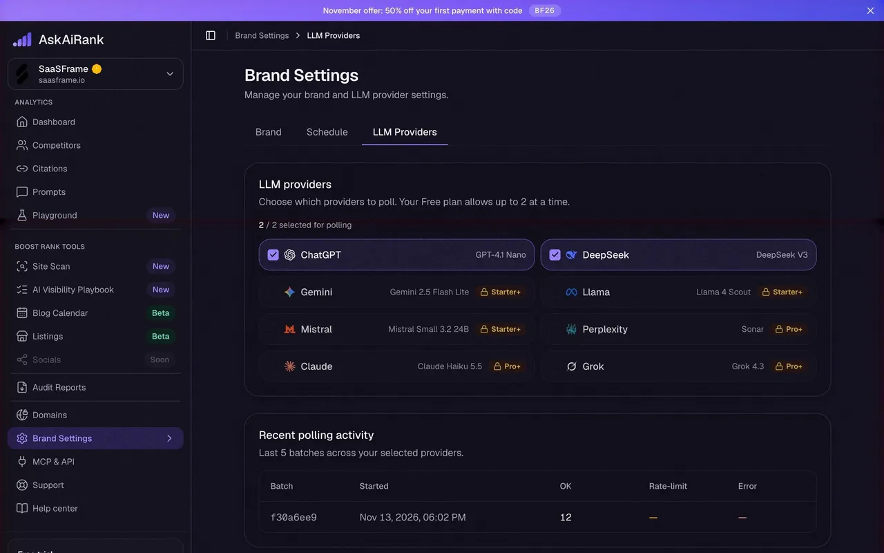
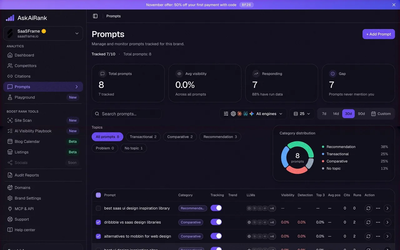
Collapsible left sidebar grouped as Analytics and Boost Rank Tools, a brand switcher card on top, a "Free trial" usage card with progress bars and a violet Upgrade button, and the account row at the bottom. Engine icon clusters (ChatGPT, Claude, Gemini, Perplexity…), segmented date ranges (7d/14d/30d/90d/Custom), pill tags for topics and plans, toggles, circular score gauges, stat tiles, data tables with row actions, centered modals over a blurred backdrop, and per-page product tour popovers with "1 / 5" counters and a floating Tour button.

## Layout
App: 300px sidebar + fluid content up to ~1200–1390px, 16–24px gaps, cards stacked in grids of 2–5 columns. Onboarding uses a top stepper and a single centered 640px card. Marketing: centered 1248–1360px container, long scrolling pages alternating hero, product screenshots, feature grids, FAQ accordions and a related-resources band.

## Tone
Direct, founder-to-founder copy, plain explanations of AEO concepts, honest empty states ("that is the normal starting point, not a broken tracker").

### Overall aesthetic
Dark settings page with stacked section cards.

### Page composition
Sidebar, breadcrumb, title, underline tabs, verification card, brand card, profile card, Search Console card, red danger card.

### Typography
Geist 16px section titles, 12px labels, Geist Mono for the TXT value.

### Colors & surfaces
Amber Not verified dot, segmented control, red-tinted danger card.

### Components
Tabs, segmented DNS/meta toggle, copy button, disabled inputs, tag chips.

### Responsive
Two-column fields stack on mobile.

### Adaptation guidance
Explain why fields are locked and put the unlock action first.

## Content

**Instructions:**

Generate realistic example content that fits the selected design reference.

Create appropriate headlines, descriptions, labels, buttons, and supporting copy based on the type of interface being designed.

If a product or business description is provided, use it to guide the content.

Otherwise, invent a plausible fictional SaaS product appropriate for the reference.

Keep the content concise, coherent, and visually balanced.

Do not present fictional statistics, customer names, or testimonials as verified facts.

## Design Direction

**Instructions:**

Use the reference screenshot as the main source of visual inspiration rather than a strict layout template.

Preserve its most distinctive design characteristics, such as typography, visual rhythm, color relationships, component treatments, and overall aesthetic.

Feel free to modify section arrangements, proportions, spacing, and individual components to better suit my content.

Introduce original design decisions where they improve usability, composition, or brand consistency.

The result should clearly reflect the reference's visual language without looking like a direct reproduction.

Follow the visual identity of the reference design.

Use its typography, color palette, component styling, and overall aesthetic as the primary design direction.

Do not introduce an unrelated visual identity.

## Output

**Instructions:**

Generate a high-fidelity visual mockup of the requested interface.

Present the design as a polished, realistic website or product UI screenshot.

Prioritize visual composition, typography, spacing, colors, alignment, and component details.

Use the available image-generation or visual-design capabilities.

Do not replace the mockup with source code, a written design specification, or a textual description.

If direct visual generation is unavailable, clearly explain the limitation.

## Constraints

- Use the actual screenshot as the primary visual reference.
- Preserve essential messaging and factual accuracy.
- Prioritize visual quality and consistency.
- Do not invent unsupported product claims.
- Adapt structure and copy length for visual balance.
Reference image Attach it to your message: assistants can’t open image links. Open in ChatGPT ↗ Open in Claude ↗
Build it in Lovable ↗ v0 ↗ Figma Make ↗
Opening a tool copies the screenshot so you can paste it with your prompt.
 SaaSFrame