 SaaSFrame
 Wordpress
Products 19
All products

Index of all 19 Userbot products examples
- Userbot Product Tour
- Userbot Product Tour
- Userbot Product Tour
- Userbot User Onboarding
- Userbot Product Tour
- Userbot User Onboarding
- Userbot Product Tour
- Userbot User Onboarding
- Userbot User Onboarding
- Userbot Product Tour
- Userbot Product Tour
- Userbot Product Tour
- Userbot Product Tour
- Userbot Product Tour
- Userbot User Onboarding
- Userbot User Onboarding
Flows 2
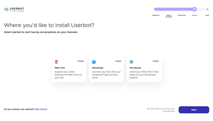
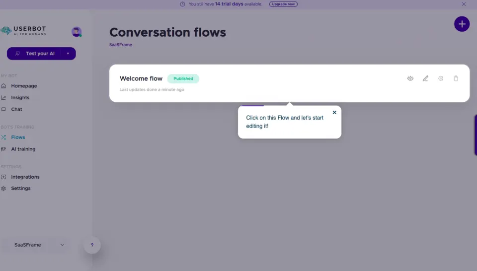
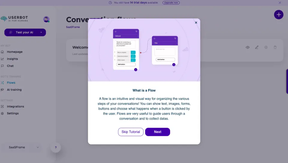
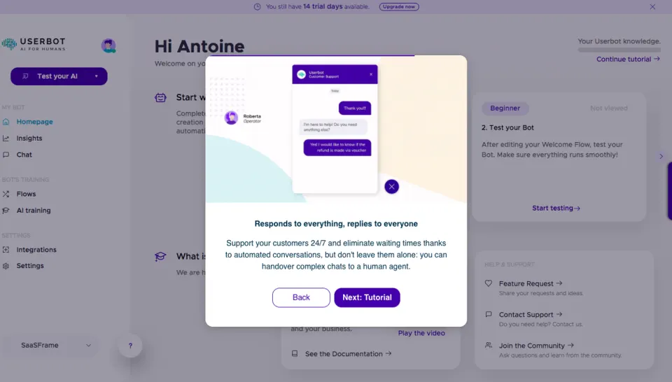
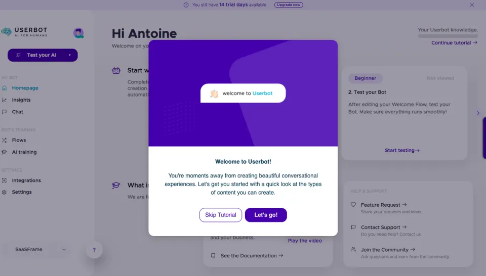
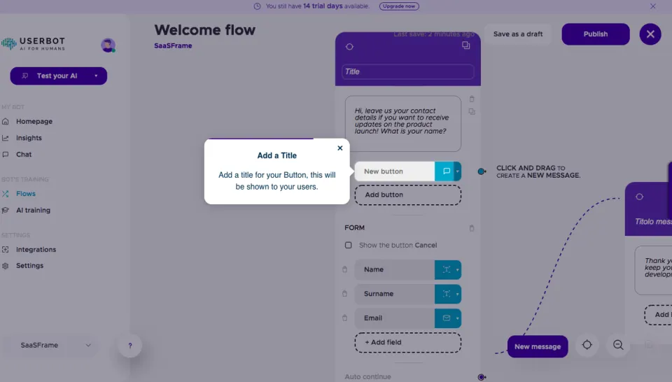
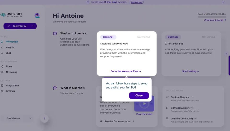
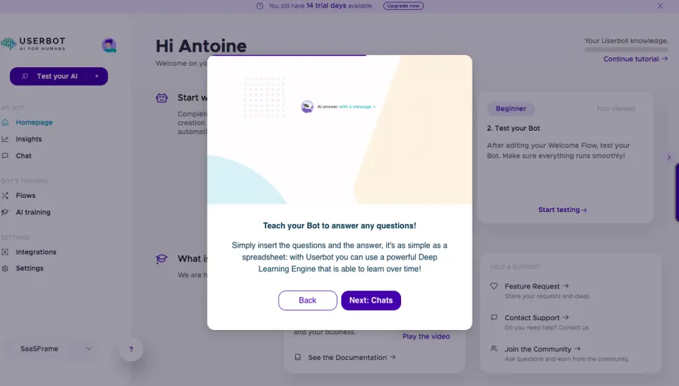
 Userbot Product Tour
11 screens
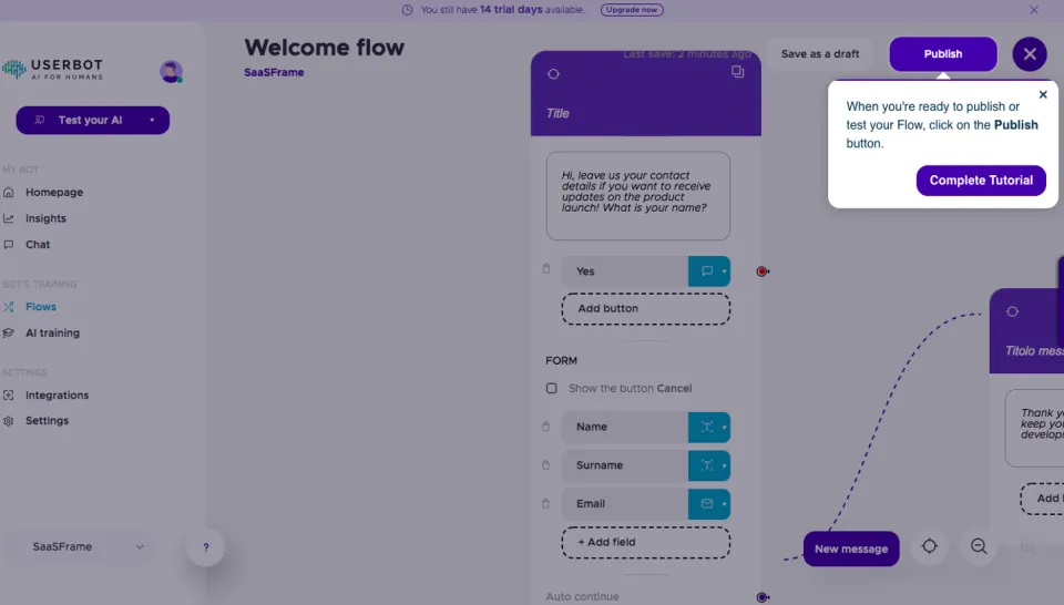
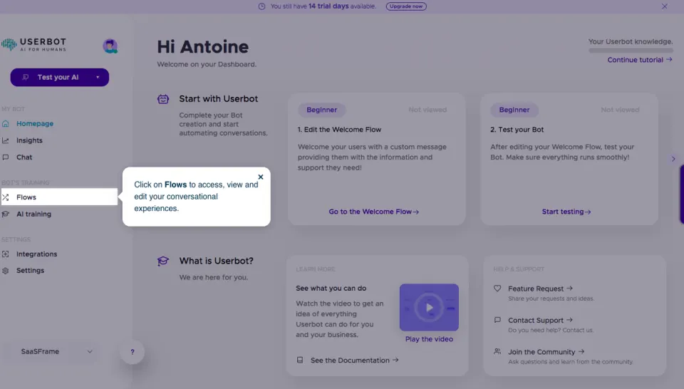



Design reference
Userbot — design reference
Source: https://userbot.ai/. Extracted 2026-10-14. Scope: public marketing website CSS; declared styles, not computed browser values. This is an observed inventory, not an official internal design system.
Typography
font-family: -apple-system,BlinkMacSystemFont,Segoe UI,Roboto,Helvetica Neue,Arial,sans-serif— selectorbodyfont-family: Metropolis,sans-serif— selectorpfont-family: Font Awesome\ 5 Brands— selectorheader nav.main-navigation #main-menu .menu-holder ul li a[data-icon]:beforefont-family: userbot— selectorfooter#page .top ul li a[data-icon]:afterfont-family: feather— selector[class|=event-element] .description .address a:beforefont-size: 1rem— selectorbodyfont-size: 100%— selectora,body,div,footer,h1,h2,h3,h4,header,html,i,img,label,li,nav,p,section,span,strong,ul,videofont-size: 3rem— selectorh1font-size: 2.5rem— selectorh2font-size: 2rem— selectorh3font-size: 1.635rem— selectorh4font-size: 1.375rem— selectorp.bigfont-weight: 400— selectorbodyfont-weight: 600— selectorh1,h2,h3,h4font-weight: 300— selectorpfont-weight: 500— selectorheader nav.main-navigation #main-menu .menu-holder ul li afont-weight: 700— selectorheader nav.main-navigation #main-menu .lang-menu ul li afont-weight: 600!important— selector\[class^=page-header]\[class_="--page"][class_=case-study] .page-header--case-study**container**paragraph>\* strongfont-weight: lighter— selector.form-lead**text-side ul li pline-height: 1.5— selectorbodyline-height: 1— selectorbodyline-height: 1.29— selectorh1,h2,h3,h4line-height: 1.4— selectorpline-height: 29px— selectorheader nav.main-navigation #main-menu .menu-holder ul li aline-height: 34px— selectorheader nav.main-navigation #main-menu .lang-menu ul li aline-height: 1.6— selectorheader nav.main-navigation #mobile-menu .mobile-wrap .primary-links ul.small li aletter-spacing: -.025rem— selector\[class|=page-content]\[class_=-saas] section#specs[class|=ttabs-wrap] .wraps .ttabs .ttab .text spanletter-spacing: -.5px— selector[class_=team-element] .title h6letter-spacing: 0— selector[class_=team-element] .title h6letter-spacing: -.2px— selectorfooter#page .bottom .wrap-sitemap .cols p
Colors and surfaces
color: #212529— selectorbodycolor: #00afd1— selectoracolor: #637178— selectorpcolor: #fff— selectorheader nav.main-navigation #main-menu .menu-holder ul li acolor: #e9e6ff— selectorheader nav.main-navigation #main-menu .menu-holder ul li a[data-icon]:beforecolor: hsla(0,0%,100%,.75)— selectorheader nav.main-navigation #mobile-menu .mobile-wrap .primary-links ul.small li acolor: hsla(0,0%,100%,.7)— selectorheader nav.main-navigation #mobile-menu .mobile-wrap .info-wrap .services \[class|=service-element]\[class_=small] pcolor: #f7f6ff— selectorheader nav.main-navigation #mobile-menu .footer ul li a ibackground-color: #fff— selectorbodybackground-color: transparent— selectorabackground-color: #f5f7fa— selectorheader .wrap-menu #menu-responsive .menu-button .barbackground-color: #f7f6ff— selectorbody[class_=page-tpl-home] header:not(.fixed) .wrap-menu .primary-menu ul li[class_=hoverline] a:afterbackground-color: hsla(0,0%,100%,.25)— selectora[class_=hoverline]:afterbackground-color: #3122ab— selector\[class|=btn]\[class_=-big][class_=-colorone],\[class|=btn]\[class_=-big][class_=-secondary]background-color: #00afd1— selector\[class|=btn]\[class_=-big][class_=-colorone]background-color: #f4f5f8— selector\[class|=page-content]\[class_=-about] section#timeline:after
Components and layout
border-radius: 1px— selectorheader .wrap-menu #menu-responsive .menu-button .barborder-radius: 0 150px 150px 0— selector\[class|=page-content]\[class_=-home] section#essential:afterborder-radius: 0 0 0 150px— selector\[class|=page-content]\[class_=-home] section#enterprise:afterborder-radius: 7px— selector[class|=input-form] [class_=submit-wrap] buttonborder-radius: 5px— selector\[class|=btn]\[class_=-small]border-radius: 50%— selectorfooter#page .top ul li a[data-icon]:beforeborder-radius: 20px— selector\[class|=page-content]\[class_=-about] section#cta [class|=ctabox-element] .wrapborder-radius: 150px— selector\[class|=page-content]\[class_=-consulting] section#ooo:afterbox-shadow: 0 2px 17px 0 rgba(0,0,0,.19)— selector[class|=input-form] [class_=submit-wrap] buttonbox-shadow: 0 10px 20px transparent— selector\[class|=btn]\[class_=-line][class_=-white]box-shadow: 5px 10px 20px 0 rgba(42,49,53,.19)— selectorfooter#page .top ul li a[data-icon]:beforebox-shadow: 0 55px 60px 0 rgba(42,49,53,.05)— selector\[class|=page-content]\[class_=-consulting] section#intro:afterbox-shadow: 0 4px 17px 0 rgba(0,0,0,.13)— selector\[class|=page-content]\[class_=-consulting] section#features videobox-shadow: none— selectorbutton.mfp-arrow,button.mfp-closebox-shadow: 0 20px 30px 0 rgba(42,49,53,.05)— selector[class_=team-element] .titlebox-shadow: 0 40px 60px 0 rgba(42,49,53,.06)— selector\[class|=imagehead-element]\[class_=title] [class_=header]max-width: 70%— selector[class_=page-header][class_="--page"][class_="--home"] p,[class_=page-header][class_="--pagebig"][class_="--home"] pmax-width: 50%— selector\[class|=main-cta]\[class_=-double] .wrap .titlemax-width: 540px— selector.containermax-width: 720px— selector.containermax-width: 960px— selector.containermax-width: 1140px— selector.containermax-width: 100%— selectorbody[class_=page-tpl-home] header:not(.fixed) .wrap-menu .primary-menumax-width: 90%— selector[class_=page-header][class_="--landing"][class_="--home"] p,[class_=page-header][class_="--page"][class_="--home"] p,[class_=page-header][class_="--pagebig"][class_="--home"] ppadding: 0— selector[type=button]::-moz-focus-inner,button::-moz-focus-innerpadding: 0 3px— selectorheader nav.main-navigation #mobile-menu .languages ul li apadding: 0 7px— selectorheader nav.main-navigation #mobile-menu .footer ul li apadding: 100px 0— selector\[class|=page-content]\[class_=-home] section#servicespadding: 50px 0— selector\[class|=page-content]\[class_=-home] section#essential .rowpadding: 10px 0— selector\[class|=box-element]\[class_=-big] .description h3padding: .375rem 0 .5rem— selector\[class|=box-element]\[class_=-big] .description ppadding: 2rem 1.875rem 1rem— selector[class|=service-element] h3gap: 20px— selector[class_=page-header][class_="--page"][class_="--home"] .double-buttons .input-form--simplegap: 10px— selector.show-products-section--minimal .show-products-section**content**navbar ulgap: 50px— selector#features>.container .row,.section-features>.container .rowgap: 30px— selector.cards-section .rowgap: 4px— selector.cards-carousel-block**wrapper\_\_item divtransition: .4s ease— selectorbody,body.visibletransition: color .4s ease— selectorheader nav.main-navigation #main-menu .menu-holder ul li atransition: padding-left .4s ease— selectorheader nav.main-navigation #main-menu .menu-holder ul li.submenu ul.sub-menu li atransition: opacity .4s ease— selectorheader nav.main-navigation #mobile-menu .languages ul li a:hovertransition: margin .4s ease— selectorheader .wrap-menu #menu-responsive .menu-button .bar-1transition: transform .4s cubic-bezier(.455,.03,.515,.955)— selectorheader .wrap-menu #menu-responsive .menu-button .bar-1transition: transform .2s cubic-bezier(.455,.03,.515,.955)— selectorheader .wrap-menu #menu-responsive .menu-button:hover .bar-1transition: margin .15s ease-out,opacity .15s ease-out,transform .15s ease-out .25s— selectorheader .wrap-menu #menu-responsive.open .menu-button .bar-1
Responsive rules
(prefers-reduced-motion: reduce)
(min-width:576px)
(min-width:768px)
(min-width:992px)
(min-width:1200px)
print
screen and (max-width:576px)
screen and (max-width:414px)
(max-width:991px)
(max-width:767px)
screen and (max-width:375px)
(max-width:1199px)
screen and (min-width:991px)
(-webkit-min-device-pixel-ratio:2),(min-resolution:192dpi)
(-webkit-min-device-pixel-ratio:2),(-webkit-min-device-pixel-ratio:2) and (max-width:767px),(min-resolution:192dpi) and (max-width:767px)
screen and (min-width:768px)
screen and (max-width:350px)
screen and (max-width:991px)
screen and (max-width:1199px)
screen and (min-width:992px)
screen and (min-width:992px) and (max-width:1199px)
screen and (max-width:991px) and (max-width:1350px)
screen and (max-width:991px) and (max-width:576px)
screen and (max-width:991px) and (max-width:991px)
screen and (min-width:1280px) and (max-width:1439px)