 SaaSFrame
Notification Preferences
Settings to choose which notifications to receive, per event and per channel.


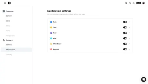
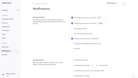
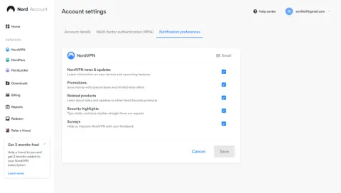
Index of all 9 Notification Preferences examples
Notification Preferences: design guide
Short answer
Notification preferences let people choose which messages they get, through which channel and how often. Group options by events people recognize, describe each type, make the channel explicit, offer frequency or thresholds where they fit, explain mandatory messages instead of showing dead switches, and keep marketing separate.
In the libraryas of November 2026
- Examples
- 9
- SaaS products
- 9
- Last added
- Nov 2026
Most common inSettings 9
Recently addedMindCloudHugging FaceDustFrameMercury
Notification preferences let people choose which messages they receive, how often and through which channel. They are the counterpart to every email, push and in-app alert a product sends: when they are clear, people tune notifications instead of ignoring them or unsubscribing from everything.
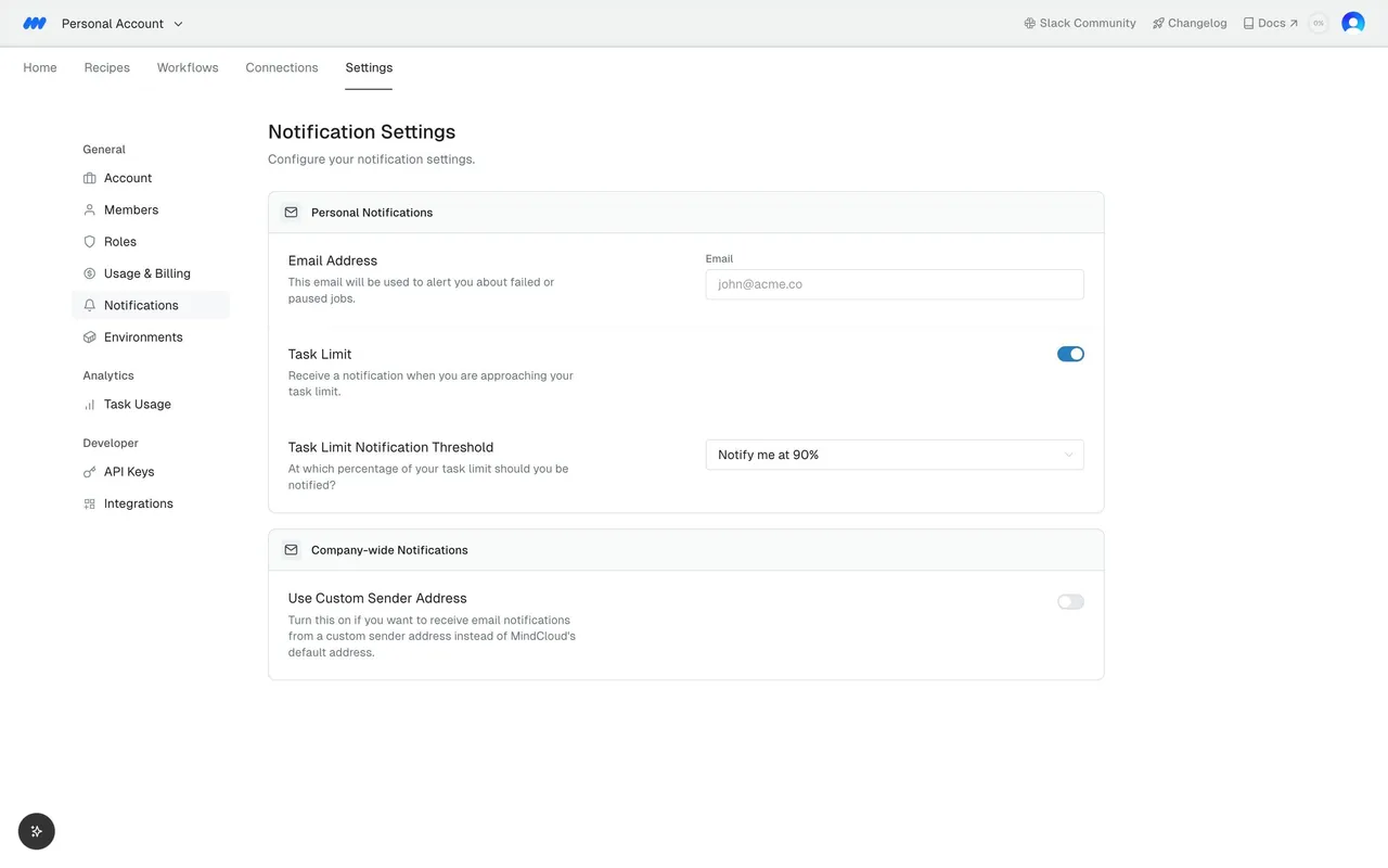
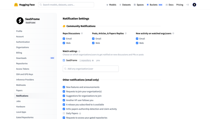
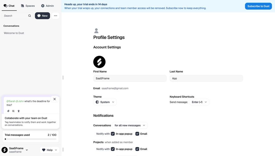
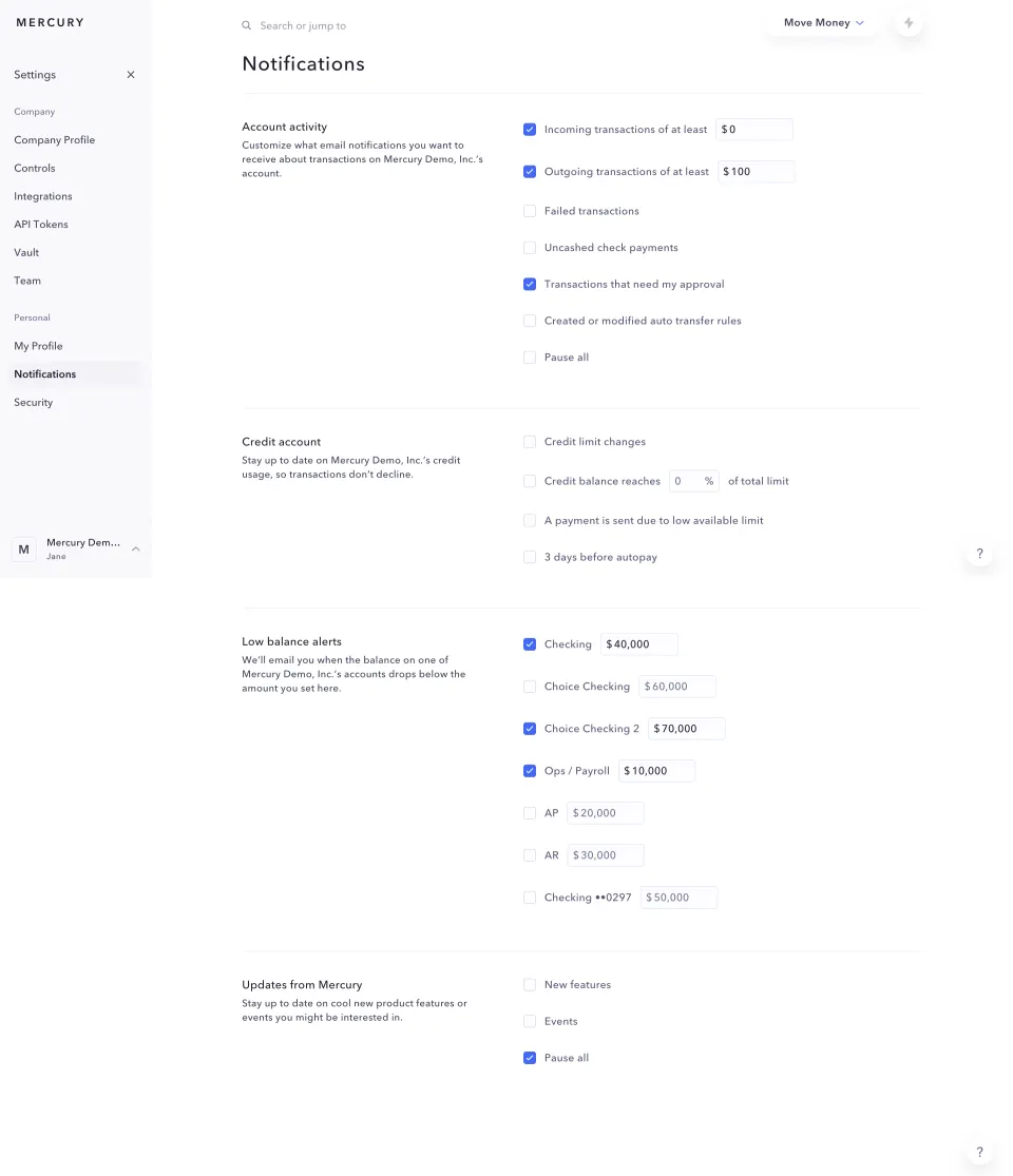
The captured settings pages range from a few toggles by email type (Mine, NordVPN) to grids of events by channel (Vercel, Hugging Face), frequency choices (Narrative BI, Dust) and alerts with thresholds (Mercury, MindCloud). The right structure depends on how many kinds of notification the product sends and how much each one matters.
How should notifications be grouped?
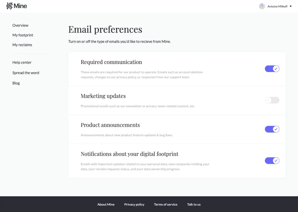
Group by what the notification is about, in terms the person recognizes. Mine lists four email types, each with a title and a description: Required communication, Marketing updates, Product announcements and Notifications about your digital footprint. Each row explains what kind of email it covers, with examples.
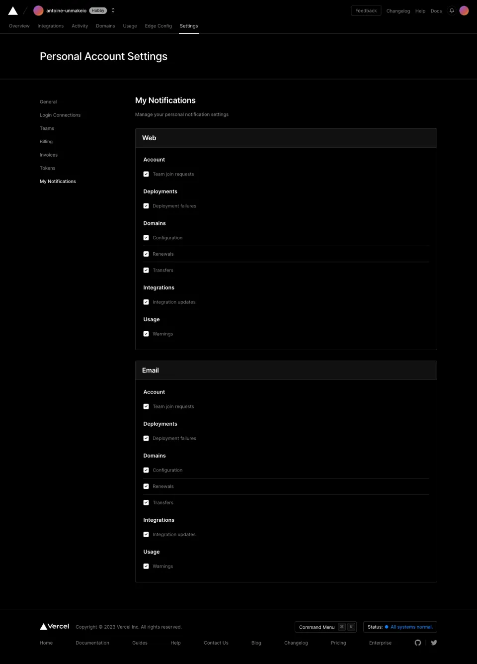
When the list grows, add a second level. Vercel groups checkboxes under Account, Deployments, Domains, Integrations and Usage, with specific events such as “Deployment failures” and “Renewals” underneath. Mercury groups by area too, and gives each group a short explanation on the left, such as what low balance alerts do, with the options on the right.
Avoid grouping by internal system names or by the service that sends the message. People think in terms of events (“someone replies to me”, “a payment fails”), not in terms of the queue or microservice behind them.
One channel or several?
When a product notifies through more than one channel, say which channel each setting controls. Vercel repeats the same event list in two cards, Web and Email, so the two channels can be configured separately. This is easy to read but doubles the length of the page.
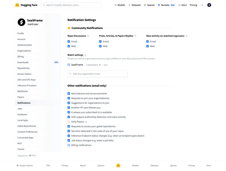
A grid with one column per channel is more compact. Hugging Face shows three event types side by side, each with Email and Web checkboxes underneath, then a separate list titled “Other notifications (email only)”. Labeling that section with its channel avoids a column of empty or disabled web checkboxes.
If only one channel exists, name it once at the top rather than on every row. NordVPN shows a single “Email” label in the card header, aligned with the column of checkboxes below.
Let people control frequency, not only on and off
For notifications that can be batched, a frequency choice is often better than a switch. Someone who turns off a noisy daily digest might have kept a weekly one. Narrative BI asks a question for each type, “How often do you want to receive narratives?”, and offers radio buttons from Daily to Never.
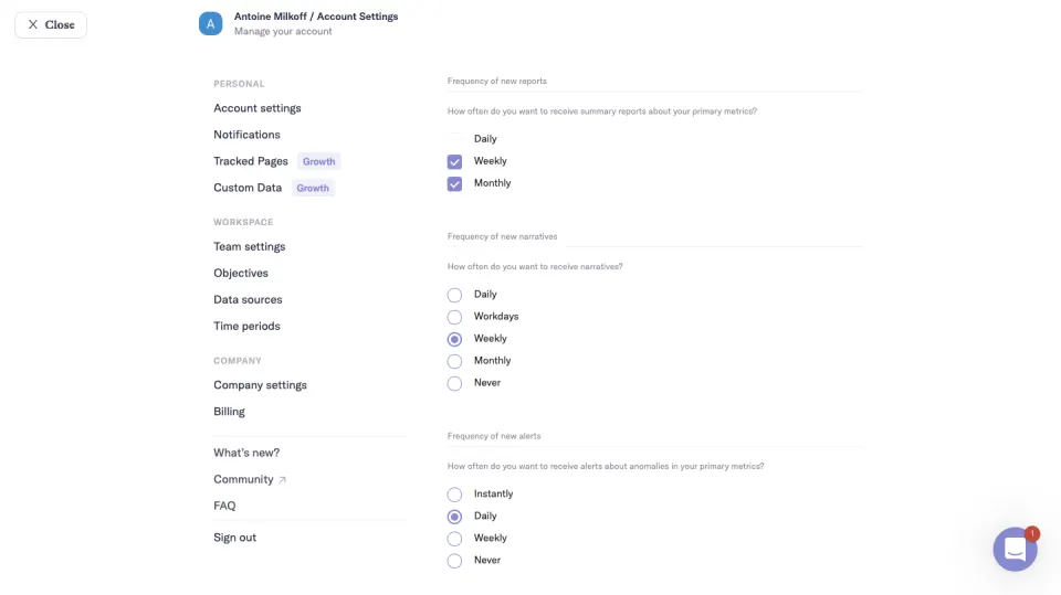
Pick the control that matches the choice. Narrative BI uses checkboxes for reports, where Weekly and Monthly can both be selected, and radio buttons for narratives and alerts, where only one frequency makes sense. Using the same control everywhere would hide that difference.
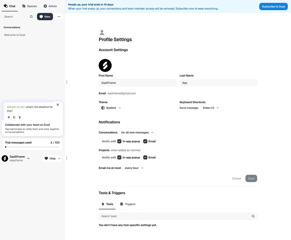
Dust adds a global cap: below its per-topic settings for conversations and projects, “Email me at most” is set to “every hour”. A cap like this protects people from bursts without forcing them to switch off whole categories.
Thresholds for alerts that depend on a value
Some notifications only matter above a certain amount. Mercury puts the threshold directly in the row: “Outgoing transactions of at least $100”, a low balance alert per account with its own amount, and “Credit balance reaches 0% of total limit”. The checkbox and the value read as one sentence.
MindCloud uses a separate row for the threshold: a Task Limit toggle, then “Task Limit Notification Threshold” set to “Notify me at 90%”. Either layout works if the threshold is next to the alert it controls and disabled or hidden when that alert is off.
Separate what can be turned off from what cannot
Security, billing and legal messages usually have to be sent. Say so on the page rather than showing a switch that does nothing. Mine’s “Required communication” row explains that these emails are needed for the product to operate (account deletion requests, privacy policy changes, support replies). Hugging Face shows its billing notifications checkbox in a lighter, checked state that reads as locked.
Keep marketing clearly apart from product notifications. Mine and NordVPN both separate promotions from service updates, so someone can stop offers without losing information about their account. Marketing should start off unless the person has opted in, in line with the consent rules that apply to you.
Saving: instant or explicit?
Toggles usually save immediately; forms with several fields usually need a Save button. Mixing the two on one page is confusing. NordVPN and Dust both use an explicit model, with Save disabled until something changes. Mine’s switches suggest instant saving. Whichever you choose, confirm the change, and if saving is instant, make each switch’s state unambiguous on its own.
Offer a way back. A “Pause all” option, as in Mercury, lets someone silence a group temporarily without losing their detailed setup. A link from every notification email straight to the matching setting saves people from searching the settings tree.
Personal versus workspace settings
In team products, some notification settings belong to the person and others to the whole workspace. MindCloud separates a “Personal Notifications” card from a “Company-wide Notifications” card with its own options. Vercel’s page is titled “My Notifications” under personal account settings. Make the scope visible so an admin does not change a teammate’s inbox by accident, and a member does not look for a setting only an admin controls.
Accessibility details
Every checkbox and switch needs a label that makes sense out of context: “Email for deployment failures”, not just “Email”. In a channel grid, associate each control with both its row and column. Group related options with fieldsets and legends, and make descriptions readable: several captured pages use very light gray text for explanations that people need in order to decide.
Notification preferences review checklist
- Are notifications grouped by events people recognize?
- Does each type have a short description with an example?
- Is the channel of every setting clear?
- Are channel-specific types labeled instead of showing disabled controls?
- Can batchable notifications be set to a frequency, including Never?
- Are thresholds placed next to the alert they control?
- Are mandatory messages explained rather than shown as dead switches?
- Is marketing separate from product and account notifications?
- Is the save model consistent and confirmed?
- Is there a way to pause a group or everything?
- Is the personal or workspace scope visible?
- Do controls have labels that make sense on their own?
Notification preferences FAQ
Toggles or checkboxes?
Switches suit independent settings that apply immediately. Checkboxes suit lists and grids, especially when changes are saved together. Use radio buttons when only one value can apply, such as a frequency.
Should every notification have its own setting?
No. Group related events and offer finer control only where people commonly want it. A long flat list of checkboxes is hard to scan and is often left at its defaults.
Where should notification preferences live?
In account settings, under a clear Notifications entry, with direct links from each notification email and from the in-app notification center.
Related patterns
See Settings & Preferences for the page around them, Notification Center for where in-app notifications appear, Toggle, Checkbox and Radio Buttons for the controls, and Consent & Opt-In for marketing consent.