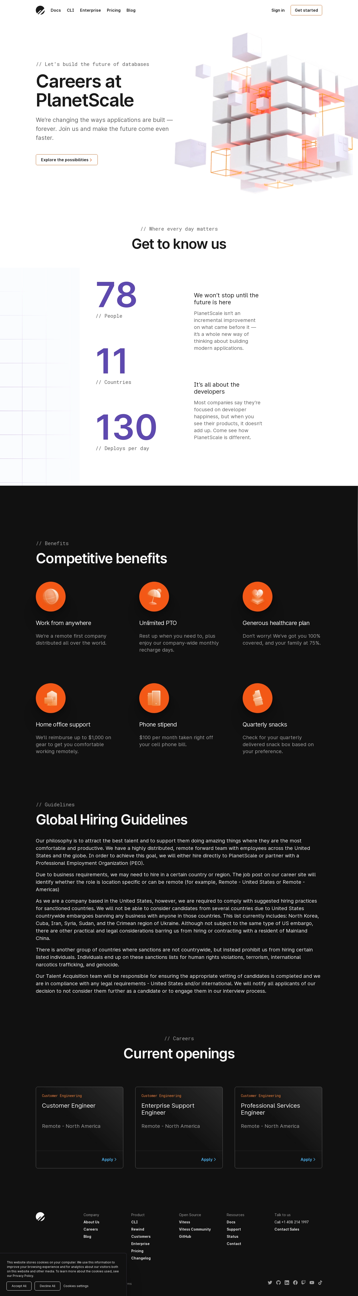
PlanetScale's careers page opens with a confident hero section pairing clean type against a striking 3D geometric illustration in orange and black. That illustration does a lot of heavy lifting, giving the page personality without cluttering things up.
Stats That Actually Land
The "Get to know us" section is the real star here. Massive serif numerals for 78, 11, and 130 create a rhythm that pulls you down the page. People, countries, deploys per day. Simple, effective. The mix of oversized display type with smaller body copy feels intentional and well balanced.
Benefits Done Right
The benefits grid uses soft orange icons on a dark background, which keeps things visually consistent without feeling heavy. Six cards, clean labels, short descriptions. No fluff.
What Makes It Work
The monospaced section labels like "// Benefits" and "// Careers" add a developer-friendly touch that fits the brand perfectly. Color palette stays tight throughout: black, white, orange, and purple accents only where needed. The current openings section at the bottom uses colored category tags that pop without overwhelming. It's a careers page that actually respects your time.
 SaaSFrame