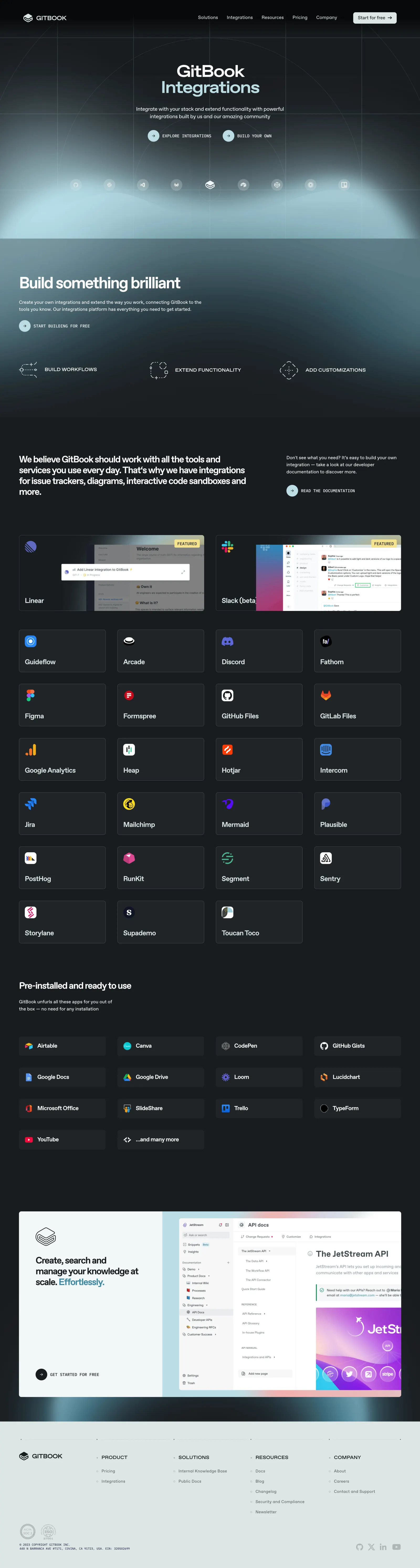
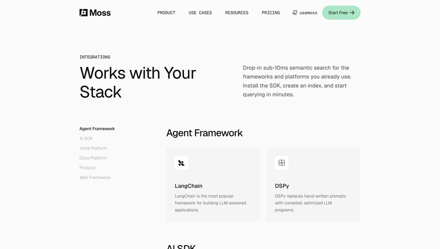
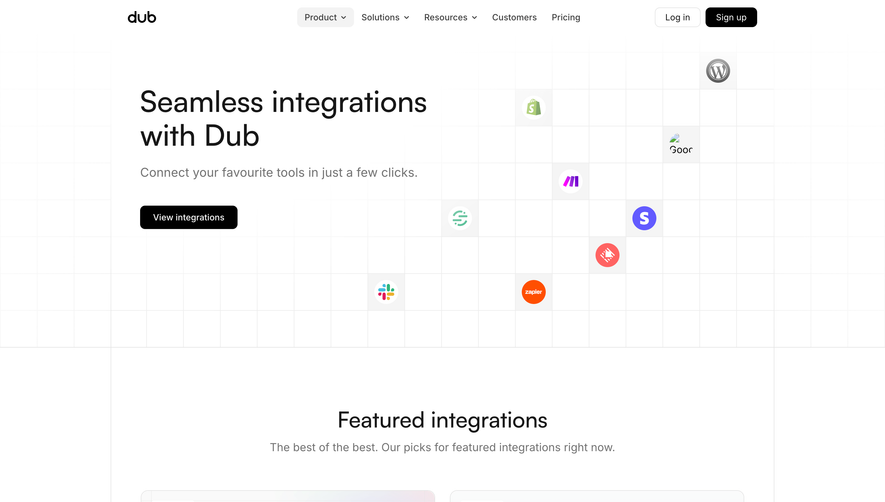
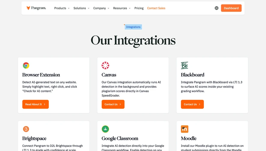
GitBook’s Integrations page embodies a sleek, modern aesthetic with a touch of playfulness. The minimalist design embraces ample white space, allowing colorful integration icons and subtle gradients to stand out. The professional tone is softened by rounded corners and micro-interactions, giving the interface an inviting, polished look.
Layout and Structure
The layout is laser-focused: a concise hero section introduces integrations with clear headline text and a pared-down subheading, followed by a visually organized grid showcasing various integrations. Each integration card uses consistent spacing and alignment for easy scanning. The footer is understated, providing essential links without clutter.
Visual Elements
Vibrant logos, custom icons, and gently animated hover effects create visual interest without overwhelming the content. The integration icons pop against the neutral background, serving both decorative and functional roles. Minimal illustrations reinforce the theme of connectivity and collaboration, while micro-animations guide the user’s attention subtly.
Color Palette and Typography
The primary palette combines clean whites with splashes of saturated blues and purples, dynamically highlighting interactive elements. Soft grays maintain visual hierarchy. The typography features modern sans-serif fonts—bold for headings, lighter weights for details—ensuring clarity and smooth user flow.
User Experience Patterns
Sticky, compact navigation ensures quick access to other parts of the site. Prominent CTAs (e.g., “Request integration”) are immediately accessible. Search and filter options make finding specific integrations frictionless. Cards respond elegantly to hover and focus, providing satisfying feedback with minimal effort.
Unique or Notable Design Choices
Notably, GitBook’s use of integration logos as both navigation elements and status indicators (enabled badges, etc.) bridges information and interaction, making the grid both browsable and actionable. The overall tone is confident and forward-thinking, communicating reliability while sparking curiosity.
 SaaSFrame