 SaaSFrame

Dock
dock.ioDecentralized Identity and Verifiable Credentials solutions

 Cloudflare
 Webflow
Websites 4
All websites
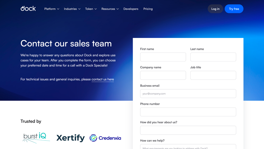
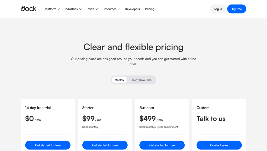
Index of all 4 Dock websites examples
Products 23
All products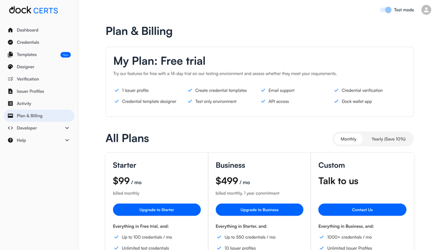
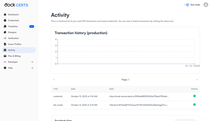
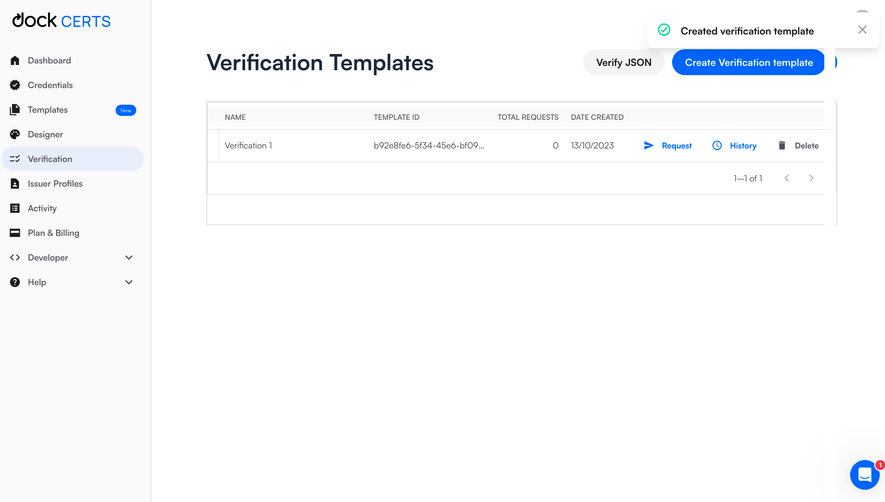
Index of all 23 Dock products examples
- Dock Create Verification Templates
- Dock Empty Verification Templates Dashboad
- Dock Credentials Dashboard
- Dock Issuing Credentials Success
- Dock Issuing Credentials Loader
- Dock Send Credential to Recipients
- Dock Add Credential Recipiend
- Dock Add Credential Recipiend
- Dock Add Credential Recipiend
- Dock Edit Credential Design
- Dock Select Credential Design
- Dock Select Credential Template
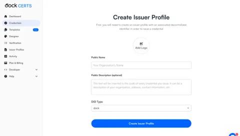
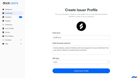
- Dock Create Issuer Profile
- Dock Create Issuer Profile
- Dock Create Issuer Profile
- Dock Empty Credentials Dashboard
- Dock Empty Dashboard
- Dock Account Setup
- Dock Verification
- Dock Signup
Flows 3
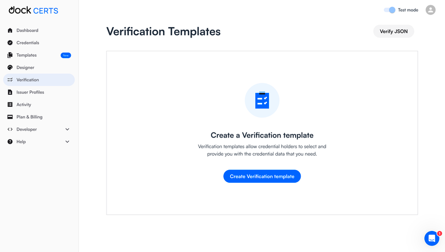
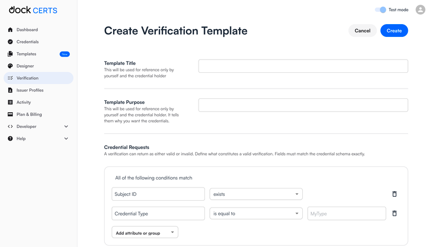
Dock Create Verification Templates
3 screens
Website sections 1
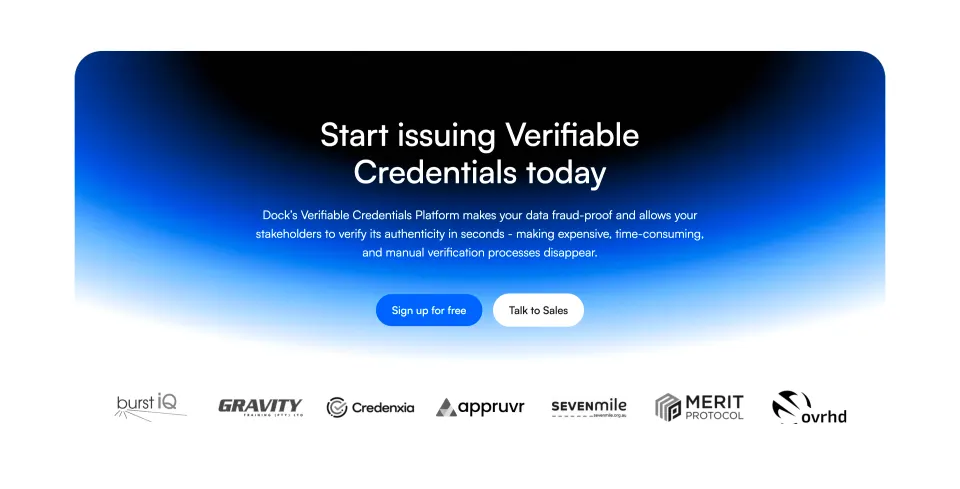
Design reference
Stack
Dock (dock.io) is built on Webflow — a no-code visual CMS platform. Assets are served from cdn.prod.website-files.com, confirming the Webflow hosting pipeline. No React, Vue, or Next.js signals are present in the public-facing marketing site. Analytics via Google Tag Manager (GTM-K885M4M). The logo is delivered as an SVG in two variants: a light logo for dark backgrounds and a dark logo for light backgrounds.
Typography
Dock uses a clean, modern sans-serif system consistent with enterprise B2B SaaS. Based on visual inspection and Webflow conventions:
- Primary typeface: Inter or a geometric sans-serif (system-fallback stack typical of Webflow sites:
Inter, -apple-system, BlinkMacSystemFont, 'Segoe UI', sans-serif) - Hero heading (H1): Large display weight, ~56–72px, bold (700–800), tight letter-spacing (−0.02em)
- Section headings (H2): ~36–48px, semibold (600–700)
- Card headings (H3): ~20–24px, semibold (600)
- Body text: ~16–18px, regular (400), relaxed line-height (~1.6)
- Small / caption: ~13–14px, regular or medium
- CTAs / buttons: ~15–16px, semibold, tracked slightly
- Numbered steps (01, 02, 03): Large decorative numerals, likely 80–120px, light weight, used as visual anchors
Color Philosophy
Dock employs a dark-first brand identity with a deep navy/near-black primary paired with white text on hero and CTA sections. A vibrant accent color (teal or blue-green) drives CTAs and interactive elements. The footer uses an inverted dark background. The trusted-by and social-proof sections use a lighter, neutral background to provide visual breathing room.
- Brand dark: Deep navy — approximately
#0A0F1Eor#0D1117 - Brand white:
#FFFFFFfor hero text and dark-section body copy - Accent / CTA blue-teal: Approximately
#2563EBor#1A6FF4(primary button fill) - Accent green / success indicator:
#22C55Eor similar for checkmark icons - Neutral light background:
#F8F9FBor#F4F5F7for mid-page sections - Text dark:
#111827on light sections - Text muted:
#6B7280for secondary copy - Border / divider:
#E5E7EB
Spacing
Webflow's default spacing grid is 4px-based. Dock uses generous vertical rhythm between sections — consistent with enterprise landing pages that benefit from visual breathing room.
- Base unit: 4px
- Section vertical padding: 80–120px (20–30 base units)
- Card internal padding: 24–32px
- Component gap (grid/flex): 16–24px
- Inline element gap: 8–12px
Component Defaults
- Buttons — Primary: Filled, rounded (~6–8px radius), dark navy or blue accent background, white text, semibold, ~14–16px. Hover: slightly lightened fill or elevated shadow.
- Buttons — Secondary / Ghost: Outlined border, transparent background, matching border color to accent. Used for secondary CTAs like "Log in".
- Navigation: Top horizontal nav, transparent on scroll or white/blurred backdrop. Logo left, links center-right, CTA buttons far right.
- Cards / Feature blocks: Light background, subtle border or drop shadow, rounded corners (~8–12px), icon or illustration at top.
- Pricing table: Three-column layout with check/minus icons from CDN PNG assets. Column headers use plan name + price prominently.
- Testimonial / Quote blocks: Large quotation mark, avatar image, name + title attribution.
- Trusted-by logos: Horizontal scrolling marquee or static row of partner logos in grayscale or brand color on neutral background.
- Step indicators: Large bold numerals (01, 02, 03) used as section anchors with alternating image+text layout.
Layout
- Grid system: 12-column CSS grid, max container width ~1200–1280px, centered with auto margins.
- Responsive breakpoints: Standard Webflow breakpoints — 1440px (desktop), 992px (tablet landscape), 768px (tablet), 480px (mobile).
- Hero: Full-width, dark background, text left or center-aligned, device mockup image right.
- Feature sections: Alternating 2-column layouts (text left / image right, then reversed).
- Footer: Dark background, 4–5 column link grid, logo bottom-left, social icons bottom-right.
- Announcement bar: Slim full-width top banner for events/promotions, dismissible.