Generate a new design based on this screen, using your own content.
Preview the prompt
# Design from Reference: Canny Features Page

Create an original, high-fidelity visual design inspired by the reference. Prioritize composition, typography, colors, spacing and component styling over technical implementation.

## Reference

- **Product:** Canny
- **Category:** Features Page
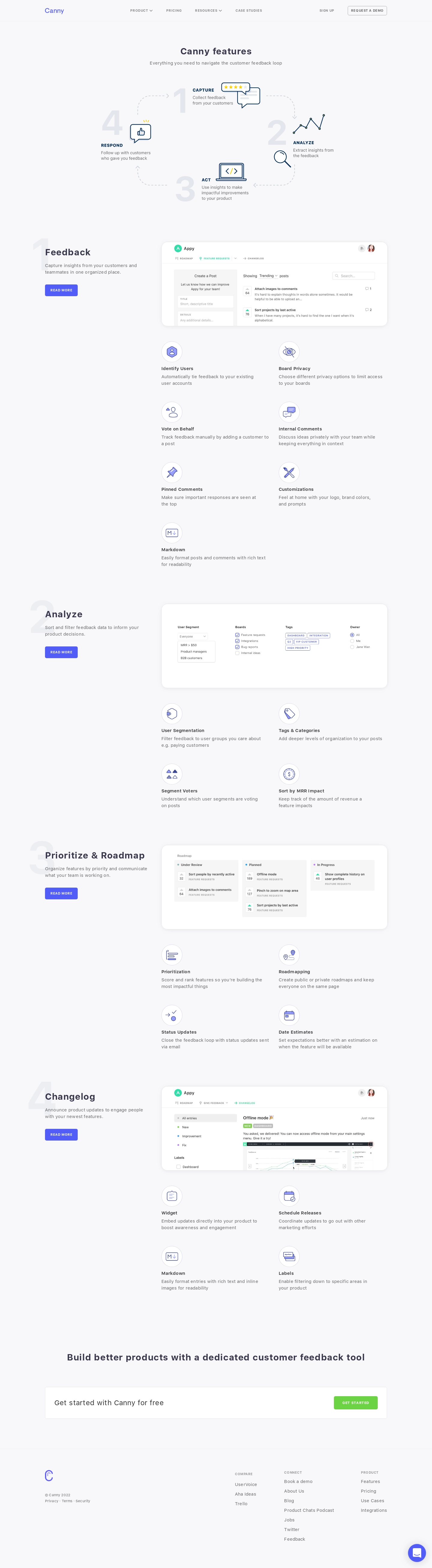
- **Screenshot:** https://media.saasframe.io/o/1726a6d407f6eaaef67f.webp

Analyze the screenshot first. If you can’t access it, ask me for it rather than guessing.

## Content

Write realistic placeholder content for a fictional SaaS product in the same category (no lorem ipsum).

Preserve essential messaging and factual accuracy. Adapt structure and copy length for visual balance; never invent product claims.

## Visual design

Use this context to reproduce the reference’s visual language: layout, typography, colors, spacing, borders, radii and distinctive elements. The screenshot takes priority if descriptions conflict.

### Overall aesthetic

- **Style:** A light, structured features page with pale lavender-gray background, violet actions, numbered chapters, and fine line illustrations.
- **Character:** Methodical and approachable, presenting the customer-feedback loop as both an opening diagram and a sequence of product modules.

### Page composition

- **Capture and scale:** The screenshot measures 1440 × 5220 pixels. Approximate dimensions below refer to screenshot pixels; CSS scale is unverified.
- **Opening:** A slim navigation header precedes a centered title/subtitle and a four-step loop diagram for capture, analysis, action, and response.
- **Feature chapters:** Four numbered sections cover Feedback, Analyze, Prioritize & Roadmap, and Changelog. A roughly 340 px left introduction column pairs with a roughly 750 px right region containing a product screenshot and two-column feature descriptions.
- **Detail counts:** The first section includes seven small feature items; subsequent sections use four each. Large pale numerals sit behind/alongside each left heading.
- **Closing:** A centered conversion headline and broad white CTA strip precede a sparse footer with brand/legal left, three link groups right, and a circular chat control.

### Information hierarchy

- **Framework:** The opening loop explains the overall product process before detailed features.
- **Chapter hierarchy:** Number, title, short description, and Read More action introduce each stage; product imagery and individual capabilities supply supporting evidence.
- **Conversion:** Violet Read More controls recur throughout, while the final Get Started action uses green for a distinct conversion emphasis.

### Typography

- **Family:** A clean sans serif is visible; exact identity is unverified.
- **Headings:** Page/chapter headings are approximately 30–32 px bold with slight positive tracking. The decorative chapter numerals are approximately 140 px and very pale.
- **Body:** Feature titles are around 15–16 px semibold; descriptions around 15 px with 22 px line-height.
- **Labels:** Navigation, diagram labels, and button text use compact uppercase letters with expanded tracking, roughly 11–13 px.

### Colors & surfaces

- **Foundation:** Sampled sRGB #F8F8FA dominates the page; #FFFFFF defines screenshot panels and the closing CTA strip. Subtle near-white variants include #F7F6F9 and #F9F9FB.
- **Neutral surfaces:** Sampled #F6F6F6 and #F3F3F5 support product UI and fine neutral details.
- **Brand accent:** Violet marks the logo, Read More actions, line icons, and chat. Dark blue-gray supports headings; exact brand hex values are unverified.
- **Diagram:** Muted pale-gray arrows/numerals and small yellow highlights keep the process diagram secondary to text. Green is reserved for the final conversion action and some product-status accents.

### Components

- **Loop diagram:** Four large pale numerals, small illustrations, uppercase labels, and short descriptions are connected by dashed rounded arrows.
- **Product panels:** Wide white screenshot containers use approximately 20–24 px radii, fine borders, and soft shadows. Visible subjects include feedback posts, filter settings, a three-column roadmap, and changelog content.
- **Feature items:** Circular outlined icon disks sit above short title/description stacks. Items remain unboxed in a consistent two-column grid.
- **Buttons:** Small violet rectangular actions use modest 4–5 px radii and uppercase white labels.
- **Closing strip:** A thin-bordered white horizontal panel places a short invitation left and compact green action right. Footer columns remain unboxed.

### Visual rhythm

- **Spacing:** Major chapters have approximately 120–160 px separation. Within chapters, product panel and feature grid have around 50 px spacing; feature rows allow generous 45–60 px vertical gaps.
- **Alignment:** Keep left introductions aligned to a common vertical edge and all right screenshot/feature regions on the same grid.
- **Visual restraint:** Maintain pale backgrounds and subtle icons throughout; avoid introducing heavy colored sections that break the quiet loop-based narrative.

### Responsive

- **Observed state:** Only desktop is shown.
- **Recommended reflow:** Place each chapter introduction above its screenshot, collapse feature grids to one column, and turn the opening loop into a simple vertical sequence.
- **Media:** Use readable product crops or enlargement options when full-width screenshots become too small. Wrap the closing CTA into a vertical stack.

### Adaptation guidance

- **Preserve:** Retain the four-stage framework, pale chapter numerals, consistent left-intro/right-evidence pattern, and circular line-icon features.
- **Adapt:** Map real product capabilities into a coherent process. Vary item counts naturally instead of padding every stage.
- **Avoid:** Do not copy reference feature claims or invent unseen screenshot content. Use actual product evidence and genuine action destinations.

## Direction

Keep the reference’s visual language (type, color, spacing, radii) but adapt the layout freely to the content.

## Output

Produce a high-fidelity static visual mockup of the full screen.

Deliver a polished, cohesive design with precise alignment, hierarchy and spacing. Produce the requested visual artifact, not just a description. If unsupported, explain the limitation.
 SaaSFrame